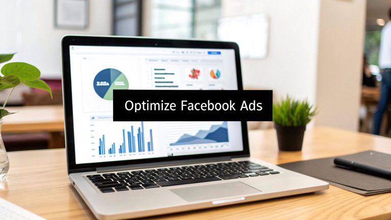
Top 7 Ways to Increase Conversion Rates in 2025
Investing in Facebook lead generation campaigns without seeing a strong return can be incredibly frustrating. You've crafted the perfect ad, targeted the right audience, and watched the clicks roll in, only for the conversion rate to fall flat. What separates a campaign that merely generates interest from one that consistently delivers high-quality leads? It’s not about spending more; it's about converting smarter.
Many marketers get stuck in a cycle of manual lead retrieval, downloading CSVs, and suffering from slow response times, which kills conversion potential before it even begins. This guide is built to change that. We will explore 10 proven ways to increase conversion rates, transforming your Facebook ad spend into a powerful, automated lead machine.
We'll dive into specific, actionable strategies, from optimizing your calls-to-action to enhancing landing page performance. To significantly boost your conversion efforts, it's also crucial to understand how to create video content that converts and resonates with your audience. Throughout this article, we’ll cover practical tactics, including how to streamline your follow-up process with tools like LeadSavvy Pro, ensuring every lead has the highest possible chance of becoming a customer. Let's get started.
1. A/B Testing
A/B testing, or split testing, is a methodical approach to compare two versions of a single variable, like a Facebook ad creative or landing page headline. It's a foundational technique for anyone serious about finding ways to increase conversion rates because it removes guesswork. By presenting "Version A" to one segment of your audience and "Version B" to another, you can gather empirical data on which variation performs better.
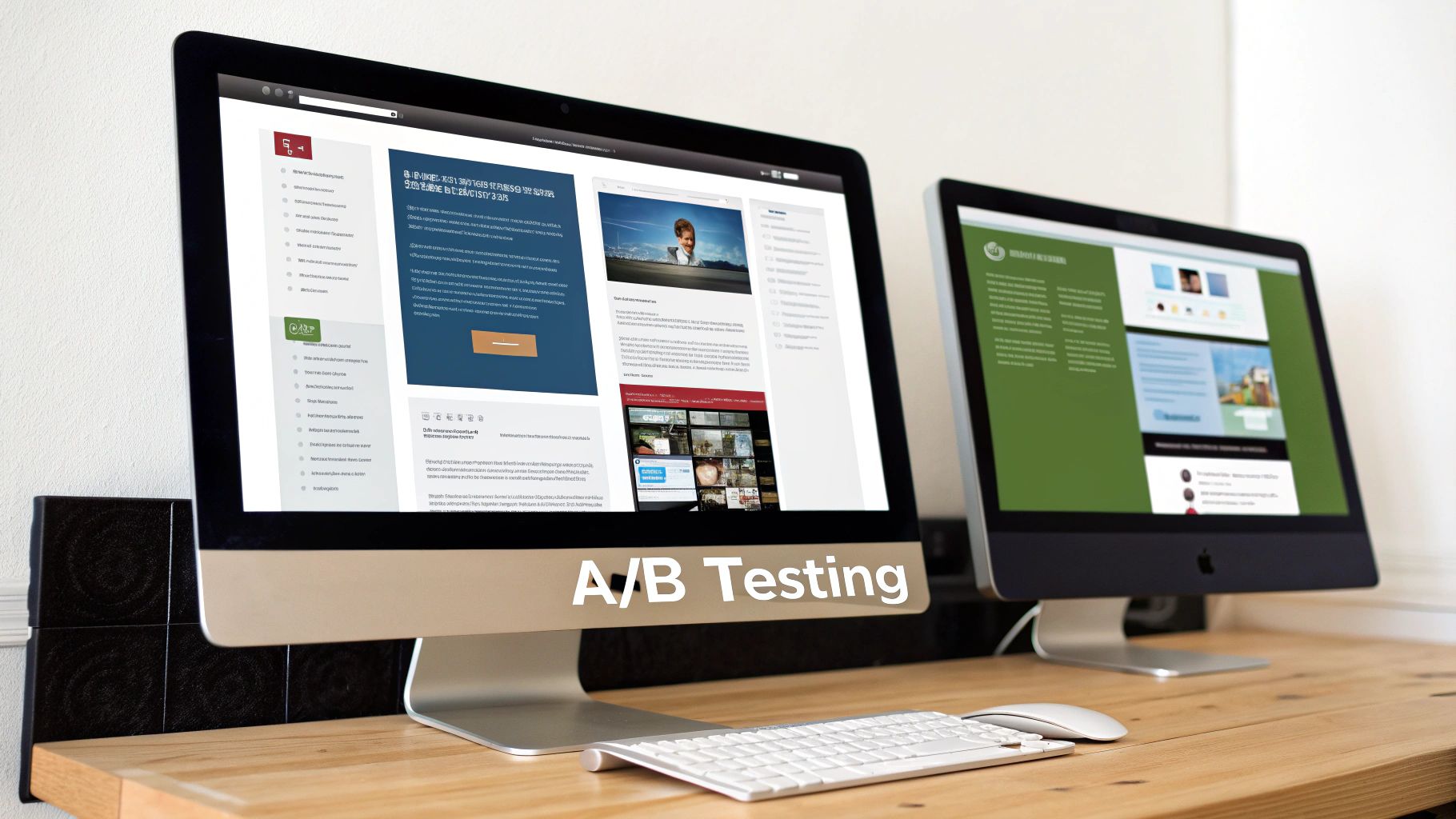
The core principle is scientific control: change only one element at a time. This ensures you can attribute any lift in performance directly to that specific change. For instance, Dropbox famously increased signups by 10% just by testing different homepage headlines. Similarly, HubSpot saw a 24% conversion boost by changing a call-to-action button color from green to red, proving that even minor tweaks can yield significant results.
How to Implement A/B Testing Effectively
To get started, focus on high-impact elements that can produce meaningful insights quickly. Don't waste time testing minuscule changes on low-traffic pages.
- Test One Variable: To get clean data, isolate a single change per test. Test a new headline, a different image, or a revised call-to-action (CTA), but not all at once.
- Ensure Sufficient Traffic: Your test needs enough visitors to reach statistical significance. If your sample size is too small, the results will be unreliable. Use a tool to determine how long to run your test.
- Focus on Impact: Start by testing elements that most directly influence the conversion action. This typically includes your headline, primary image or video, and CTA button text.
- Document Everything: Keep a log of every test you run, including your hypothesis, the variants, the results, and what you learned. This becomes an invaluable resource for future optimization efforts.
2. Optimizing Call-to-Action (CTA) Buttons
Your Call-to-Action (CTA) button is the gateway to conversion, and optimizing it is one of the most direct ways to increase conversion rates. This involves strategically designing and phrasing the button to compel users to click. It’s not just about what the button says, but also its color, size, and placement, which all work together to signal the next step for a potential lead.
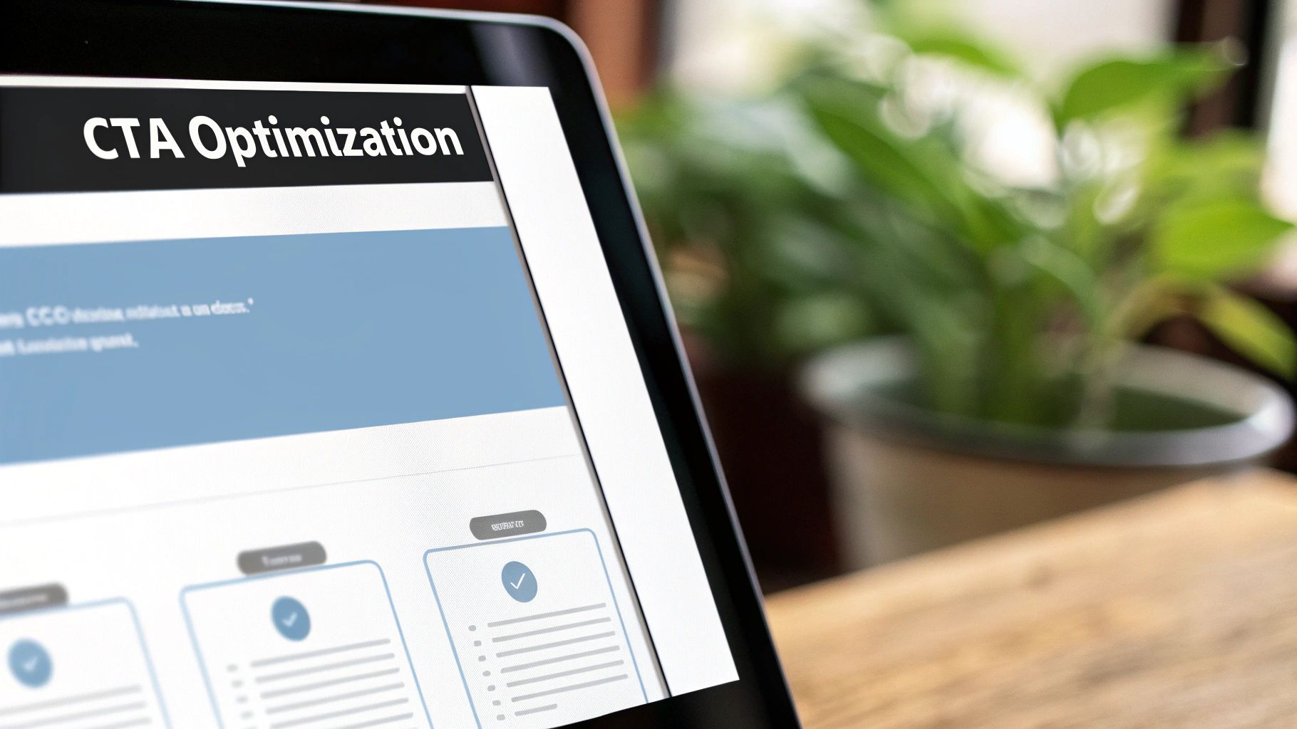
The impact of a well-crafted CTA is well-documented. For example, Performable famously increased conversions by 21% simply by changing its button text from the generic "Start your free trial" to the more personalized "Start my free 30-day trial." Similarly, research by platforms like Unbounce has consistently shown that high-contrast colors like orange can significantly outperform others, making the button impossible to ignore. These minor adjustments can yield major improvements in lead generation.
How to Implement CTA Optimization Effectively
To get the most out of your CTAs, focus on clarity, urgency, and visibility. Your goal is to make the desired action obvious and appealing.
- Use Action-Oriented Verbs: Start your CTA with a strong command verb. Instead of "Submit," try "Get My Free Quote" or "Download Your Guide Now." This frames the action around the value the user will receive.
- Create Urgency: Incorporate words that prompt immediate action, like "Now," "Today," or "Limited Time." This psychological trigger can reduce hesitation and encourage instant clicks.
- Optimize for Visibility: Your button must stand out. Use a contrasting color that pops against the background, ensure it’s large enough to be easily tapped on mobile, and place it prominently above the fold.
- Keep it Personal: Using first-person language ("Get My Free Ebook" instead of "Get Your Free Ebook") can create a stronger sense of ownership and increase click-through rates.
3. Social Proof Integration
Social proof integration is a powerful technique that leverages the psychological principle that people are more likely to take an action if they see others doing it. This is one of the most effective ways to increase conversion rates because it builds trust and credibility. By showcasing testimonials, user reviews, case studies, or even real-time activity, you assure potential customers that they are making a wise choice endorsed by their peers.
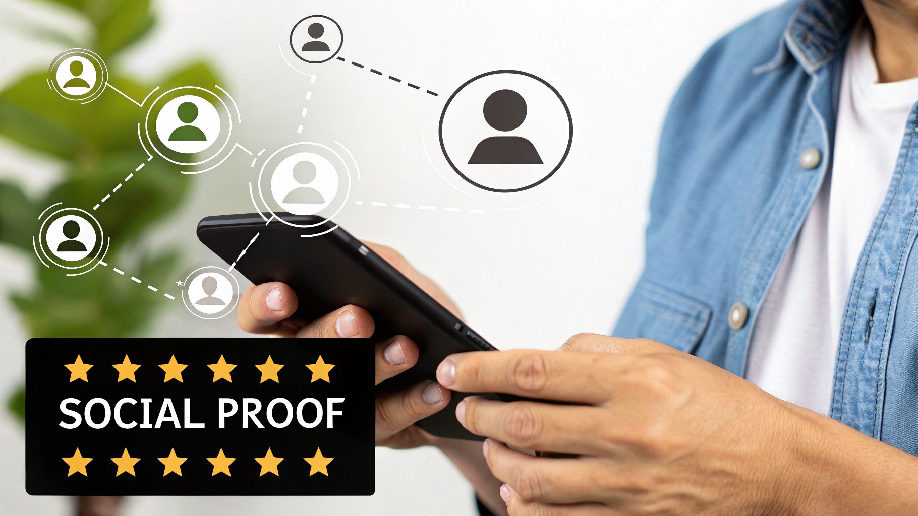
This method taps into our natural tendency to conform and trust the wisdom of the crowd. For instance, Booking.com creates urgency by showing how many people are currently viewing a hotel, while Amazon’s extensive review system has become a cornerstone of its e-commerce dominance. Similarly, SaaS companies like Basecamp prominently display logos of well-known clients to instantly boost their authority and validate their service for new visitors.
How to Implement Social Proof Integration Effectively
To make social proof work, it must feel authentic and be placed strategically where it can have the most impact on a user's decision-making process.
- Display Detailed Testimonials: Go beyond generic praise. Use specific, result-oriented testimonials that include the customer’s full name, company, and photo for maximum believability.
- Show Real-Time Activity: Integrate tools that display recent purchases or sign-ups. Seeing that others are actively converting in real-time can create a sense of urgency and FOMO (fear of missing out).
- Leverage User Counts: Highlight the size of your community or customer base. Phrases like “Join 50,000+ satisfied customers” provide immediate validation.
- Place It Near CTAs: Position your strongest social proof elements, like a 5-star rating or a powerful quote, directly next to your primary call-to-action buttons to overcome last-minute hesitation.
4. Page Loading Speed Optimization
Page loading speed optimization is the practice of decreasing the time it takes for a user to see the content on your landing page. In an era of instant gratification, every second counts. A slow-loading page frustrates users, increases bounce rates, and directly kills conversions. This is a critical factor in finding ways to increase conversion rates, as users are quick to abandon a site that doesn't load almost instantly.
The impact of speed is well-documented by major brands. Walmart found that every one-second improvement in page load time increased their conversions by 2%. Similarly, Pinterest reduced its load times by 40% and saw a corresponding 15% increase in signups. These examples prove that a faster site directly translates to a better user experience and higher revenue, making it a non-negotiable part of any optimization strategy.
How to Implement Page Loading Speed Optimization
Improving your page speed involves a mix of technical and content-based enhancements. Start with the changes that will provide the most significant improvements for your users.
- Compress Images: Use tools to reduce image file sizes without sacrificing visual quality. Large, unoptimized images are one of the most common causes of slow pages.
- Minimize HTTP Requests: Reduce the number of individual files your page has to load. Combine CSS and JavaScript files where possible to streamline the loading process.
- Use Browser Caching: Configure your site to store parts of your page in a visitor's browser. This allows for much faster load times for returning visitors. You can learn more about how to improve website conversion rates on LeadSavvy.pro.
- Monitor Performance Regularly: Use tools like Google PageSpeed Insights or GTmetrix to regularly test your page speed. This helps you identify new performance bottlenecks and track your progress over time.
5. Landing Page Optimization
Landing page optimization is the process of creating and refining dedicated web pages designed for a single conversion goal. Unlike a homepage with dozens of links and distractions, a landing page focuses a visitor's attention on one specific action, making it one of the most effective ways to increase conversion rates. By ensuring message match between your ad and your page, you create a seamless and persuasive user journey.
The goal is to eliminate friction and guide the user directly toward your call-to-action. Companies like Unbounce and HubSpot are masters of this, creating campaign-specific landing pages that convert at exceptionally high rates. For example, Dropbox famously used a simple, highly focused landing page with a clear value proposition to drive millions of signups, proving that clarity and focus outperform complexity.
How to Implement Landing Page Optimization Effectively
To get the most out of your traffic, direct campaign visitors to a dedicated landing page instead of your general website. This focused approach is a key part of successful sales funnel optimization.
- Match Your Messaging: Ensure the headline and core message on your landing page directly reflect the ad the visitor clicked. Inconsistency here is a primary cause of high bounce rates.
- Remove Distractions: Eliminate the main navigation menu and any unnecessary outbound links. The only clickable path forward should be your primary call-to-action.
- Focus on Benefits: Instead of listing product features, write copy that explains how your offer solves the visitor's problem or improves their life.
- Optimize Your Form: Place your lead form "above the fold" so visitors don't have to scroll. Test different form lengths, as asking for less information often increases submissions.
- Use a Single, Clear CTA: Your page should have one goal. Make your call-to-action (CTA) button prominent with clear, action-oriented text like "Get Your Free Quote" or "Download the Guide Now."
6. Mobile User Experience Enhancement
With a significant portion of web traffic now coming from smartphones, enhancing the mobile user experience is no longer optional; it's a critical component of finding ways to increase conversion rates. Mobile UX optimization involves designing your website and landing pages specifically for smaller screens, touch interactions, and on-the-go user behavior. A clunky, slow, or hard-to-navigate mobile site is a direct path to lost leads and sales.
The impact of a mobile-first approach is well-documented. For example, AliExpress saw an incredible 104% increase in conversions for new users after investing in their mobile web experience. Similarly, Target optimized its mobile site and experienced a 20% lift in mobile sales, demonstrating that a seamless experience directly translates to revenue. These successes underscore the importance of treating mobile users as a primary audience, not an afterthought.
How to Implement Mobile UX Enhancement Effectively
To begin optimizing, you must think from the perspective of a mobile user who is likely distracted and using their thumb to navigate. Prioritize simplicity, speed, and ease of use.
- Design for Thumb Navigation: Place key navigation elements and call-to-action buttons within the "thumb zone" at the bottom or middle of the screen for easy one-handed use.
- Use Large Tap Targets: Ensure all buttons, links, and form fields are large enough to be easily tapped. Apple’s guideline suggests a minimum target size of 44×44 pixels.
- Optimize Forms and Payments: Use mobile-friendly keyboards (e.g., numeric pads for phone numbers) and integrate one-click payment options like Apple Pay or Google Pay to reduce friction.
- Test on Real Devices: Browser emulators are useful, but nothing beats testing your site on actual iPhones and Android devices to identify real-world usability issues.
7. Personalization and Dynamic Content
Personalization is the strategy of tailoring web content and user experiences based on individual visitor data, such as behavior, demographics, or location. By using dynamic content that changes in real-time, you can present the most relevant offers and messages to different audience segments, which is a powerful way to increase conversion rates. Instead of a one-size-fits-all approach, each visitor sees content that speaks directly to their needs.
The impact of this approach is well-documented. Amazon’s recommendation engine, a prime example of personalization, is credited with driving a massive portion of its revenue. Similarly, Netflix personalizes content suggestions to keep users engaged, while Spotify’s Discover Weekly playlist has amassed millions of loyal followers. These giants prove that when you make the user experience feel unique and relevant, conversions naturally follow.
How to Implement Personalization and Dynamic Content
Effective personalization doesn't require an Amazon-sized budget. You can start small and scale your efforts as you gather more data and see results. To truly maximize conversion through personalization, it's essential to learn how to personalize customer interactions across all touchpoints.
- Start with Segmentation: Begin by grouping your audience based on simple criteria like new vs. returning visitors, geographic location, or traffic source. Show a unique welcome message to first-time visitors or a special offer to those who came from a specific Facebook ad.
- Use Progressive Profiling: Instead of overwhelming new leads with long forms, gather information gradually. Ask for their company size on the second visit, and their biggest challenge on the third. Use this data to tailor future communications.
- Personalize Calls-to-Action (CTAs): A dynamic CTA can dramatically improve performance. For example, show a "Create My Free Account" button to new users and a "Upgrade Your Plan" button to existing free users.
- Leverage Geolocation: Customize content based on a visitor's location. A clothing retailer could show winter coats to visitors from cold climates and swimwear to those in tropical areas. This simple step makes your offers far more relevant.
8. Trust Signal Implementation
Trust signals are visual and textual cues that build credibility and reduce user anxiety. These elements reassure visitors that your business is legitimate, their data is secure, and their purchase is protected. Implementing them is one of the most effective ways to increase conversion rates because it directly addresses the subconscious fears that cause cart abandonment and form drop-off.
The core principle is to build confidence at every stage of the user journey. For example, Blue Fountain Media boosted conversions by 42% simply by adding a Verisign trust badge to their website. Similarly, Zappos turned its 365-day return policy into a powerful trust signal that became a key competitive advantage, reassuring customers that they had nothing to lose. These signals show you stand behind your product and value customer security.
How to Implement Trust Signals Effectively
To get started, strategically place trust signals near key decision-making points, like CTA buttons, form fields, and checkout pages. The goal is to preemptively answer the user's security and reliability questions.
- Display Security Badges: Prominently feature well-recognized logos like McAfee SECURE, Norton, or PayPal on your checkout and lead capture pages. This assures users their financial and personal information is encrypted and safe.
- Show Guarantees Clearly: A money-back guarantee, satisfaction guarantee, or generous return policy removes the perceived risk of a purchase. Make this promise highly visible.
- Provide Accessible Contact Info: A physical address, phone number, and professional email address show that a real business with real people is behind the website, increasing legitimacy.
- Leverage Certifications: Display industry-specific accreditations or certifications (like Better Business Bureau) to demonstrate expertise and adherence to quality standards.
9. Urgency and Scarcity Tactics
Urgency and scarcity are powerful psychological triggers that compel users to act now rather than later. These tactics work by leveraging the principle of FOMO (Fear of Missing Out), making an offer seem more valuable because it is limited in time or quantity. This is one of the most effective ways to increase conversion rates by short-circuiting the user's tendency to procrastinate on a decision.
The core idea is to create a sense of exclusivity or a need for immediate action. Booking.com famously masters this by displaying messages like "Only 2 rooms left at this price," creating scarcity that drives immediate bookings. Similarly, Amazon's "Lightning Deals" use prominent countdown timers to create urgency, pushing customers to purchase before the deal expires. When users perceive that they might lose an opportunity, they are more motivated to convert.
How to Implement Urgency and Scarcity Effectively
To leverage these tactics without appearing manipulative, authenticity and clear value are key. The goal is to motivate, not pressure, your audience.
- Use Genuine Scarcity: Only claim limited stock if it's true. Displaying real inventory levels, like "Only 5 left in stock," builds trust and is more effective than generic claims.
- Add Countdown Timers: For time-sensitive offers, such as a flash sale or an early-bird discount on a webinar, a visible countdown timer on your landing page creates a powerful sense of urgency.
- Highlight Time-Limited Bonuses: Instead of just discounting a product, offer a valuable bonus for a limited time. For example, "Sign up today and get our free e-book, offer ends Friday."
- Combine with a Clear CTA: Your urgency messaging must lead directly to a clear action. Pair a message like "Offer expires in 24 hours" with a strong call-to-action like "Claim Your Discount Now".
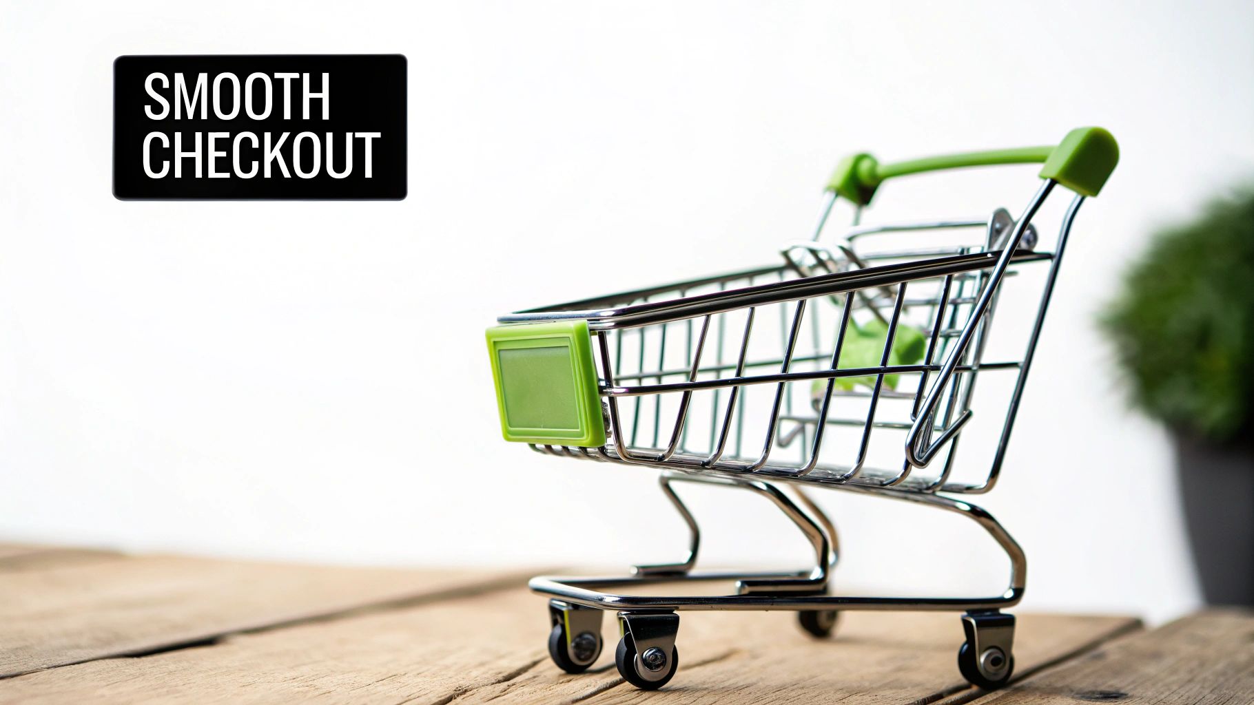
10. Checkout Process Streamlining
Checkout process streamlining is the practice of simplifying and optimizing the steps a customer takes to complete a purchase. This is one of the most direct ways to increase conversion rates because it targets the final, most critical stage of the buyer's journey. By removing friction, you reduce cart abandonment and guide more users from interest to a completed transaction.
The goal is to create a smooth, intuitive, and fast flow from cart to confirmation. Amazon's patented 1-Click ordering is a legendary example, generating billions by making purchasing effortless. More recently, Shopify's Shop Pay has drastically reduced checkout time by pre-filling customer information, leading to higher conversion rates for millions of merchants. These examples prove that a frictionless checkout is a powerful competitive advantage.
How to Implement Checkout Process Streamlining Effectively
Start by analyzing your current checkout flow to identify points of friction or unnecessary steps. The fewer clicks and fields required, the better. Specifically for e-commerce, streamlining the checkout process is vital for reducing abandonment. You can learn more by following a WooCommerce one-page checkout guide to consolidate the entire process.
- Offer Guest Checkout: Don't force users to create an account. Make guest checkout the most prominent option to remove a significant barrier to purchase.
- Minimize Form Fields: Only ask for essential information. Do you really need a phone number or a second address line? Every extra field is a reason for a potential customer to leave.
- Be Transparent with Costs: Display all costs upfront, including shipping, taxes, and fees. Unexpected charges at the final step are the leading cause of cart abandonment.
- Provide Multiple Payment Options: Cater to user preferences by offering credit/debit cards, PayPal, Apple Pay, and other digital wallets. This simple addition can significantly boost conversions.
10 Strategies to Boost Conversion Rates Comparison
| Item | Implementation Complexity 🔄 | Resource Requirements ⚡ | Expected Outcomes 📊 | Ideal Use Cases 💡 | Key Advantages ⭐ |
|---|---|---|---|---|---|
| A/B Testing | Moderate to high – needs setup and statistical know-how | High – requires significant traffic | Data-driven decisions, measurable improvements | Testing variations in webpage or marketing assets | Eliminates guesswork, continuous improvement |
| Optimizing CTA Buttons | Low – relatively easy and quick to implement | Low – minor design & development | Immediate lift in clicks and conversions | Improving button design on pages or emails | Quick wins, low cost, enhances user experience |
| Social Proof Integration | Low to moderate – mainly content and design updates | Low to moderate – requires testimonials | Builds trust, reduces anxiety, increases conversions | Displaying testimonials, reviews, user counts | Builds credibility, leverages psychology |
| Page Loading Speed Optimization | High – requires technical expertise and monitoring | High – ongoing maintenance and tools | Improved UX, SEO, reduced bounce rates | Enhancing site performance and mobile experience | Broad impact on UX and SEO, reduces abandonment |
| Landing Page Optimization | Moderate – design focused, needs ongoing testing | Moderate – design and copywriting | Higher conversion rates, better attribution | Campaign-specific landing pages | Focused user journeys, easy to track & optimize |
| Mobile UX Enhancement | Moderate to high – responsive design & testing | Moderate to high – development resources | Increased mobile engagement and conversions | Mobile-first websites and apps | Captures mobile audience, improves rankings |
| Personalization & Dynamic Content | High – needs advanced tech and data infrastructure | High – technology & data management | Higher engagement, retention, and order values | User-specific content and recommendations | Competitive advantage, improves satisfaction |
| Trust Signal Implementation | Low to moderate – mostly design and content additions | Low to moderate – badge costs & updates | Builds credibility, reduces purchase anxiety | E-commerce, form completions | Enhances trust, reduces abandonment |
| Urgency and Scarcity Tactics | Low to moderate – setup of timers and messaging | Low – content and UI elements | Boosts immediate conversions and sales | Limited-time offers, inventory clearance | Leverages FOMO, drives fast actions |
| Checkout Process Streamlining | High – complex integration and security considerations | High – development and payment systems | Reduced cart abandonment, higher transaction rates | E-commerce checkout flows | Simplifies purchase, improves satisfaction |
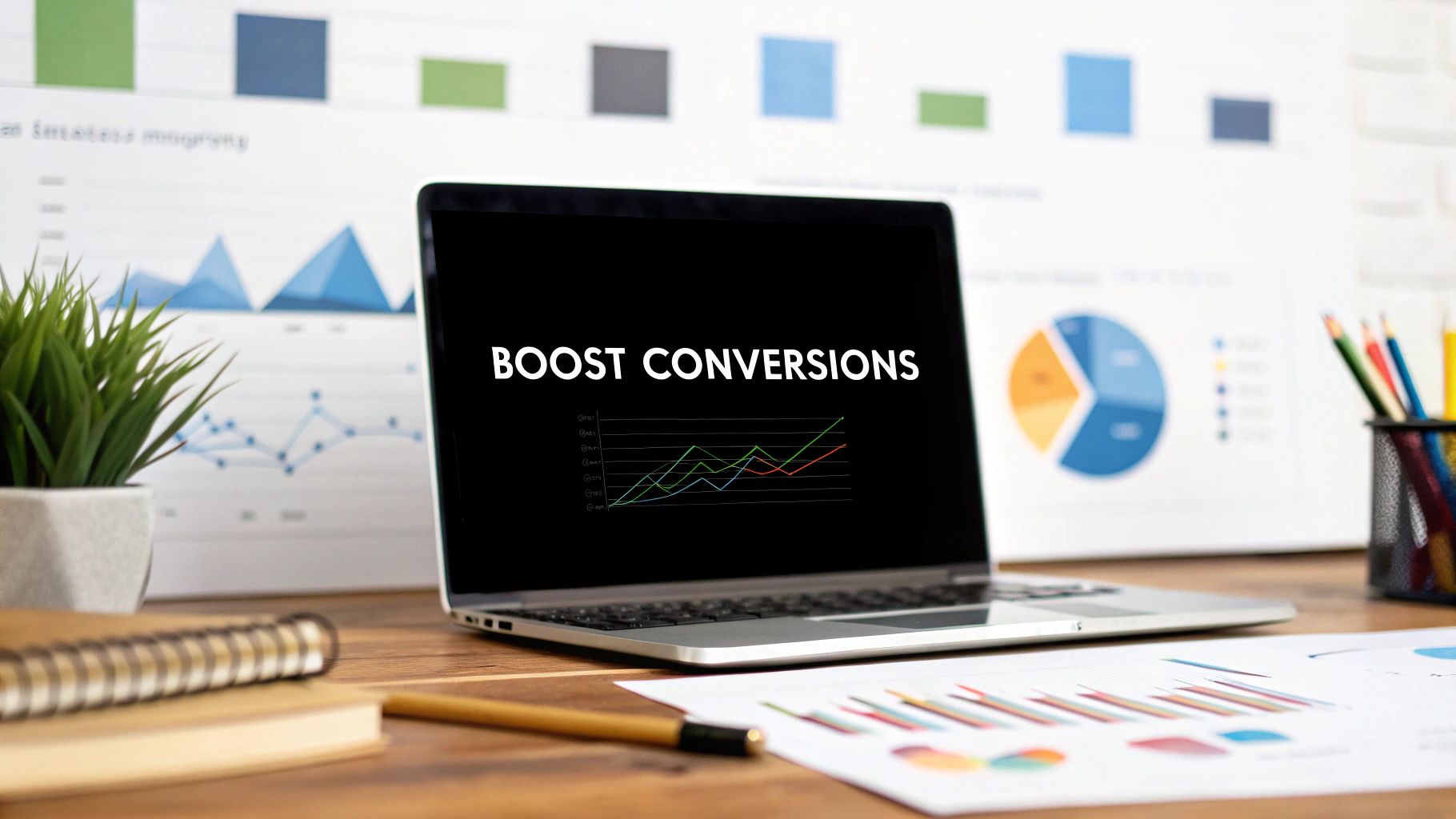
Automate and Dominate Your Facebook Lead Generation
Navigating the landscape of Facebook lead generation can feel like a complex puzzle, but as we've explored, the solution lies in a strategic, multi-faceted approach. Boosting your conversion rates isn't about a single secret weapon; it's about the cumulative impact of consistent optimization. By systematically implementing the ten strategies we've detailed, you build a powerful, high-performance conversion engine piece by piece.
From the foundational practice of A/B testing your creative and ad copy to fine-tuning the psychological triggers of urgency and scarcity, each element plays a critical role. Integrating robust social proof and prominent trust signals builds the credibility necessary to turn a curious prospect into a confident lead. Meanwhile, technical excellence through page speed optimization, a streamlined checkout process, and a flawless mobile user experience removes the friction that kills conversions.
The Power of Incremental Gains and Automation
The true path to mastering high conversion rates involves treating each of these areas not as a one-time fix but as an ongoing process. Optimizing your landing page design and ensuring your call-to-action is compelling are continuous efforts. Layering in personalization and dynamic content transforms a generic ad into a relevant, one-on-one conversation, dramatically increasing its effectiveness.
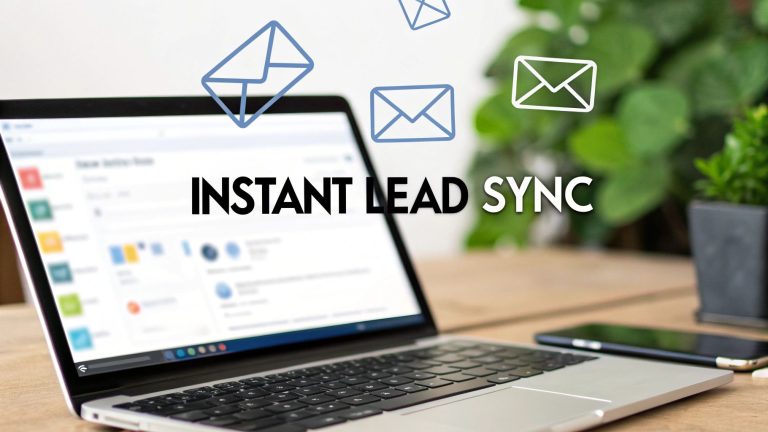
However, the most significant leap forward often comes after the click. All the optimization in the world means little if the lead goes cold. This is where automation becomes the ultimate amplifier for all your efforts. The critical gap between a user submitting their information on a Facebook Lead Ad and your sales team making contact is where the highest potential for drop-off exists. Closing this gap isn't just a good idea; it's one of the most effective ways to increase conversion rates you can implement.
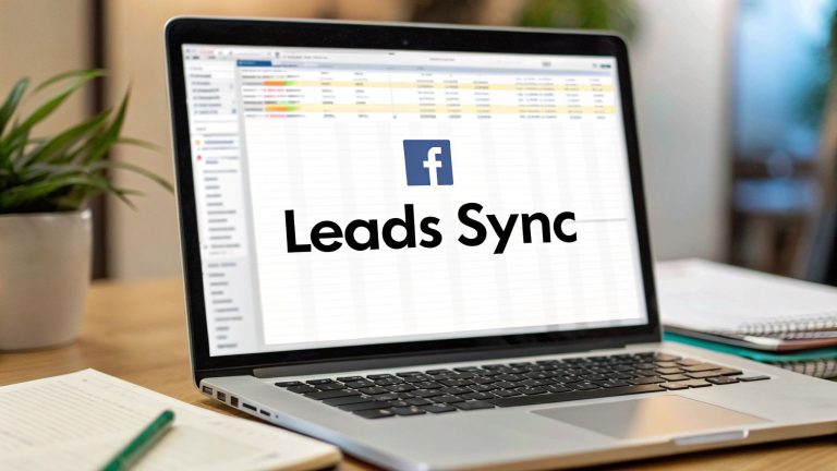
By automating the transfer of leads from Facebook directly into your CRM or a simple Google Sheet, you eliminate manual delays and human error. This immediate handoff empowers your team to engage with prospects in real-time, at the peak of their interest. This combination of front-end ad optimization and back-end process automation is the blueprint for creating a predictable, scalable, and dominant lead generation machine.
Ready to eliminate the manual work and instantly connect with your hottest leads? LeadSavvy Pro bridges the gap between your Facebook Lead Ads and your sales process, ensuring no lead ever goes cold again. Start your free trial of LeadSavvy Pro today and turn your ad spend into immediate, actionable conversations.