Create Your Marketing Campaign Tracking Spreadsheet Today
Let's be honest, trying to make sense of your marketing performance by bouncing between Google Analytics, Facebook Ads Manager, your email platform, and who-knows-what-else is a nightmare. It's more than just a time-sink; it’s a surefire way to get a disjointed, confusing picture of what’s actually working.
If you’ve ever felt that pain, you know exactly why a centralized tracking spreadsheet isn't just a "nice-to-have"—it's essential. It becomes your single source of truth, pulling everything together so you can see the whole story, not just scattered chapters.
Why You Need a Centralized Tracking Spreadsheet
A good tracking spreadsheet is the difference between reacting to last month's numbers and proactively shaping next month's success. It lets you spot trends as they happen, giving you the confidence to shift your budget and efforts toward the campaigns that are actually delivering results.
From Scattered Data to Strategic Insights
Think about this all-too-common scenario: your social media ads are getting tons of clicks, but sales are dead flat. At the same time, your email campaigns boast high open rates, but very few people are actually buying. When these metrics live in separate dashboards, they're just isolated data points. It’s almost impossible to see how a lead from a Facebook ad interacts with your email sequence before making a purchase.
This is where a unified spreadsheet changes the game. By bringing all your key metrics into one view, you can finally connect the dots. You can trace the entire customer journey, from the first click to the final conversion. That kind of clarity is what separates good marketers from great ones.
When you centralize your data, you stop managing channels and start orchestrating a cohesive strategy. It's like finally seeing the whole forest instead of just a few individual trees.
Drive Better Decisions and Prove Your Value
A well-organized marketing spreadsheet is a powerful tool for any marketer looking to optimize their efforts. In fact, many teams find they can improve their ROI by as much as 20% just by reallocating resources based on the clear, actionable data their spreadsheet provides. If you're looking for a head start, you can find some effective templates on Smartsheet.com to get inspired.
A centralized system also drastically cuts down on human error. We've all been there—manually copying and pasting numbers is a recipe for disaster. One wrong digit can completely skew your analysis and lead to some seriously flawed decisions. If you want to tighten up your process, our guide on how to avoid common data entry errors is a great resource for maintaining data integrity.
Ultimately, having a single source of truth isn't just about making your own life easier. It empowers you to make smarter, faster decisions that directly boost the bottom line. And when you can do that, you're not just running campaigns—you're proving your team's value to the entire business.
Before you start building your own, it helps to understand the key pieces that make a tracker truly effective.
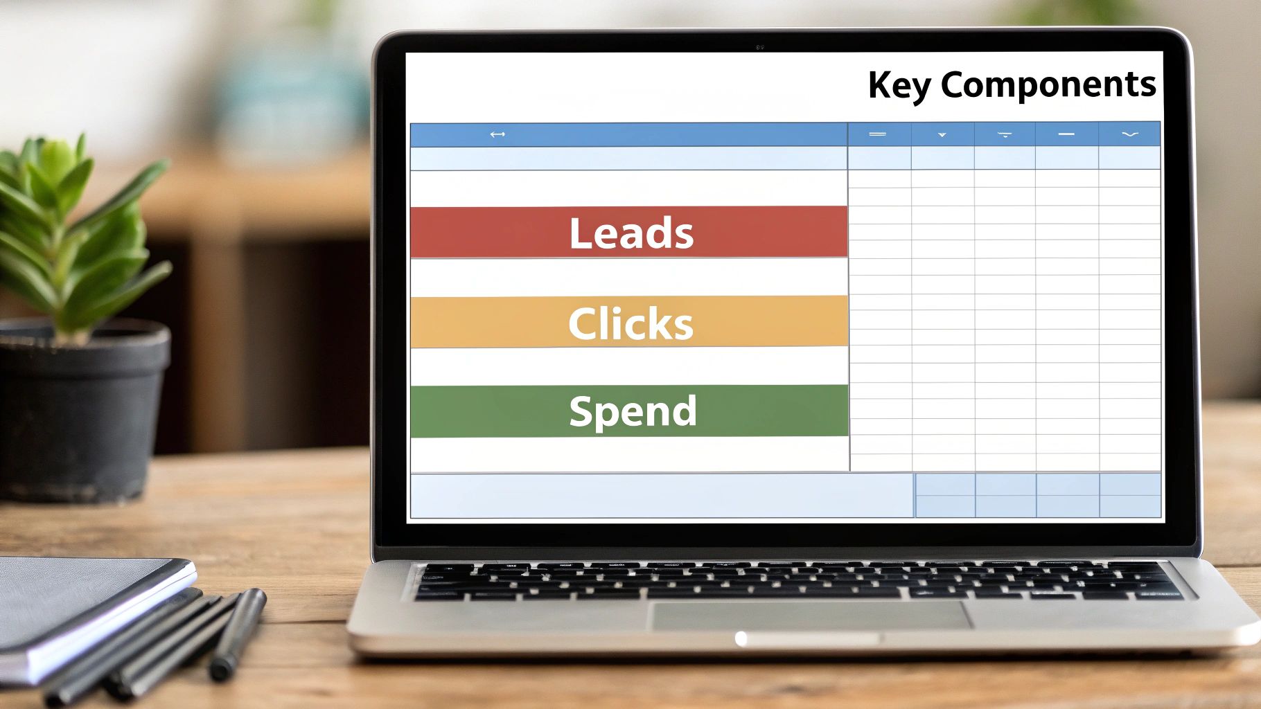
Core Components of an Effective Tracking Spreadsheet
Every great tracking spreadsheet is built on a few fundamental pillars. This table breaks down what you absolutely need to include to get a full picture of your campaign performance.
| Component | What It Tracks | Why It's Critical |
|---|---|---|
| Campaign Info | Campaign Name, Start/End Dates, Channel (e.g., Facebook, Email), Budget | Provides essential context and allows for easy filtering and organization. |
| Reach & Clicks | Impressions, Clicks, Click-Through Rate (CTR) | Measures top-of-funnel engagement and how well your creative resonates. |
| Leads | Leads Generated, Cost Per Lead (CPL) | Connects ad spend directly to lead acquisition, a core marketing goal. |
| Conversions | Conversions (e.g., Sales, Sign-ups), Conversion Rate, Cost Per Acquisition (CPA) | Tracks the ultimate success metric and measures the efficiency of your funnel. |
| Revenue | Total Revenue, Return on Ad Spend (ROAS) | Proves the direct financial impact of your marketing efforts. |
With these components as your foundation, you’ll have a robust system that not only tracks what happened but also provides the insights needed to decide what to do next.
Right, let's get our hands dirty and build the backbone of your campaign tracking system. This is where a little bit of setup work pays off big time down the road.
A killer tracking spreadsheet isn't just one massive, intimidating sheet. That's a rookie mistake. The real power comes from a thoughtfully structured workbook with multiple, interconnected tabs. Each tab has a specific job, which keeps your data clean and stops you from getting lost in a sea of numbers.
First things first, let's create three core tabs. Just click the little '+' at the bottom of your Google Sheet or Excel file and name them:
- Campaign Overview: Your high-level command center.
- Metric Log: The nitty-gritty, day-by-day performance data.
- Budget Tracker: The master sheet for all your financial tracking.
Trust me, this segmented approach is the secret sauce. As you scale your marketing, you can just add new campaigns or more data without wrecking the whole system. It's so much more manageable than wrestling with a single, monstrous sheet.
Structuring Your Campaign Overview Tab
Think of the "Campaign Overview" tab as the table of contents for all your marketing efforts. The goal here is clarity. You want to be able to glance at it and know exactly what's running, where, and why. That means getting your columns right is crucial.
I always start with these fundamentals:
- Campaign Name: Don't just wing it. Use a consistent naming system you'll actually stick with, like
[Q3-2024]-[Social]-[BrandAwareness]. - Channel: The main platform (e.g., Facebook Ads, Google Ads, Email Newsletter).
- Target Audience: A quick note on who you're aiming for, like "New Subscribers – US."
- Start Date & End Date: Essential for tracking performance within specific windows.
- Status: A simple dropdown menu with options like "Planning," "Active," "Paused," and "Completed."
That status dropdown is a small detail that makes a huge difference. In Google Sheets or Excel, you can use the Data Validation feature to create this. It prevents typos and inconsistencies (no more "Active" vs. "Activ" messing up your filters) and keeps your reporting clean. A few minutes of setup now will save you hours of cleanup later. It's a no-brainer.
Detailing the Metric Log and Budget Tracker
While the overview gives you the "what," your "Metric Log" is all about the "how." This is where you'll dump the raw performance data. This tab needs to be set up for quick and easy data entry, whether you're typing in numbers by hand or pasting them from a platform export.
Let's structure it chronologically. Here are the columns you'll need:
- Date: The specific day the data was pulled.
- Campaign Name: This is the key that links back to your "Campaign Overview" tab.
- Impressions: How many times your ad was shown.
- Clicks: The total clicks on your ad or link.
- Spend: How much cash you burned that day.
- Leads/Conversions: The number of people who did the thing you wanted them to do.
Finally, the "Budget Tracker" tab ties it all together financially. On this sheet, you’ll list each campaign from your overview and give it a total budget. Later on, we’ll use some simple formulas to automatically pull the actual daily spend from your "Metric Log" and compare it against your budget.
This foundational setup is what turns a basic spreadsheet into a dynamic system. By keeping your high-level strategy, daily performance, and financial oversight in separate-but-connected tabs, you create a tool that's both incredibly powerful and surprisingly easy to maintain.
Defining Your Most Important KPIs

Alright, your spreadsheet is built. Now for the hard part: deciding what to actually track.
It’s tempting to cram your shiny new tracker with dozens of metrics. I’ve seen it happen countless times. But this is the fastest way to get lost in the data and lose sight of what matters. The secret isn't tracking everything; it's tracking the right things.
Metrics without a clear purpose are just noise. The best trackers I’ve ever worked with focus laser-sharp on Key Performance Indicators (KPIs) that tie directly to real business goals, like generating revenue or growing your customer base. This means moving past vanity metrics (like social media likes) and focusing on the numbers that tell the real story of your campaign's performance.
A great KPI dashboard should immediately answer one question: "Did this campaign make us money, or get us closer to making money?" If your metrics can't do that, they probably don't belong on your main dashboard.
Aligning KPIs with Campaign Goals
The KPIs you prioritize will naturally change depending on your campaign’s objective and where it sits in your marketing funnel. Let’s be clear: not all metrics are created equal, and their importance shifts.
-
Top-of-Funnel (Awareness): When your goal is simply to introduce your brand to new people, you need to focus on reach and initial engagement. Track metrics like Impressions, Clicks, and Click-Through Rate (CTR). These tell you if your message is getting in front of the right eyeballs and if your creative is strong enough to grab their attention.
-
Mid-Funnel (Consideration): Once you’re trying to generate leads, your focus gets narrower. This is where you measure efficiency. The critical metrics become Conversion Rate (for a form fill or download), Cost Per Lead (CPL), and maybe even a Lead Quality Score to see if you’re attracting the right prospects.
-
Bottom-of-Funnel (Decision): For campaigns designed to drive sales, it's all about the money. You need to be tracking Customer Acquisition Cost (CAC), Return on Ad Spend (ROAS), and Customer Lifetime Value (CLV). These are the metrics that prove the financial impact of your marketing spend to the higher-ups.
For an e-commerce business running a holiday sale, for instance, ROAS is everything. For those in e-commerce, knowing how to set up Magento 2 Google Ads conversion tracking is non-negotiable for getting accurate data.
Putting It All Together
This structured, goal-oriented approach is now standard practice for a reason. By mid-2025, it's projected that over 40,000 marketing teams will have adopted specialized templates just to monitor core metrics like conversion rate, CPA, and ROAS across all major ad platforms.
By matching your KPIs to each campaign's specific goal, you turn your spreadsheet from a glorified data log into a powerful decision-making tool. This clarity not only helps you optimize on the fly but also lets you speak the language of business results. You can dive deeper into aligning your efforts with our guide on marketing automation best practices to really streamline your workflows.
Automating Your Data with Smart Formulas
A static spreadsheet is just a logbook. A dynamic one? That's your campaign command center. The real magic happens when you let formulas do the heavy lifting, transforming your sheet from a tedious data entry chore into an automated powerhouse of real-time insights.
Forget just using =SUM(). We're diving into smart formulas that connect data across different tabs, calculate complex metrics instantly, and give you a crystal-clear view of campaign performance without any manual number-crunching.
Calculating Key Metrics on the Fly
Let's start with the metrics that actually impact your bottom line. You shouldn't have to pull out a calculator every time you want to check your Cost Per Lead (CPL) or Return On Ad Spend (ROAS). Instead, you can build these calculations right into your sheet.
For instance, in your "Campaign Overview" tab, set up dedicated columns for ROAS and CPL. Then, pop in these simple formulas to have them update automatically:
- To calculate CPL:
=SUM(Spend) / SUM(Leads) - To calculate ROAS:
=SUM(Revenue) / SUM(Spend)
With this small step, your most critical performance indicators are always current, reflecting the very latest data from your log. For a deeper dive into which numbers to watch, check out our guide on essential lead generation performance metrics.
This flow is pretty straightforward: you define your metrics, you plug in the raw data, and you let the formulas deliver the results.
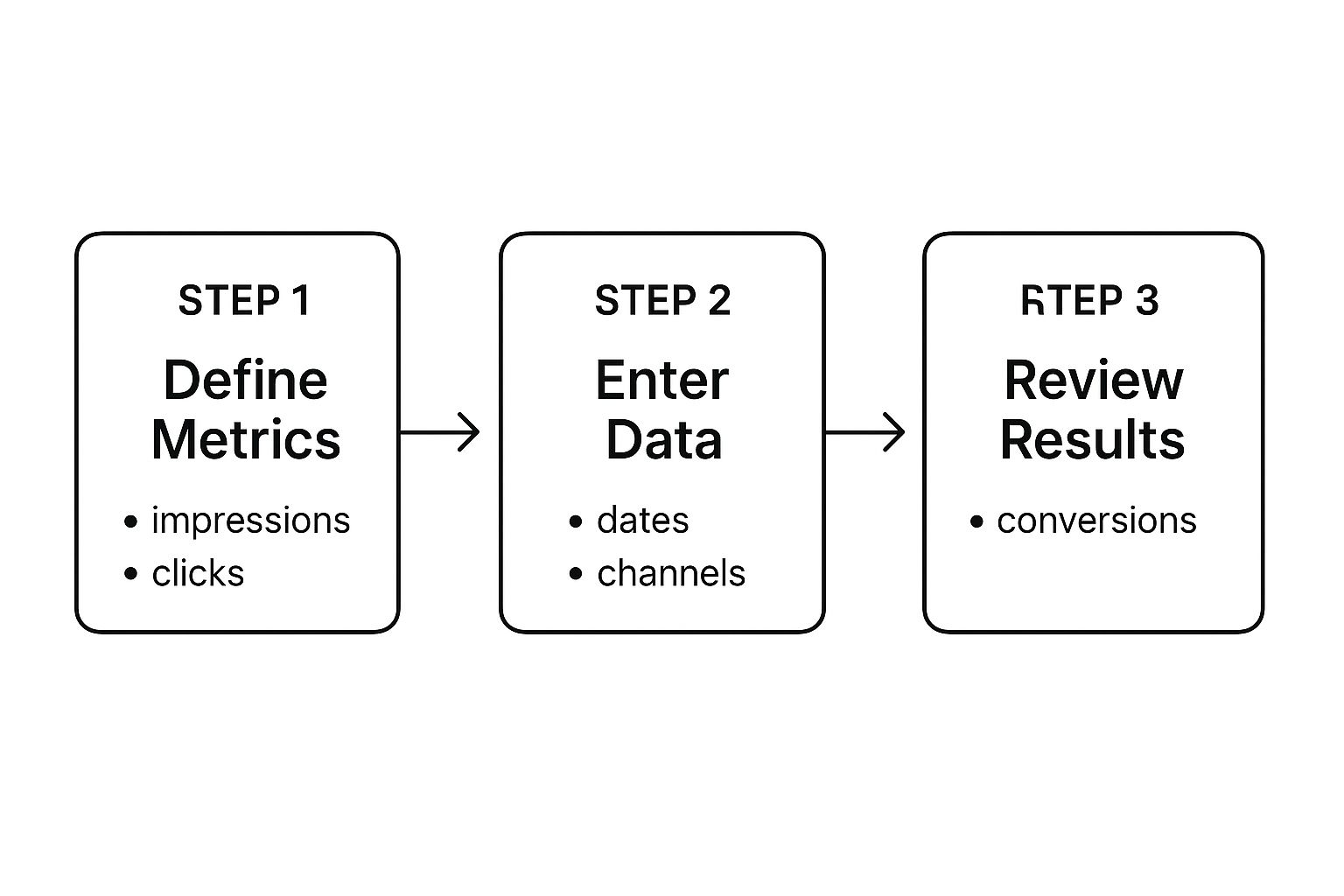
This process shows how a structured approach, powered by formulas, turns basic inputs into meaningful outputs with very little effort on your part.
Advanced Formulas for Deeper Insights
To really level up your spreadsheet, you need to go beyond basic math. This is where powerful functions like SUMIFS and VLOOKUP become your best friends for building a truly intelligent dashboard.
Let's say you want to see the total ad spend for just your Facebook campaigns in Q3. Manually filtering and adding everything up is a classic recipe for mistakes. Instead, let the SUMIFS function do it for you, perfectly, every time.
The formula might look something like this:
=SUMIFS('Metric Log'!E:E, 'Metric Log'!B:B, "Facebook Ads", 'Metric Log'!A:A, ">=2024-07-01")
This formula scans your "Metric Log," finds every entry for "Facebook Ads" after a specific date, and sums up the "Spend" column for you. It's specific, automated, and completely accurate.
Another game-changer is VLOOKUP. You can use it on your "Metric Log" tab to automatically pull in details like "Campaign Status" or "Target Audience" from your main "Campaign Overview" tab. This simple trick enriches your daily data without forcing you to re-type the same information over and over.
Creating a Master Dashboard
The ultimate goal here is to create a master dashboard tab that summarizes everything at a single glance. This dashboard will pull data from all your other sheets, giving you a real-time snapshot of your entire marketing health.
Think of the time this saves. Marketers who build these dashboards report saving up to 30% of their time on data compilation alone, freeing them up to focus on actual strategy. It's also a great way to keep spending in check; clear budget visibility helps reduce overruns by an average of 18%.
Your dashboard could include things like:
- A summary table of total spend vs. budget for all active campaigns.
- A chart showing CPL trends by channel over the last 30 days.
- A ranked list of your top 5 performing campaigns based on ROAS.
Each of these elements would be powered by formulas, updating automatically as you add new data to your "Metric Log." This is how your simple spreadsheet evolves into an active, indispensable tool for making smart, data-driven decisions.
Visualizing Your Data in a Campaign Dashboard
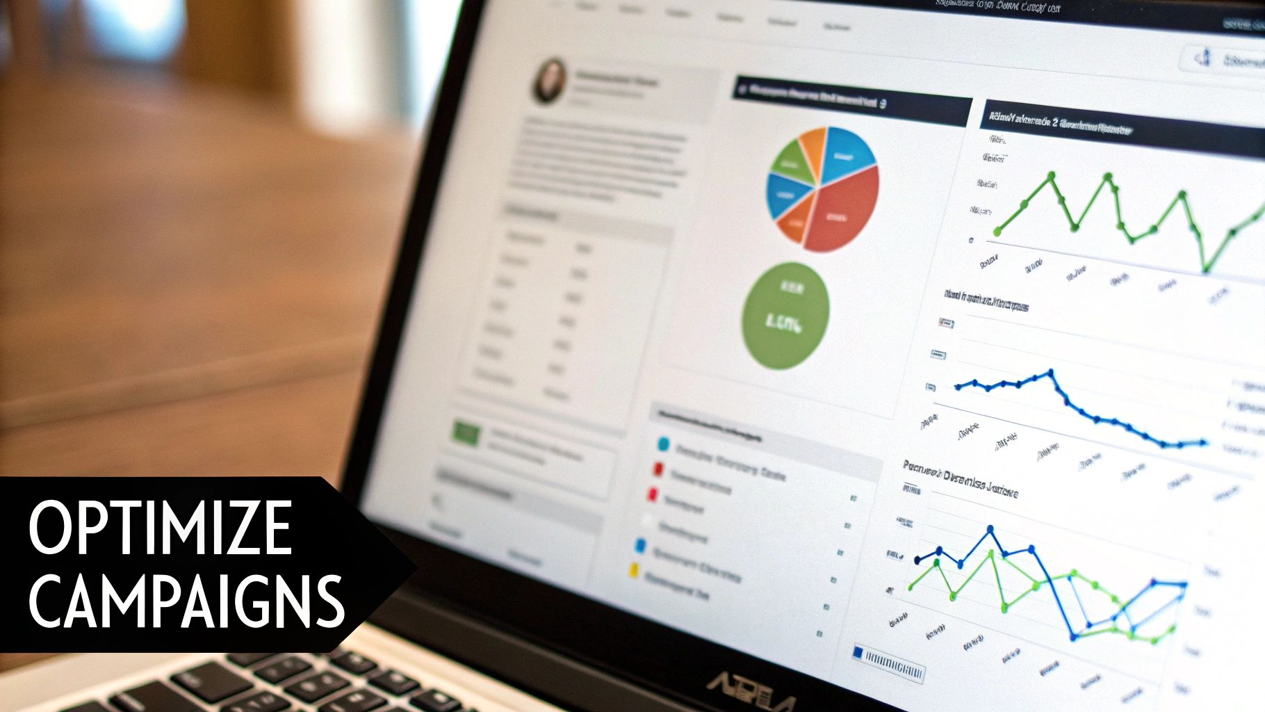
You've got the formulas dialed in, and your tracking spreadsheet is humming along. But let's be honest, rows of raw numbers don't exactly scream "success" to your boss or client. This is where we turn that data from a glorified logbook into a strategic command center.
The real magic happens when you visualize the data. It’s not about making pretty charts; it's about getting answers to your most important questions at a single glance. When a stakeholder looks at your dashboard, they shouldn't have to go on a treasure hunt. The visuals need to do the heavy lifting—highlighting wins, flagging problems, and sparking the right conversations.
The goal? A dashboard that’s so clear, it speaks for itself. That all starts with picking the right chart for the right job, a critical step that’s surprisingly easy to get wrong.
Choosing the Right Visuals for Your Story
The type of chart you use has a massive impact on how your data is understood. The wrong choice can muddy your message or, even worse, lead someone to the wrong conclusion. Let's stick to the essentials every marketer needs in their toolkit.
-
Bar Charts for Comparison: These are your workhorses. Need to see which channel is bringing in the most leads or which campaign has the best Return on Ad Spend (ROAS)? A simple bar chart makes the winner obvious in seconds.
-
Line Graphs for Trends: When you need to see performance over time, nothing beats a line graph. It’s perfect for tracking how your Cost Per Lead (CPL) has changed over the last quarter or watching your website traffic grow month-over-month.
-
Pie Charts for Composition: Use these with care, but they're fantastic for showing parts of a whole. A pie chart is the clearest way to show your budget breakdown, illustrating exactly what percentage of your spend goes to each marketing channel.
These three visuals are the foundation of a killer dashboard. They make complex performance data easy to digest without forcing anyone to squint at a spreadsheet.
Designing an Intuitive and Clean Dashboard
Here's a hard truth: a cluttered dashboard is an ignored dashboard. Simplicity and focus are your best friends. Only include visuals that track your main KPIs. If a chart doesn't help you make a smarter decision, it doesn't belong on the main screen.
The point of a dashboard isn’t to show everything; it's to show the right things. It needs to create clarity, not confusion. Every single chart has to earn its spot by delivering an actionable insight.
To make sure your dashboard is both informative and easy on the eyes, follow these data visualization best practices. Simple things like a consistent color scheme, clear labels, and a bit of white space make a world of difference.
Take our client, LeadSavvy Pro, for example. They use a lean dashboard to monitor their Facebook lead gen campaigns. A big line graph tracks daily lead volume, and a bar chart right next to it compares the CPL for different ad sets. That's it. This simple, two-chart view instantly shows what's working and where to focus their energy. By keeping it clean, they ensure the most critical data is always front and center, driving fast, effective decisions.
A Few Common Questions About Campaign Spreadsheets
Even with a great template, you're bound to run into a few practical questions once you start plugging in your own campaign data. Getting these things right from the start is what separates a spreadsheet you actually use from one that just collects digital dust.
Let's clear up some of the most common questions I hear from marketers.
How Often Should I Update My Data?
This is a big one, and the honest answer is: it depends entirely on the pace of your campaigns.
- For fast-moving campaigns, like your daily Google or Facebook ads, you need to be in there updating numbers daily, or weekly at the absolute minimum. This lets you catch performance dips or find optimization wins almost in real-time before you waste a dollar of ad spend.
- For the slow-burn stuff, like your content marketing or long-term SEO work, popping in for a weekly or bi-weekly update is perfectly fine. The trends here move much slower.
The most important thing? Consistency. Block out a recurring time on your calendar to do it. That’s how your dashboard stays trustworthy and becomes a real tool for making decisions.
What’s the Biggest Mistake People Make?
The single biggest mistake I see is overcomplicating the spreadsheet right out of the gate. It's so tempting to want to track every single metric imaginable, but that's the fastest way to create a cluttered, overwhelming sheet that no one on your team will ever want to touch.
Start lean. Seriously.
Focus only on the mission-critical KPIs that tie directly back to your business goals. Think Cost Per Lead (CPL), Return On Ad Spend (ROAS), and Conversion Rate. You can always add more columns and dig deeper as your campaigns get more complex.
Your tracking sheet should tell you what you need to know, not everything you could know. Simplicity is what keeps it useful.
Can This Integrate with My Other Marketing Tools?
Absolutely. While it's not a live API connection, you can set up a super-efficient workflow that feels almost automatic.
The best way to do this is to export CSV reports from your platforms—like Google Analytics, your ad accounts, or your CRM. Then, just copy and paste that information into a dedicated "Raw Data" tab in your spreadsheet.
Your dashboard tabs and formulas can then pull from this raw data source automatically. It saves a ton of time over manual entry and, more importantly, slashes the risk of human error. It’s the perfect middle ground between full automation and simple, manual control.
Should I Use Google Sheets or Excel?
While both are fantastic tools, for most marketing teams, Google Sheets usually wins out.
Its real-time collaboration is just unbeatable. Having multiple people view, edit, and drop comments on the same sheet at once is a game-changer for teams that need to move fast and make quick decisions.
Excel is definitely more powerful if you're wrangling truly massive datasets or building incredibly complex financial models. But for the vast majority of campaign tracking needs, the easy collaboration and cloud access of Google Sheets make it the clear winner.
Ready to stop wrestling with manual CSV downloads from Facebook and get leads delivered right where you need them? LeadSavvy Pro automates the entire process, syncing new leads instantly to a Google Sheet or your CRM. You get real-time notifications and can act on hot leads in minutes, not hours.
Start streamlining your lead management for free with LeadSavvy Pro today.