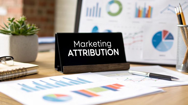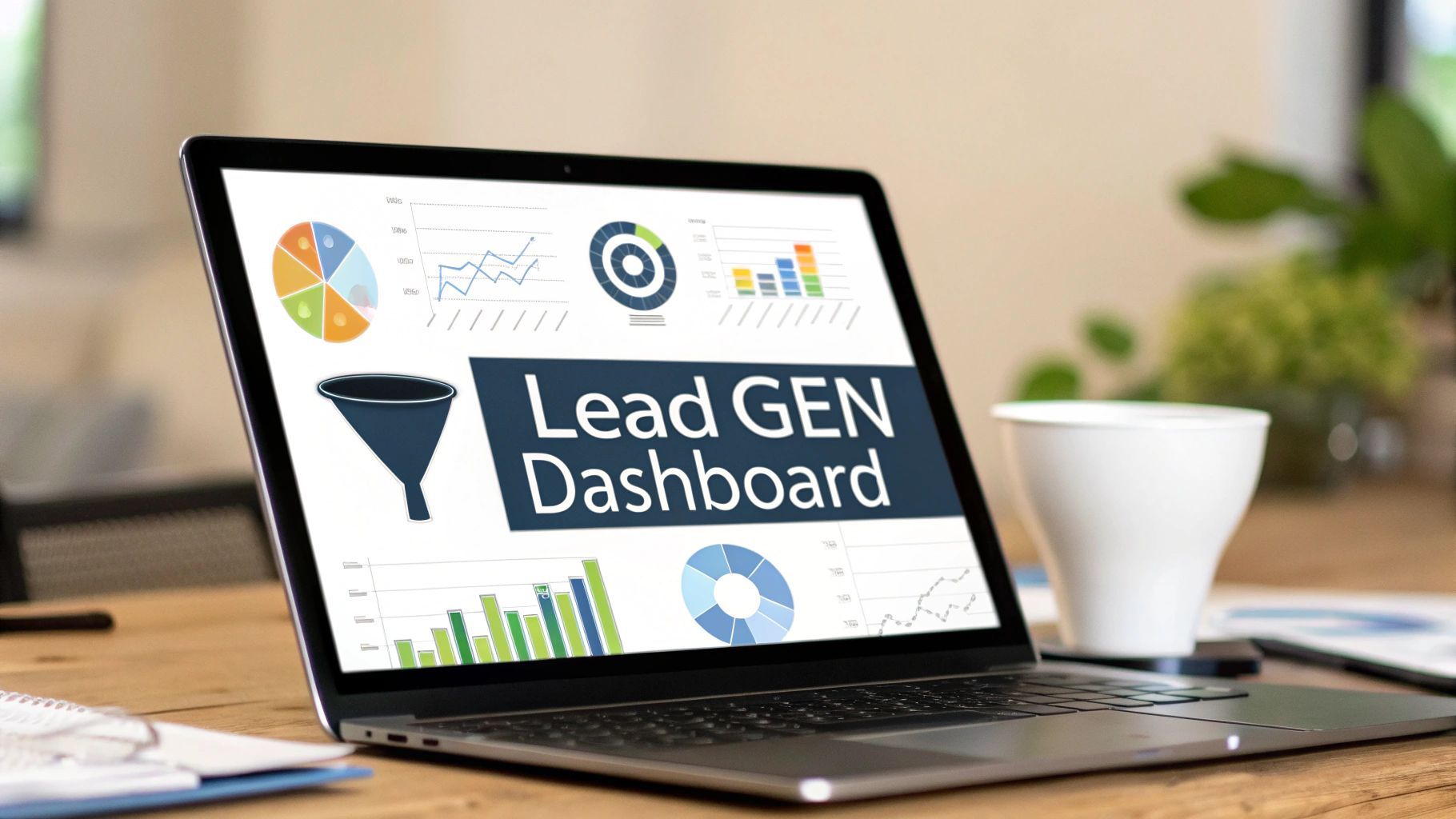
Build a Powerful Lead Generation Dashboard
Let's be honest—juggling data from Google Ads, your CRM, and social media feels like a constant battle. You're trying to piece together a story from a dozen different browser tabs, and it's exhausting.
A lead generation dashboard cuts through all that chaos. It pulls all your marketing data into one clean, visual interface. It’s not just about counting leads; it’s about finally understanding their entire journey, from the first ad click to the final sale.
Why You Need a Centralized Lead Dashboard

When your lead data lives on separate platforms, you get information silos. Your Google Ads report shows you clicks and cost, while your CRM holds all the juicy customer interactions. Without a bridge connecting them, you’re flying blind and can never see the full picture of your marketing performance.
A centralized dashboard breaks down those walls. It transforms scattered data points into a clear, compelling story about what’s actually working—and what’s just burning through your budget. Instead of guessing, you get immediate, data-backed answers to your most critical questions.
Understand Your True Performance
A unified dashboard becomes your single source of truth. It lets you see precisely which channels are bringing in high-quality prospects and which ones are just noise.
This kind of clarity is mission-critical. By 2025, lead generation remains a top priority, with a staggering 91% of marketers identifying it as their number one goal. With companies generating an average of 1,877 leads monthly and facing a cost per lead of nearly $200, every dollar and every decision has to count.
A well-built dashboard helps you optimize that spend by showing you a complete, honest view of your marketing funnel. To really dig into the strategic benefits, it's worth reading up on the power of a central ad dashboard and how it can reshape your entire approach.
A great lead generation dashboard does more than just report numbers; it reveals the 'why' behind them. It connects your ad spend directly to sales outcomes, making it an indispensable tool for smart, sustainable growth.
But what metrics should you actually track? It's easy to get lost in vanity metrics. The table below highlights the essentials that reveal true performance.
Essential Metrics for Your Lead Dashboard
A quick look at the core metrics your lead generation dashboard needs to track and why they are vital for measuring true performance.
| Metric | What It Reveals | Why It's Essential |
|---|---|---|
| Cost Per Lead (CPL) | How much you're spending to acquire one new lead. | Helps you understand the efficiency of your campaigns and manage your budget effectively. |
| Lead-to-Customer Rate | The percentage of leads that become paying customers. | This is the ultimate measure of lead quality and sales effectiveness. |
| Conversion Rate by Channel | Which marketing channels are best at turning prospects into leads. | Shows you where to double down on your efforts and where to pull back. |
| MQL to SQL Ratio | The percentage of marketing-qualified leads that the sales team accepts as sales-qualified. | A key indicator of sales and marketing alignment. A low ratio signals a disconnect. |
| Average Lead Response Time | How quickly your team follows up with a new lead. | Speed is critical. A faster response time directly correlates with higher conversion rates. |
Tracking these metrics gives you a powerful, 360-degree view of your lead generation engine, moving you from simply collecting leads to strategically converting them.
Make Faster and Smarter Decisions
When all your data is in one place, you can spot trends and anomalies in real time. Imagine noticing a sudden drop in lead quality from a specific Facebook campaign. With a dashboard, you can catch this instantly and hit pause before it wastes another dollar.
This agility empowers you to make smarter, faster decisions that have a direct impact on your bottom line. Suddenly, you can:
- Reallocate budget from underperforming channels to your proven winners.
- Identify top-performing content that consistently brings in qualified leads.
- Improve sales and marketing alignment by sharing a common, trusted view of lead flow and quality.
Ultimately, a centralized lead generation dashboard isn't some nice-to-have luxury—it's a necessity for any business that's serious about growth. It stops you from marketing with a blindfold on and gives you the vision to navigate your efforts with confidence and precision.
Choosing Metrics That Actually Matter
A lead generation dashboard cluttered with vanity metrics is just digital noise. Let's get strategic and move beyond simple website traffic to find the numbers that tell a real story about what's working. The goal is to pick Key Performance Indicators (KPIs) that connect directly to your actual business goals.
Think about it: the metrics that matter for a B2B SaaS company with a six-month sales cycle are completely different from those for an e-commerce brand selling T-shirts. Your dashboard needs to reflect that reality.
The first step is to separate the high-level metrics an executive needs for a quick glance from the nitty-gritty details your marketing team needs to optimize campaigns.
Differentiating Executive And Specialist Views
For your leadership team, the dashboard should be a clean, clear health check of your lead gen engine. They need to see the bottom-line impact without getting bogged down in the weeds.
- Total Marketing Qualified Leads (MQLs): This is your top-of-funnel volume. It shows how many potential customers your marketing is pulling in.
- Overall Cost Per Lead (CPL): A crucial budget metric. It answers the simple question, "How much are we paying for each new lead?"
- Lead-to-Customer Conversion Rate: This is the ultimate measure of lead quality. It tells you what percentage of those leads are actually turning into paying customers.
Your marketing specialists, on the other hand, need to go deeper to diagnose performance and tweak campaigns. Their dashboard should be packed with tactical metrics that directly influence those high-level KPIs.
A classic mistake is building one dashboard for everyone. The CEO doesn't need to know the click-through rate of a single Facebook ad, but the person managing that campaign absolutely does. Tailor the view to the audience.
Granular Metrics For Campaign Optimization
For the marketers on the front lines, the devil is in the details. A specialist-focused dashboard digs into how individual channels, content pieces, and conversion funnels are performing. This is where you pinpoint exactly what’s driving results—and what isn’t.
Here are a few essential granular metrics to track:
- Landing Page Conversion Rates by Source: Is organic search outperforming paid social? This tells you where your most motivated audience is coming from.
- Time to Conversion: How long does it take for a visitor to become a lead? This insight can shape your nurturing sequences and content strategy.
- Lead Quality Score: If you use lead scoring, tracking the average score by channel helps identify which sources bring in the most valuable prospects. We break this down even further in our complete guide to https://leadsavvy.pro/post/lead-generation-performance-metrics/.
- MQL to SQL Ratio: This tracks the crucial handover from marketing to sales. A low ratio often signals a misalignment in what you consider a "qualified" lead.
The real power of a modern dashboard is its ability to pull data from everywhere—Google Analytics, Facebook Ads, your CRM—and put it all in one place for real-time optimization. KPIs like Lead Conversion Rate and Click-Through Rate (CTR) can be tracked automatically, giving you immediate feedback.
To really get a handle on your performance, you have to choose metrics that tie back to your goals. For a deeper dive into channel-specific KPIs, check out these essential email marketing metrics to track. When you focus on the right data, your dashboard stops being a report and becomes your roadmap for growth.
Your lead generation dashboard is only as good as the data flowing into it. The real power comes from unifying information that usually lives in separate, siloed platforms. Think about it: your CRM, ad platforms, and website analytics all hold a piece of the puzzle. The magic happens when you bring them all together into one clear picture.
This might sound like a job for a team of developers, but modern dashboard tools have made it surprisingly simple. You generally have two ways to get your data connected: native connectors or a custom API setup.
-
Native Connectors: These are your plug-and-play options. Dashboard software like Looker Studio or Databox has these built right in for popular platforms like Google Ads, HubSpot, or Salesforce. It usually just takes a few clicks to give permission and start pulling data. For most teams, this is the quickest and easiest way to get started.
-
Custom API Solutions: If you’re working with unique in-house systems or need to pull data in a very specific way that a native connector can't handle, an API (Application Programming Interface) connection is your best bet. This path offers incredible flexibility but often requires a developer to set up. It gives you total control over what data comes in and how.
How to Choose Your Connection Method
For a typical lead generation dashboard, you'll probably rely on a mix of native connectors. Let's say you want to see the entire customer journey, from the moment someone clicks a Google Ad to the point they become a qualified lead in your Salesforce CRM. You’d simply connect both Google Ads and Salesforce to your dashboard using their built-in integrations. The tool does the heavy lifting of syncing that data behind the scenes.
This image lays out the basic flow of connecting and automating your data sources.
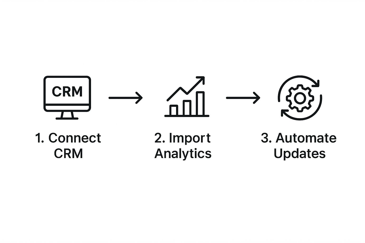
As you can see, it’s a straightforward, three-stage process. You connect your core sources (like your CRM), pull in your marketing analytics, and then set it all to update automatically so your data is always fresh.
Keeping Your Data Clean and Automated
Once your sources are plugged in, data integrity becomes the top priority. It's a common headache: your ad platform and your CRM might not agree on what a "lead" is or how to attribute a conversion. This is how you end up with messy, conflicting reports.
The key to trustworthy insights is establishing a single source of truth. You have to decide which platform is the final authority. Usually, it's your CRM that holds the definitive record for metrics like MQLs or SQLs. Set your dashboard to honor that hierarchy.
Finally, automation is non-negotiable. Set your dashboard to refresh its data automatically—at least daily, but hourly is even better for fast-moving campaigns. This ensures your insights are always current, letting you spot trends and fix problems in real-time.
Manually exporting and uploading spreadsheets is a recipe for delays and mistakes. If you're worried about bad data creeping in, it helps to understand the common causes of data entry errors and how to stop them from wrecking your reports. By automating this entire process, you build a reliable, always-on tool that helps you make smart decisions without the guesswork.
Designing Your Dashboard for Actionable Insights

Let’s be honest: an ugly, confusing dashboard is often worse than no dashboard at all. I've seen them. You've seen them. When data is a jumbled mess, it just creates more questions than answers and can trick you into making terrible decisions.
The whole point of a lead generation dashboard is to cut through the noise. It should turn a mountain of complex data into clear, actionable insights that anyone—from the CEO to a marketing intern—can understand in a single glance.
This all starts with a smart, intuitive layout. Think of it like the dashboard in your car. Your speed is front and center because it's the most critical piece of information. Everything else is smaller or off to the side. Your marketing dashboard needs that same clear hierarchy.
Put your big-picture, summary KPIs right at the top. This is the "five-second check-in" zone. It should immediately answer questions like, "Are we hitting our MQL target?" and "What's our overall cost per lead this month?"
Structuring Your Layout for Clarity
Once you’ve nailed those top-line metrics, the rest of the dashboard should flow like a story, letting people drill down for more detail if they want to. A great way I've found to structure this is by thinking about who's looking at it.
- Executive View (Top): This is for the big-picture numbers. Think Total Leads, Total MQLs, and Overall CPL. No fluff, just the bottom line.
- Manager View (Middle): Here, you get into channel-specific performance. This is where you'd show Leads by Source (Organic vs. Paid vs. Social) and Conversion Rates by Campaign.
- Specialist View (Bottom): Now we're in the weeds. This is for the team members doing the day-to-day work. It includes granular data like Landing Page Performance, Ad Creative Click-Through Rates, and Lead Quality by Keyword.
This tiered structure makes the dashboard valuable for everyone. The executive can get a quick pulse check, while the specialist managing ad spend can dive deep to find optimization opportunities. It naturally guides the eye from the general to the specific.
A well-designed dashboard tells a story. It should guide the viewer from the 'what' (we generated 500 leads) to the 'why' (because our new organic content campaign drove a 20% increase in conversions).
This need for clarity and trust is becoming even more critical. With AI-powered tools and content generation on the rise, people crave authenticity. As industry analysis points out, genuine and transparent communication is the key to building trust. You can find out more about the B2B lead generation trends shaping 2025 and see how this plays a role.
Choosing the Right Chart for Your Data
Visuals are the heart of your dashboard, but picking the wrong chart can completely butcher your data's story. Use the right one, and trends and comparisons practically jump off the screen.
For example, have you ever seen a pie chart with ten different slices? It's a colorful, unreadable mess. A simple bar chart would have been so much clearer for comparing all those channels. Don't make that mistake.
To help you out, here’s a quick guide to picking the most effective chart type for common lead generation KPIs.
Choosing the Right Chart for Your Data
| Data You Want to Show | Best Chart Type | Real-World Example |
|---|---|---|
| Trends over time | Line Chart | Tracking your monthly MQL growth over the last year. |
| Comparing different channels | Bar Chart | Showing which source (Google, Facebook, LinkedIn) brought in the most leads this quarter. |
| Progress toward a goal | Gauge or Bullet Chart | Displaying how close you are to hitting your quarterly lead target of 1,000 MQLs. |
| A single, key number | Number Card | Highlighting your current Cost Per Lead (CPL). |
The final touch is strategic color use. Stick to neutral colors for the dashboard's base. Then, save bright, attention-grabbing colors like red or green to flag critical changes—like a sudden spike in CPL or a campaign that’s absolutely crushing it.
This simple approach transforms your dashboard from a boring, passive report into an active monitoring tool that works for you.
Turning Dashboard Insights Into Smarter Campaigns
So, you've built a killer lead generation dashboard. That's a huge win. But here's the thing: its real power isn’t just in the slick charts and graphs. It's about turning those numbers into smarter, more profitable campaigns.
A dashboard isn't a passive report you glance at once a week. It’s an active tool. It’s where data finally becomes a decision. Let's get into a few real-world situations. Seeing the numbers is one thing, but knowing what to do with them is where the pros separate themselves from the amateurs. Think of your dashboard as a diagnostic tool, helping you spot trouble and find goldmines before anyone else does.
Diagnosing Problems and Spotting Opportunities
Here’s a classic scenario I see all the time: your dashboard shows lead volume is through the roof, maybe even crushing your monthly goal. High fives all around, right? But then you notice the lead-to-customer conversion rate is in a nosedive.
This is a textbook "quantity over quality" problem, and your dashboard holds all the clues.
Your first move? Look straight at the "Leads by Source" chart. Is one channel—maybe that new paid social campaign—driving a flood of cheap but totally unqualified leads? By checking that against your MQL to SQL ratio, you can see if the sales team is immediately rejecting them. If they are, the data has just handed you a clear action item: pause or totally rethink that ad campaign.
Now, let's flip that around. Imagine your paid social leads have dried up, but you see an unexpected spike in organic search MQLs. This isn’t just a random number; it's a massive opportunity waving a flag at you.
What’s the play?
- Dig In: Jump into your analytics and find out exactly which blog posts or landing pages are bringing in this organic traffic. Did a new article just hit a nerve with your audience?
- Double Down: Shift some of that stalled paid social budget over to boost these winning organic posts. Or, better yet, create more content around that same topic.
- Optimize the Path: Make sure the user experience on these popular pages is perfect. Is the CTA obvious? Is the form easy to fill out? Don't let a clunky page kill your momentum.
Your dashboard's job is to flag these performance shifts. Your job is to ask "why" and then act on the answer. This continuous feedback loop is the core of a data-driven marketing strategy.
Guiding A/B Testing and Content Strategy
Your dashboard is also your best friend when it comes to continuous improvement, especially for A/B testing. Instead of throwing spaghetti at the wall to see what sticks, you can use dashboard insights to make smart, data-backed hypotheses.
For instance, if your "Landing Page Conversion Rates" widget shows a page getting tons of traffic but very few conversions, you've found your next A/B test. You can test a new headline, a different button color, or a shorter form. Your dashboard then acts as the referee, showing you exactly which version wins out over time.
This same logic sharpens your content strategy. If leads from your webinar series consistently have the highest lead quality score, that’s a loud-and-clear signal to create more webinars. If a certain lead segment isn't responding to your welcome emails, it’s time to rethink your messaging. For fresh ideas, you can check out some proven templates in our guide to lead nurturing email templates.
And to take engagement even further, you can explore strategies like conversational marketing to make your follow-up feel more human—a strategy that can be directly shaped by the insights you’re already gathering.
Of course. Here is the rewritten section, crafted to sound like an experienced human expert, following all the provided guidelines and examples.
Got Questions About Your Lead Dashboard? I’ve Got Answers.
Building out a new dashboard is one thing, but using it in the real world always brings up a few practical questions. It happens to everyone.
Let’s tackle some of the most common hurdles I see teams run into when they're getting their lead generation dashboard off the ground.
What's the Best Tool for Building a Dashboard?
I get this question all the time, and the honest answer is: it depends. The "best" tool is the one that fits your specific stack, budget, and how comfortable your team is with data. There’s no single right answer, but you can narrow it down fast.
My advice is always the same: start by listing out the data sources you absolutely can't live without. Think Google Analytics, HubSpot, or Facebook Ads. Then, find a tool that connects to them seamlessly.
- If you want something fast and easy, tools like Databox or Geckoboard are brilliant. They have a ton of pre-built connectors that can get you a working dashboard in minutes, not days.
- If you need deep customization and have complex data, Google's own Looker Studio (which is free) and Tableau are the industry heavyweights. They require a bit more setup, but you can blend and visualize data in almost any way you can imagine.
Here's a pro tip: the most expensive, feature-packed tool isn't always the right choice. Success comes from picking a platform that actually solves your problems and cuts down on manual work, not one that adds another layer of complexity to your day.
How Often Should I Actually Look at This Thing?
Your data should be refreshing automatically—at least once a day. But how often you personally need to check it depends on your role and what you're running.
Consistency beats frequency, every time.
As a manager, I might do a deep dive once a week to look for bigger trends and see if our overall strategy is on track. But if you’re in the trenches actively managing paid ads, a quick daily check-in is non-negotiable. You need to be on top of your ad spend, cost per lead (CPL), and any sudden performance drops.
The goal is to build a habit. Make the dashboard your first stop for answers, not just a place you go when you feel like something's broken.
Why Doesn't My Dashboard Lead Count Match My CRM?
Ah, the classic dashboard nightmare. You're staring at two different numbers, and it's driving you crazy. I’ve been there. The good news is, it's usually an easy fix.
When I see a data discrepancy, I run through a quick three-point check.
- Are the date ranges identical? Seriously. It’s the simplest mistake, but it happens more than you’d think.
- Are you counting the same thing? This is the most common culprit. Your dashboard might be counting every single form submission as a "lead," but your CRM only counts them once they become a Marketing Qualified Lead (MQL). Mismatched definitions will always cause a mismatch in numbers.
- Did you accidentally leave a filter on? It’s so easy to apply a filter in your dashboard tool that screens out certain lead sources or types, making the numbers drift apart over time. Double-check your settings.
Ready to stop downloading CSV files and get your leads where they need to go, instantly? LeadSavvy Pro connects your Facebook Lead Forms directly to Google Sheets or your CRM. It’s all automated. Start for free and streamline your lead management today.