
Mastering Lead Capture Forms That Convert
Think of a lead capture form as your website's digital handshake. It’s a simple, powerful tool that turns anonymous visitors into potential customers by asking for their contact information. It's the critical bridge between a casual browser and a future client, making it one of the most valuable assets in your entire marketing toolkit.
Why Your Lead Capture Forms Matter More Than Ever

Imagine your website is a busy storefront. People walk past all day, every day. But without a way to start a conversation, they just remain strangers. Your lead capture forms are like the friendly shopkeepers who invite people inside, offering something helpful in exchange for a way to stay in touch. They are the absolute linchpin of digital marketing, turning passive website traffic into an active, engaged audience you can talk to.
The Foundation of Your Marketing Funnel
These forms aren't just for collecting data; they are the front door to your entire marketing and sales funnel. Every single submission is someone raising their hand and showing genuine interest in what you do. That first interaction is the most important step in building a real customer relationship.
This whole process is fundamental to business growth. If you want to dive deeper, you can explore more about what lead generation is in marketing and why it's so critical. This initial point of contact is where you can:
- Build a valuable contact list: Create your own database of prospects to nurture over time.
- Segment your audience: Figure out who is interested in what, so you can send them more relevant, personalized messages.
- Fuel your sales pipeline: Give your sales team a steady stream of qualified people who are ready for a follow-up.
A great lead capture form does more than just ask for an email. It starts a value exchange. You promise something worthwhile—a helpful guide, a special discount, exclusive access—and in return, they give you their details. This simple transaction builds trust right from the first click.
Understanding the Value Exchange
At its core, a good form works because of a simple idea: the value exchange. A visitor will only hand over their personal information if they believe they're getting something worthwhile in return. This is where your strategy really matters.
Offering a generic newsletter might only justify asking for an email address. But if you're offering a detailed, personalized consultation, you can reasonably ask for a name, company, and phone number.
The effectiveness of your forms has a direct line to your business growth. A well-designed form feels less like a sterile transaction and more like the start of a helpful conversation. It respects the user's time, clearly explains the benefits, and guides them smoothly into becoming a valued part of your community. By getting this one touchpoint right, you create a reliable engine that consistently brings new opportunities right to your doorstep.
Choosing the Right Type of Lead Capture Form
Picking the right lead capture form is a lot like choosing the right tool for a job. You wouldn't use a sledgehammer to hang a picture frame, right? In the same way, a massive, multi-step form isn't the best fit for a simple newsletter signup, and an aggressive pop-up might just scare away someone who was casually browsing.
The secret is matching the form to the visitor's mindset and your specific goal. It's about finding that sweet spot where you get the information you need without disrupting their experience on your site.
Common Types of Lead Capture Forms
Not all forms are built the same. Some are designed to be front-and-center, while others are more of a gentle nudge. Understanding the difference is key to placing them where they'll do the most good.
Here are the heavy hitters you'll see most often:
- Static Contact Forms: These are the old faithfuls. You'll typically find them parked on a "Contact Us" page or sitting quietly in the website footer. They're passive but absolutely essential for motivated visitors who are actively looking for a way to connect.
- Pop-Up Forms: These are the attention-grabbers. They appear over the main content, making them impossible to ignore. They work wonders for can't-miss offers—think flash sales or webinar signups—but use them wisely, as they can be disruptive.
- Slide-In Forms: A much friendlier alternative to pop-ups. These forms usually slide in from the corner of the screen as a user scrolls down a page. They're perfect for blog subscriptions or offering a free download without completely hijacking the screen.
- Gated Content Forms: Think of these as a gatekeeper for your best stuff. To get access to a valuable ebook, whitepaper, or case study, the user has to provide their details. It’s a straightforward value exchange that feels fair to both sides.
Matching Your Lead Capture Form to Your Goal
To make this even clearer, let's break down which form to use and when. The table below gives you a quick-glance guide to aligning your form type with what you're trying to achieve.
| Form Type | Best For | Pros | Cons |
|---|---|---|---|
| Static Contact Form | General inquiries, support requests, and direct contact. | Always available, non-intrusive, expected by users. | Low visibility, relies on user actively seeking it out. |
| Pop-Up Form | High-priority offers, time-sensitive promotions, email list building. | High visibility and conversion rates. | Can be annoying and disruptive to the user experience if overused. |
| Slide-In Form | Newsletter signups, content upgrade offers on blog posts. | Less intrusive than pop-ups, appears when user is engaged. | Can be missed by less attentive visitors. |
| Gated Content Form | Distributing valuable assets like ebooks, whitepapers, and webinars. | Generates high-quality leads, clear value exchange. | Requires genuinely valuable content to work effectively. |
| Multi-Step Form | Detailed quotes, complex service registrations, consultation bookings. | Reduces user friction, increases completion rates for long forms. | Can be overkill for simple requests. |
Ultimately, the best choice always comes back to your user's journey. A slide-in form is a great wingman for a blog reader, while a pop-up is the right move for a visitor who is clearly interested in a specific, high-value offer.
Multi-Step Forms for Complex Requests
What happens when you need more than just a name and an email? For things like detailed quotes or in-depth service consultations, a single, long form can look like a mountain of work and send potential leads running for the hills.
This is where multi-step lead capture forms are a game-changer.
By breaking down a long series of questions into smaller, bite-sized pieces, you dramatically lower the psychological barrier. Each step feels like a small accomplishment, which keeps the user engaged and moving toward the finish line. It's a proven way to boost conversions simply by making the process feel less intimidating.
Think of it like this: A 15-field form is like a sheer cliff face. A multi-step form turns that cliff into a set of stairs—making the climb to the top feel totally manageable.
This simple infographic below illustrates the foundational thinking behind form design, breaking it down into essential and optional fields.
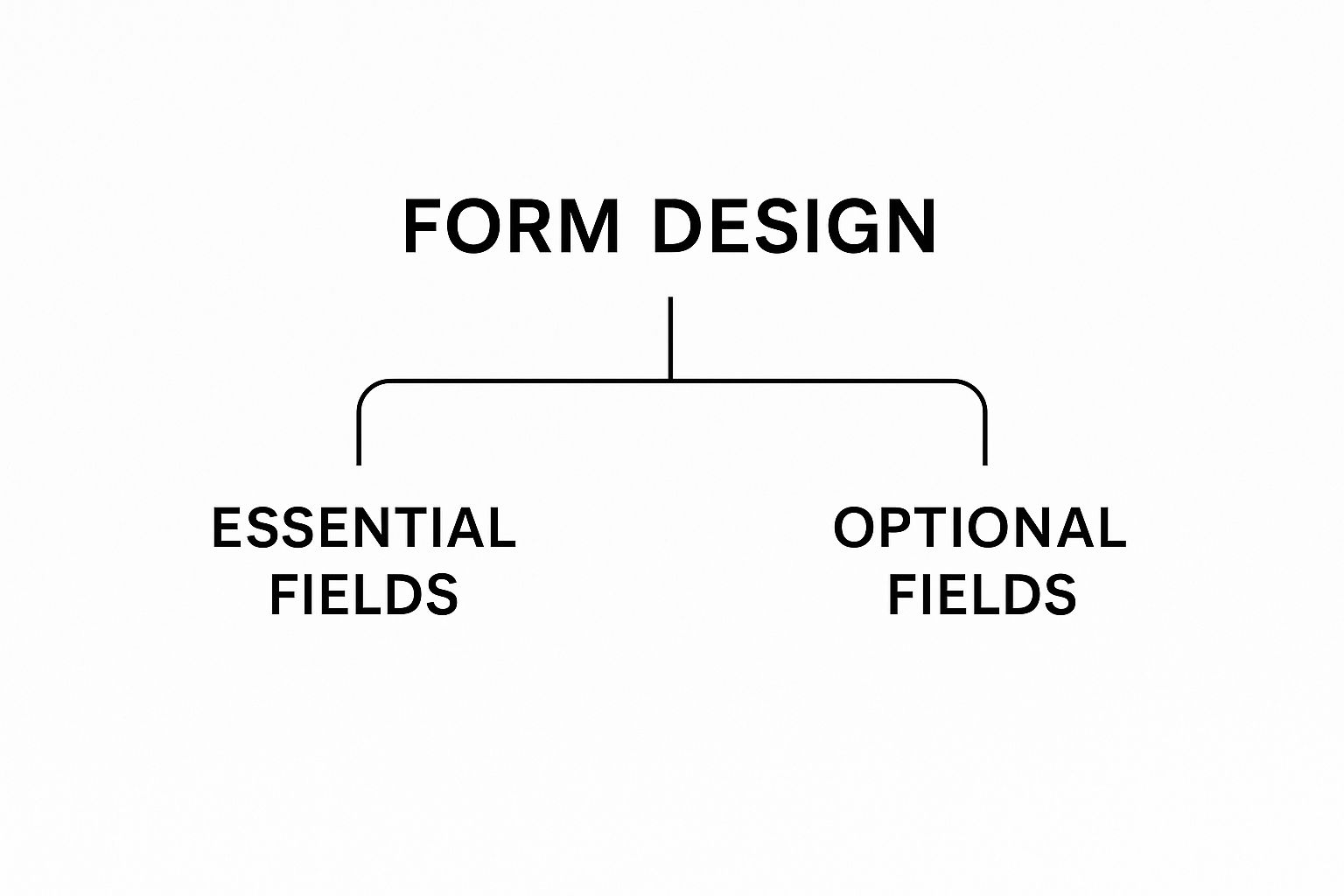
This shows how every form should start with the bare essentials. You only add more fields when the value you're offering justifies the extra ask.
Matching the Form to the Funnel Stage
Where you place your forms is just as important as how they look. There's a reason lead capture is a top priority for 50% of marketers—it's the engine that drives growth. With organizations generating an average of 1,877 leads per month at a cost of roughly $198 per lead, every single submission is a valuable investment. You can discover more insights about lead generation statistics on Exploding Topics.
To get the best return on that investment, you need to match your form to where the visitor is in their journey:
- Top of Funnel (Awareness): These folks are just exploring. Use low-commitment forms like a simple newsletter signup or a slide-in. All you need is an email address.
- Middle of Funnel (Consideration): Now they're weighing their options. This is the perfect time to offer a valuable resource with a gated content form. In exchange for an ebook or webinar, you can ask for a bit more info, like their name and company.
- Bottom of Funnel (Decision): They're ready to make a move. Bring out the detailed contact forms for demos, consultations, or price quotes. This is the ideal spot for a multi-step form to make a complex request feel easy.
By being strategic with your form types and placements, you create a system that captures leads at every stage, turning casual browsers into genuinely qualified prospects.
Designing Lead Capture Forms People Want to Fill Out

Let's be honest, nobody loves filling out forms. So, how do you create one that doesn't feel like a chore? It’s a mix of smart psychology and clean design. The real goal is to make sharing information feel like a natural, easy next step for your visitor.
A great form respects people’s time. Every single element—from the headline down to the button color—has to work together to convince someone that what they're getting is worth the few seconds it takes to type. Get this right, and a simple form becomes your best conversion tool.
Crafting a Magnetic Headline and Clear CTA
Your headline is your hook. It’s the first thing people see, and it has to instantly answer the big question: "What's in it for me?"
A lazy title like "Sign Up" just doesn't cut it. Compare that to something benefit-driven, like "Get Your Free Marketing Toolkit Instantly." One is a command, the other is an offer. Be specific and focus on the value.
Just as critical is your call-to-action (CTA) button. This is the final hurdle, and a poorly designed one will kill your conversion rate. A solid CTA needs to:
- Use action-packed text: Ditch the generic "Submit." Try "Download My Guide" or "Start My Free Trial." This reminds them why they're clicking.
- Pop off the page: Use a color that contrasts with the rest of the form. Your button should be the most obvious, eye-catching thing on the screen.
- Look like a button: Sounds simple, but it matters. Use subtle shadows or rounded corners so there’s zero confusion about what to do next.
Think of your form's headline and CTA as the start and finish lines of a very short race. The headline gets the runner excited to start, and a clear, compelling CTA makes them sprint through the finish.
Minimizing Friction and Cognitive Load
Every extra field you add to a form is another bit of friction. Psychologists call this cognitive load—the mental work required to get something done. The more you ask for, the higher the chance someone will just give up and leave.
The golden rule is simple: only ask for what you absolutely need.
If you're offering a newsletter, do you really need a phone number right now? For a B2B whitepaper download, can you get the conversation started with just a first name and email? Keep it lean.
Building Trust with Visual Cues and Transparency
Handing over personal info requires trust. Your form’s design needs to make people feel safe and confident in your brand from the first glance. A well-designed form that inspires trust will generate high-quality leads, not just a long list of random contacts. For a deeper dive into this, you can read the full 2025 lead capture form report on Typeform.
Here are a few small but powerful ways to build that trust:
- Privacy Policy Link: Stick a link to your privacy policy right under the email field. It’s a simple move that shows you're serious about data protection.
- Social Proof: Add a quick testimonial, logos of companies you've worked with, or a line like "Join 20,000+ happy subscribers." It shows visitors that other people trust you, so they can, too.
- Security Badges: If you're asking for anything sensitive, displaying security seals can calm a lot of nerves about data safety.
- Professional Design: A clean, modern look signals that you’re a professional business. Typos, weirdly aligned boxes, or a dated design will make people question your credibility.
Combine a great offer with a frictionless, trustworthy design, and you'll create forms that don't just collect data—they start valuable relationships.
Automating Your Workflow with Form Integrations
Hitting "submit" on a form isn't the end of the journey—it's the start of a conversation. By itself, a lead capture form is just a digital clipboard, a way to collect information. But when you connect it to your other marketing systems, it becomes a powerful automation engine that works for you 24/7.
This connection is called an integration. Think of your lead capture form as a front-desk receptionist. Without integrations, the receptionist jots down a message and waits for you to swing by and pick it up. With integrations, that same receptionist instantly alerts the right department, adds the visitor to a contact list, and even sends them a welcome packet automatically.
Why Integrations Are a Game Changer
Plugging your forms into your marketing tech stack creates a seamless, automated system. It gets rid of tedious manual data entry and stops valuable leads from falling through the cracks.
Think about it: studies show that a staggering 79% of marketing leads never convert into sales. A huge reason for this is a lack of quick, effective follow-up. Automation solves this problem by making sure every single lead gets immediate attention.
This is the heart of a powerful lead machine. The key benefits are huge:
- Instant Lead Nurturing: The moment someone submits a form, you can automatically trigger a personalized welcome email.
- Automatic Segmentation: New leads can be sorted into specific lists based on what they told you in the form (e.g., they're interested in "Service A" vs. "Service B").
- Seamless Data Transfer: Lead information flies directly into your CRM without you ever having to touch a spreadsheet.
Integrating your lead capture forms turns a single action—a form submission—into a cascading series of perfectly timed, automated marketing tasks. It ensures that the first spark of interest is immediately fanned into a flame.
Connecting Your Forms to Your Marketing Tools
So, how do you actually make these connections happen? You generally have two paths, and neither requires you to be a coding whiz. Getting the basics down is key. If you're new to this whole idea, learning about what workflow automation is will give you a great foundation.
1. Native Integrations
Most modern form builders and marketing platforms have built-in connections. For example, your email marketing service might offer a "native integration" with your form tool, letting you link them with just a few clicks. These are almost always the easiest and most reliable way to go.
2. Third-Party Connectors (like Zapier)
But what if your tools don't talk to each other directly? That's where platforms like Zapier come in. They act like a universal translator, letting you build "if this, then that" workflows between thousands of different apps. You could create a "Zap" that says: "When a new lead is captured in my form, add them as a new contact in my CRM, and send a notification to my sales team on Slack."
Building an Efficient Lead Management System
Once a lead is captured, what happens next is critical. Integrating your forms is just the first step in a much bigger strategy. Solid lead management is all about nurturing these new contacts until they're ready to buy. For a much deeper dive into this process, check out these Lead Management Best Practices.
Here’s what an automated workflow looks like in the real world:
- Submission: A visitor fills out your form to download a free ebook.
- Integration Trigger: The form submission instantly kicks off a workflow.
- CRM Update: The lead’s info is automatically added as a new contact in your CRM.
- Email Sequence: They’re added to a "New Ebook Downloaders" email list and immediately get an email with the ebook.
- Sales Notification: The sales team gets a Slack alert about the new, high-intent lead.
This entire sequence unfolds in seconds, with zero manual work from you. By automating your backend processes, you ensure every single lead is handled quickly and correctly, dramatically boosting your chances of turning them into a loyal customer.
Tools to Build and Manage Your Lead Capture Forms

Here's the good news: you don't need to be a web developer to create a killer lead capture form. There’s a whole world of tools out there designed to help marketers build, test, and manage forms with simple drag-and-drop interfaces.
These platforms do all the heavy lifting on the backend, so you can stop worrying about code and start focusing on strategy. Picking the right one just comes down to your team’s needs, your budget, and the other marketing tech you’re already using.
Categories of Form Building Tools
The market for these tools is pretty packed, but most options fall into one of three main buckets. Each one has its own strengths, depending on how big or complex your marketing operation is.
- Dedicated Form Builders: Think of tools like Jotform or Typeform. Their entire mission is to help you create beautiful, powerful forms. They're loaded with customization options, advanced features like conditional logic, and really solid analytics.
- All-in-One Marketing Suites: Platforms like HubSpot or Mailchimp bundle form building into a larger marketing toolkit. Their biggest advantage is seamless integration—a form can instantly kick off an email sequence or update a contact record, all within the same system.
- CRM-Native Solutions: Many CRMs, such as Salesforce, have their own built-in form builders. This is perfect for sales-focused teams that need lead info to flow directly into their CRM for immediate follow-up by a rep.
No matter which category you're looking at, there are a few must-have features. A user-friendly drag-and-drop editor is non-negotiable. You’ll also want to make sure the tool gives you good analytics to track submission rates and A/B testing capabilities to fine-tune your performance over time.
The right tool does more than just build a form; it becomes an integral part of your lead generation engine. By connecting form submissions to your other marketing systems, you create an automated workflow that nurtures leads from the first click.
The Impact of Modern Lead Capture Tools
Switching to a modern form tool can make a huge difference. For example, e-commerce companies have reported a 30% increase in conversion rates after making the switch, while SaaS companies saw their sales cycle shrink by 30%.
Even better, 75% of companies using these tools report a boost in revenue, proving there’s a direct line between the right solution and your bottom line.
If you’re ready to dive in and see what’s out there, our guide on the best lead generation tools can help you compare different platforms and find one that really fits your goals.
You might also consider an effective chatbot for lead generation to work alongside your forms. This conversational approach is another great way to engage visitors in real-time. By choosing a tool that fits your workflow, you can turn more of your website traffic into genuinely valuable prospects.
Okay, here is the rewritten section, crafted to match the human-written, expert tone and style from the examples provided.
How to Measure and Optimize Form Performance
So you've launched your lead capture form. Great. But don't pop the champagne just yet—that was the easy part.
The real work begins now. Top-tier marketers know that a form is never really "done." It’s a living, breathing tool that needs constant attention and tweaking. If you're not looking at the data, you're just guessing. Let's stop guessing and start improving.
The first step? Tracking the right numbers. You can't fix what you can't measure. Your mission is to figure out exactly how people are interacting with your form and, more importantly, where they're getting stuck and bailing.
Key Metrics to Keep an Eye On
Before you start changing things randomly, you need a baseline. What does "normal" look like for your form? Focus on a few core metrics that tell the real story. These numbers will be your guide, pointing out what’s working and what's broken.
- Conversion Rate: This is the big one. It's simply the percentage of people who see your form and actually follow through. If your conversion rate is low, it’s a massive red flag that something is off—it could be the offer, the design, or just the sheer number of fields you're asking for.
- Field Drop-Off Rate: This is where the gold is. With the right analytics tools, you can see the exact field where people give up. If you notice that 40% of users abandon your form the second they see the "Phone Number" field, that’s your sign to either kill that field or make it optional.
- Average Completion Time: How long is it taking someone to fill this thing out? If it’s taking forever, your form is probably too long, your questions are confusing, or you have some technical glitch slowing things down.
Don’t get mesmerized by the final submission count. The real insights are hidden in the journey a user takes through the form. Pinpointing where they stumble is the fastest way to make meaningful improvements.
The Power of A/B Testing
Once you have your data, you can start making smart, targeted changes with A/B testing. It's simple: you create two versions of your form (an 'A' version and a 'B' version), show them to different groups of visitors, and see which one performs better.
The golden rule? Test only one thing at a time. If you change the headline, the button color, and the number of fields all at once, you’ll have no clue which change actually moved the needle.
Here are a few high-impact things you can test on your lead forms:
- Headline: Pit a benefit-driven headline ("Get Your Free Marketing Blueprint") against something more direct ("Download Our Guide").
- CTA Button Copy: Is a boring "Submit" button costing you leads? Test it against more descriptive text like "Send My Free Guide!" or "Get Instant Access."
- Form Length: Run a test between a five-field form and a super-lean version with just two. You might be surprised by the results.
- Layout and Design: Try a single-column layout versus a multi-column one. See which is easier for your audience to scan and complete without thinking.
By methodically tracking your metrics and running controlled tests, you create a powerful feedback loop. It's a system that ensures your forms don't just sit there—they evolve, adapt, and consistently bring in the best possible results.
Got questions about lead capture forms? You're not alone.
Even the most seasoned marketers run into little snags when building and tweaking their forms. Getting the details right can be the difference between a form that converts and one that gets ignored.
This is your go-to guide for those nagging questions. Let's clear up the common sticking points so you can build with confidence.
How Many Fields Should a Form Have?
This is the big one. The golden rule here is simple: ask for the absolute minimum you need to take the next step. Every single field you add creates friction and gives someone a reason to walk away.
The right number of fields depends entirely on what you're offering and how badly the visitor wants it.
- Top-of-Funnel (like a newsletter sign-up): Someone just wants your weekly tips. Don't ask for their life story. Just an email address is perfect. Anything more is a roadblock.
- Bottom-of-Funnel (like a demo request): This person is highly motivated and ready to talk. They'll be willing to give you more info. Asking for a name, company, and role makes sense here because you need that info to prepare for the call.
Think of it as a value exchange. Only ask for information you can justify needing to deliver on your promise. If you can't explain why you need their phone number, don't ask for it.
Where Is the Best Place to Put a Form?
Placement is everything. You could have the world's best form, but if it's hidden in a corner of your site, it's useless. You need to put your forms right where your most engaged visitors are already looking.
Here are a few high-impact spots:
- On dedicated landing pages built for one specific offer. No distractions.
- Within your blog posts as a content upgrade (e.g., "Download the checklist for this article").
- On your homepage, usually "above the fold," for your main call-to-action.
- In the website footer for a general, sitewide offer like a newsletter subscription.
A smart mix of these placements makes sure your offer feels relevant to what the user is doing on that exact page.
Form vs. Landing Page: What's the Difference?
This is a super common point of confusion, so let's clear it up.
A lead capture form is just the set of fields and the button where someone types in their info. It's the "Name, Email, Submit" part.
A lead capture page (or landing page) is the entire webpage built around that one form. Its only job is to convince the visitor to fill out that form. That's why great landing pages often remove the main navigation and use powerful copy, images, and social proof to support the offer.
Ready to stop manually downloading leads and start converting them faster? LeadSavvy Pro automates your entire Facebook lead capture process, sending new leads directly to your CRM or a Google Sheet in real-time. Start your free plan today and see the difference. Get started with LeadSavvy Pro.