
Build a High-Converting Lead Capture Form
So, what exactly is a lead capture form? Think of it as the digital handshake between your business and a potential customer. It’s a simple form on your website or landing page where you collect contact info, turning an anonymous visitor into someone you can actually talk to.
The Bridge Between Clicks and Customers

Imagine your Facebook ad is a billboard on a busy highway. Thousands of people see it, and some slow down, curious. A lead capture form is the exit ramp you build, guiding that interested traffic straight to your front door instead of letting them speed past and forget you ever existed.
Without that ramp, your ad spend is just creating temporary awareness. But with it, you start building a real database of potential customers.
This simple tool works because it kicks off a value exchange. A visitor gives you their contact details—like an email or phone number—and you give them something valuable in return.
This could be:
- Exclusive Content: Ebooks, white papers, or juicy case studies.
- Special Offers: Discounts, free trials, or early bird access.
- Direct Engagement: Webinar registrations or a free consultation booking.
By capturing their info, you get permission to follow up, build a relationship, and guide them through their buying journey. It’s the first real step in turning a click into a customer.
Why This Is a Game-Changer for Growth
The proof is in the numbers. The market for lead capture software hit $2.69 billion in 2024 and is expected to rocket to $4.55 billion by 2029. This explosive growth shows just how critical these forms are to any modern marketing strategy.
When you get it right, a lead capture form is way more than just a few input fields; it's a strategic weapon. It lets you:
- Build Your Email List: Create a direct line of communication with people who want to hear from you.
- Qualify Prospects: Gather the right details to see if a lead is a good fit from the get-go.
- Personalize Your Marketing: Use what you learn to tailor your messages and offers.
- Measure Your ROI: Finally connect your ad spend directly to the number of leads you generate.
This whole process is the heart of what is known as lead generation in marketing, and it’s non-negotiable for sustainable growth.
A lead capture form isn't just a data collection tool—it's the start of a customer relationship. Every submission represents a person who has raised their hand and shown genuine interest in what you have to offer.
Beyond the classic form, you might also want to explore lead generation chatbots. They offer a more conversational, interactive way to gather info from visitors. For people who’d rather chat than fill out fields, this can be a fantastic way to engage them.
No matter the method, the goal is always the same: create a smooth, trustworthy experience that makes people want to connect with you.
The Anatomy of a High-Converting Form
A truly effective lead capture form isn't just a random collection of boxes and buttons. It’s a carefully constructed machine where every single component has a specific job. To build a form that consistently turns clicks into customers, you have to understand how each part works together to create an experience that feels effortless for the user.
Think of it like building an engine. You can't just throw parts into a metal box and expect it to run. Each gear, piston, and wire must be in the right place, working in perfect harmony. A high-converting form follows the same principle, with each element guiding the user smoothly toward that final click.
To see what I mean, the infographic below breaks down the core hierarchy of an effective lead capture form.
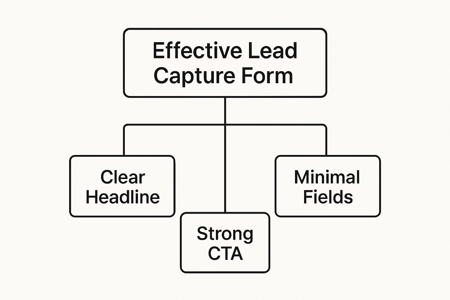
This visual hierarchy shows that success starts with a clear promise (the headline), requires a low-friction process (minimal fields), and ends with a decisive action (a strong CTA). Let's dissect these crucial components one by one.
H3 The Headline: Your Hook
Your headline is the first thing people read, and you've got about three seconds to convince them to stick around. Its only job is to answer their biggest question: "What's in it for me?" A weak headline promises nothing and gets ignored, while a strong one grabs attention by clearly stating the benefit.
Instead of a generic title like "Sign Up," try something that's driven by the value you're offering:
- Weak: Newsletter Subscription
- Strong: Get Weekly Marketing Insights Trusted by 50,000+ Pros
- Weak: Download Now
- Strong: Grab Your Free Ebook and Double Your Website Traffic
The second option in each example works because it sells the outcome, not the action. It makes the value exchange feel instantly worthwhile.
H3 The Body Copy: Your Promise
If the headline is the hook, the body copy is the promise. This is where you briefly elaborate on the value you just introduced. The key here is to be quick and clear. Use a short sentence or a few bullet points to reinforce the benefits and squash any potential hesitation.
Your form's copy should feel like a conversation, not an interrogation. It should be helpful and reassuring, guiding the user forward by highlighting the awesome outcome waiting for them on the other side of 'submit.'
For instance, if you're offering a webinar, your body copy could quickly list what attendees will learn, like "Discover three proven strategies to cut ad spend by 30%" or "Learn to automate your follow-up in under 10 minutes." This builds excitement and justifies the user sharing their information with you.
To really dial this in, let's break down the essential elements of a form that just plain works.
Core Components of a High-Converting Form
This table breaks down the key parts of a lead capture form, what they do, and how to get them right.
| Component | Purpose | Best Practice Example |
|---|---|---|
| Headline | Grab attention and communicate the core benefit immediately. | "Get Your Free 5-Step SEO Checklist" |
| Body Copy | Briefly explain why the offer is valuable and what the user will get. | "Used by 10,000+ marketers to boost rankings." |
| Form Fields | Collect the necessary information with minimal friction. | Just ask for Name and Email. That's it. |
| CTA Button | Drive the final action with clear, compelling language. | A bright button that says, "Send Me the Checklist!" |
| Trust Signal | Reassure users their data is safe and the offer is legitimate. | "We hate spam, too. Your email is safe with us." |
By seeing how these pieces fit together, you can start to spot weaknesses in your own forms and make simple tweaks that yield big results.
H3 The Form Fields: Your Ask
This is the make-or-break part of your form, as it’s where the user actually has to do some work. The golden rule is simple: only ask for what you absolutely need. Every extra field you add increases friction and can cause your abandonment rates to skyrocket. Time and again, studies show that cutting down the number of fields can dramatically boost conversions.
Start with the bare minimum—usually just a name and an email address. If you need more info for segmentation (like company name or size), you can always ask for it later in the customer journey. This keeps the initial barrier to entry as low as possible.
H3 The CTA Button: Your Nudge
The Call-to-Action (CTA) button is the final step. It needs to be visually prominent and use compelling, action-oriented language. The text on your button should perfectly match the value proposition of the form.
Ditch vague words like "Submit" or "Go." Instead, make the text specific to what they're getting:
- "Get My Free Guide"
- "Join the Webinar"
- "Start My Free Trial"
- "Download the Checklist"
This kind of microcopy reinforces the value exchange and makes the user feel like they are getting something, not just giving away their data. For a deeper dive into these nuanced optimizations, check out our complete guide on lead capture form best practices.
H3 Trust Signals: Your Reassurance
Finally, great forms build trust. People are more cautious than ever about their data. Including small trust signals can make a huge difference in their comfort level.
These simple elements go a long way:
- Privacy Policy Link: A simple link to your privacy policy shows you're transparent.
- Anti-Spam Reassurance: A short note like "We'll never share your email" can ease major concerns.
- Social Proof: Mentioning the number of subscribers ("Join 25,000+ marketers") or adding a small customer testimonial can be incredibly persuasive.
By thoughtfully assembling these five core components, you transform a simple web form into a powerful conversion tool that works for your business around the clock.
Designing Your Form to Build Trust
Think of your lead capture form as a handshake. Its design is more than just looks—it’s a direct signal to a potential customer about whether or not they can trust you. A cluttered, confusing, or sketchy-looking form will make even the most interested person slam on the brakes. The goal here is to make the experience feel less like an interrogation and more like a friendly, secure conversation.

Good design is really about psychology. It smooths out the mental friction, making the whole process of sharing information feel easy and safe. When a user feels confident and secure, they’re far more likely to hit that submit button and become a valuable lead for your business.
This isn’t just a hunch; it’s backed by data. A 2025 report that dug into over 10,000 customer lead forms found that trust is everything. It confirmed that the best forms collect details transparently, and their success hinges on great design, clarity, and offering real value. People are happy to trade their info for things they want, like discounts or exclusive content. You can dive into more of the findings in the 2025 Lead Capture Form Report.
Create a Clean and Intuitive Layout
First impressions count. Big time. A visually overwhelming form creates instant resistance. The secret is simplicity. You want a layout that naturally guides the user's eye from one field to the next without them having to think about it.
It's like walking into a well-organized room versus a messy one. The organized room is calming and easy to navigate. The messy one is stressful and makes you want to turn around and leave. Your form needs to be that clean, organized room.
Here’s how to get there:
- Stick to a Single-Column Layout: This is the gold standard for a reason. A single, vertical column creates a clear path for the user to follow, which is an absolute must-have on mobile.
- Keep it Logical: Arrange your fields in an order that makes sense. Start with the easy stuff like "First Name" and "Email" before you ask for anything more detailed.
- Use Clear Labels: Always place labels directly above the input field they belong to. It’s the most intuitive placement and cuts down on confusion.
Leverage White Space and Color Psychology
White space—the empty area around the elements on your form—is your best friend. It isn't wasted space; it’s a powerful design tool that makes your form feel less intimidating and helps users focus. Plenty of white space gives your form room to breathe.
Color is another heavy hitter. While your form should obviously match your brand, your call-to-action (CTA) button needs to be the star of the show.
Use a high-contrast color for your CTA button that makes it pop. This is a powerful visual cue that pulls the user's eye right where you want it and makes it crystal clear what to do next.
For example, if your landing page is mostly cool blues and grays, a bright orange or green button will stand out and practically beg to be clicked.
Guarantee a Seamless Mobile Experience
It’s 2025. With over 60% of website traffic coming from phones, a mobile-friendly form isn't optional—it's essential. If people have to pinch, zoom, and struggle to tap tiny fields, they’re gone.
A great mobile experience means:
- Large, Tappable Fields: Make sure your form fields and buttons are big enough for a thumb to tap easily. No precision required.
- Optimized Keyboards: Use the right input types in your code (like
type="email"ortype="tel"). This automatically brings up the correct keyboard on a phone, saving users a ton of frustration. - Be a Minimalist: Mobile screens are small. Be ruthless. Cut every single field you don't absolutely need.
Build Confidence with Transparency
Finally, your design has to scream "trustworthy." People are protective of their personal data, and for good reason. You can put their minds at ease with a few simple, reassuring design elements.
Just add a clear link to your privacy policy near the submit button. A simple line like, "We respect your privacy and will never share your info," can make a world of difference. These small touches show you’re a legitimate business that takes data protection seriously, making users feel much more secure as they click "Submit."
Writing Form Copy That Inspires Action

If the design is the first impression, your words are what actually do the heavy lifting. The copy on your lead capture form is the final conversation you have with a user before they decide to hand over their info. Every single word matters.
Good form copy does more than just describe what the form is for; it sells the outcome. It has to immediately answer the user's biggest question: "What's in it for me?" Get that right, and you turn a curious visitor into a genuinely interested lead.
Crafting a Value-Driven Headline
Your headline is your opening pitch. It's not just a title; it's a promise. A generic header like "Contact Us" or "Sign Up" tells the user absolutely nothing about the benefit they're about to receive. You need a headline that grabs them by focusing on the awesome result they'll get.
Think about the transformation you're offering. Are you saving them time? Giving them exclusive knowledge? Solving a nagging problem? Your headline should shout that from the rooftops.
-
Instead of: "Newsletter Signup"
-
Try: "Get Weekly Insights to Grow Your Business"
-
Instead of: "Download Ebook"
-
Try: "Grab Your Free Guide to Triple Your Leads"
The second options just work better. They spell out a tangible benefit, making the exchange feel instantly worth it.
Writing Benefit-Focused Body Copy
Once the headline has their attention, the body copy is there to seal the deal. This is your spot for a quick sentence or two that backs up the value and knocks down any last-second doubts. Keep it short and sweet—bullet points are your best friend here.
For example, if you're promoting a webinar, your body copy could highlight the key takeaways:
- Learn the 3-step framework to slash ad spend by 30%
- Get a free template for tracking campaign ROI
- Discover the secret to writing ads that actually convert
This approach builds excitement and gives them a logical reason to finish the form. They can clearly see the reward waiting for them on the other side.
Your form's copy should feel like a helpful guide, not a demanding gatekeeper. Every word should reduce friction and build excitement for the value you're about to deliver.
The Power of Microcopy
Microcopy is all the small bits of text that guide users through the form—things like field labels, placeholder text, error messages, and little reassurances. It might seem small, but its impact is huge. Good microcopy makes the whole process feel smooth, intuitive, and human.
Just think about the text on your Call-to-Action (CTA) button. A lazy word like "Submit" is a massive missed opportunity. Instead, use action-oriented text that reinforces what they're getting.
Here’s a quick comparison:
| Generic CTA | Action-Oriented CTA |
|---|---|
| Submit | Get My Free Checklist |
| Download | Start My Free Trial Now |
| Go | Send Me the Case Study |
The options on the right are way more compelling because they describe what the user is getting, not what they are giving up. This simple language shift can give your conversion rate a serious boost.
Another crucial piece of microcopy is the reassurance text. A simple message like, "We hate spam too. Your email is safe with us," placed near the email field can calm anxiety and build just enough trust to earn that click. Even helper text inside a field, like "Enter your best email," provides clarity and prevents user error. By focusing on these small details, you create a far more persuasive and user-friendly experience from start to finish.
Optimizing Lead Capture Forms for B2B
Capturing a lead in a business-to-business (B2B) world is a completely different ballgame. Unlike B2C, where a simple email might be all you need, B2B sales cycles are much longer and more complex. To even start a conversation, your sales team needs more detail to properly qualify a prospect. Your lead capture form has to reflect this reality.

The trick is finding the sweet spot between your hunger for data and the user's patience. Ask for too much, too soon, and you'll scare away even the most interested leads. This is where a strategic approach to your B2B lead capture form becomes absolutely critical for success.
Balancing Data Needs with User Experience
In B2B, fields like "Company Name," "Job Title," and "Company Size" are gold for your sales team. They provide crucial context that helps them segment, prioritize, and personalize every single follow-up. A lead from a Fortune 500 company is going to be handled very differently than one from a small startup, right?
But here's the rub: a form with ten fields looks like a mountain of work. The solution? Figure out the absolute minimum information your sales team needs for an initial qualification. Often, this boils down to just a name, work email, and company name. Everything else can wait.
A B2B lead capture form isn't just a contact collector; it's a strategic qualifier. The goal is to gather just enough intelligence to see if the lead is a potential partner, helping your sales team focus their energy where it actually counts.
This isn't just a hunch; the data backs it up. Lead capture forms are a top priority for about 75% of B2B marketers. Research shows 74% of businesses use them for lead generation, and for nearly half (49.7%), they are the highest-converting tool they have. The most requested fields reflect this laser focus: email (97%), name (92%), and company information (79%).
Using Progressive Profiling
One of the slickest techniques for gathering more data without overwhelming users is progressive profiling. This smart method shows new, different form fields to people who have visited your site before.
Think of it like building a relationship. It unfolds like this:
- First Visit: A user downloads a simple checklist. The form only asks for their name and email. Easy.
- Second Visit: They come back for a webinar. The form remembers them (no need to re-enter their name and email!) and now asks for their company name and job title.
- Third Visit: They're ready to request a demo. Now, the form asks about their company size and specific challenges.
This approach builds a detailed profile of your lead over time, making each interaction smooth and frictionless. You get the rich data you need without throwing up a giant, intimidating form on the very first date.
Choosing the Right B2B Lead Magnets
The value you offer in exchange for contact info has to hit the mark with a professional audience. B2B decision-makers aren't usually swayed by a 10% discount; they want resources that solve real, nagging business problems.
High-value lead magnets for a B2B audience include things like:
- In-depth White Papers: Detailed reports packed with unique industry data or creative solutions.
- Exclusive Webinars: Live training sessions with experts who can tackle specific business challenges.
- Case Studies: Real-world proof showing how your solution delivered killer results for a similar company.
- Free Tools or Templates: Calculators, checklists, or frameworks that actually help them do their job better.
For businesses that need some outside expertise to get their lead capture strategy just right, bringing in a specialized agency like Vertically Media's marketing solutions can make all the difference. When you align your form and your lead magnet with what your sales team truly needs, every lead you capture is valuable and ready for a meaningful conversation.
Automating Your Follow-Up with LeadSavvy Pro
Getting a lead with a killer form is a great start, but that's just the opening move. The real action happens in the seconds after they hit that submit button. A fast, relevant follow-up is often the one thing that separates a hot prospect from a lead who goes cold.
This is where your lead capture form stops being just a data collector and becomes the engine of your marketing machine. When you hook it up to an automation tool like LeadSavvy Pro, you can finally say goodbye to cold leads and the soul-crushing task of manually downloading CSV files from Facebook.
From Submission to Sales Pipeline Instantly
Picture this: a potential customer sees your Facebook ad and fills out your form. Instead of their info getting stuck in a spreadsheet until you have time to check it, an automated workflow kicks in immediately. This connection is the bridge that carries a lead from their first flicker of interest right into your sales process, with zero delay.
LeadSavvy Pro builds that bridge for you. The instant a submission happens, the system can:
- Send Leads Straight to Your CRM: No more copy-pasting. A new contact is created in your CRM automatically.
- Trigger a Welcome Email: Deliver that promised e-book or discount code while they're still thinking about you.
- Notify Your Sales Team: Ping the right person on your team so they know a fresh, qualified lead is ready for a conversation.
This isn't just about efficiency—it's about making a great first impression. Instant action shows you're on the ball and keeps your brand top-of-mind when their interest is at its absolute peak.
The image below shows you exactly how LeadSavvy Pro talks to your other tools to make this seamless automation happen.
This really drives home the main point: your form isn't a dead end. It’s a launchpad that sends fresh lead data exactly where it needs to go.
Using Form Data for Smarter Automation
Now, here's where things get really powerful. You can use the data your form collects to create personalized follow-up for every single lead. Let’s be real, not all leads are the same, so your follow-up shouldn’t be either.
Based on their answers, you can automatically sort, score, and nurture each contact. For example, if a lead checks a box saying they're a "small business," they can be automatically dropped into an email sequence focused on SMB pain points. Someone who requests a demo? That's a high-intent lead. They can be scored higher, instantly triggering a notification for a sales rep to call them ASAP.
Automation is like having a digital assistant who works 24/7. It perfectly sorts every lead, puts them in the right bucket, and starts the conversation for you.
This kind of personal touch doesn't just make for a better customer experience—it dramatically boosts your odds of making a sale. To really nail this, you need to know what to say and when. Check out our complete guide on lead follow-up best practices to master the art of the follow-up.
When you combine a smart lead capture form with powerful automation, you build a system that consistently turns clicks into customers.
Got Questions About Your Lead Capture Forms?
Even with the best strategy, you're bound to run into a few questions when you’re in the thick of building and tweaking your lead capture forms. Let's tackle some of the most common ones I hear all the time so you can get back to what matters—generating quality leads.
How Many Fields Should My Form Have?
This one’s easy: as few as humanly possible.
Think of every single field as a tiny hurdle. The more hurdles you add, the more likely someone is to just give up and walk away. For that first point of contact, all you really need is a first name and an email. That's it.
You can always circle back later to gather more details once you've started a conversation. Your only job right now is to get your foot in the door. In fact, one study found that cutting form fields from 11 down to just 4 can crank up conversions by a whopping 120%. Less really is more.
Where’s the Best Place to Put My Form?
Placement is everything, and the best spot really depends on your goal. But after years of running campaigns, I've found three locations that almost always win:
- Above the Fold: Slap that form right at the top of your landing page. No scrolling required. This works perfectly when the form is the star of the show, like on a dedicated page for a free download or webinar signup.
- Inside Your Blog Content: Got a killer blog post? Embed a relevant form right in the middle of it. If someone's reading a deep dive on SEO, they'll be far more likely to sign up for your "Ultimate SEO Checklist" when it's right there in front of them. It captures them right at their peak moment of interest.
- As an Exit-Intent Pop-up: This is your last-ditch effort. Just as someone is about to click away from your site, a pop-up appears with one final, irresistible offer. It's a surprisingly effective way to grab their info before they're gone for good.
What Makes a Good Call-to-Action (CTA)?
A powerful CTA is specific, tells people exactly what to do, and reminds them what's in it for them. Forget boring, generic buttons like "Submit" or "Go." They’re lazy and don't inspire anyone to click. Instead, your button text should finish the sentence, "I want to…"
Your CTA button shouldn't feel like a chore; it should feel like a prize. Use language that reinforces the value they're getting. For example, "I want to Get My Free Template."
Your CTA also needs to pop visually. Use a color that contrasts sharply with the rest of your page. This simple trick makes the button the most obvious next step, drawing the eye and making that final click a total no-brainer.
Ready to stop downloading CSVs and start automating your lead flow? LeadSavvy Pro instantly syncs your Facebook leads to your CRM or Google Sheets, so you can follow up faster and convert more customers. Get started for free today at LeadSavvy Pro.