A Guide to Improving Landing Page Conversions
Before you can even think about boosting your landing page conversions, you need a reality check. What's actually happening on your page right now?
Without a data-backed baseline, any changes you make are just shots in the dark. You have to get into the weeds, see how users are behaving, find the friction points, and figure out what’s working—and more importantly, what isn’t.
Diagnosing Your Current Performance
Trying to optimize a landing page without a proper performance audit is like trying to navigate a ship without a compass. Sure, you're moving, but you have no idea if it's in the right direction. This whole diagnostic phase is about swapping out your assumptions for cold, hard data.
Think of yourself as a detective. Your job is to piece together clues from different sources to build the full story of your user's journey. This is what stops you from wasting weeks tweaking things that don't matter and instead points you directly to the changes that will make the biggest impact.
Start with the Numbers: Quantitative Data
Your first stop is almost always going to be your web analytics platform, like Google Analytics. This is where you find out what users are doing on your page. But don't get distracted by vanity metrics. You need to focus on the numbers that tell a real story about behavior and intent.
These metrics give you that high-level, birds-eye view of your page’s health. For example, is your bounce rate through the roof for traffic coming from a specific Facebook ad? That’s a classic sign of a mismatch between your ad copy and what's on the landing page. If your session duration is just a few seconds, people aren't even sticking around long enough to read your value prop.
Here are the key metrics I always start with:
- Bounce Rate: What percentage of people bail after seeing just one page? Anything above 70% is usually a red flag and could point to a bad user experience or the wrong kind of traffic.
- Average Session Duration: How long are people actually staying? If they're gone in seconds, your message isn't landing.
- Traffic Sources: Where are your visitors coming from? Knowing if they're from organic search, paid ads, or social media helps you meet their expectations.
- Device Category: Are most of your users on mobile or desktop? A page that looks great on a desktop but is a nightmare on a phone is a conversion killer.
To really get granular, you absolutely need to have goals and funnels set up. You can learn more about this by understanding what is conversion tracking and setting it up correctly. This shows you exactly where people are dropping off in the process and pinpoints the weakest link in your conversion chain.
Uncover the 'Why' with Qualitative Insights
Okay, so now you know what's happening. The next, crucial step is to figure out why. This is where qualitative tools come in, giving you a peek into the actual user experience. They help you build empathy by letting you see the page through your visitors' eyes.
Heatmaps, for instance, are pure gold. They show you exactly where people are clicking, where their mouse is moving, and how far down the page they scroll. A heatmap might reveal that everyone is clicking on an image that isn't a link—a dead giveaway of a design flaw. Or maybe it shows that nobody is scrolling far enough to even see your main call-to-action.
A common mistake is focusing solely on the numbers in Google Analytics. Heatmaps and session recordings provide the human context behind the data, turning abstract metrics into actionable design insights.
Session recordings take it a step further by letting you watch anonymized videos of real user sessions. You can literally see their mouse movements, where they pause in confusion, and where they get stuck. It's one of the most powerful ways to spot friction points you would have never noticed otherwise.
For a more holistic approach to making your landing page more effective, check out these expert strategies for landing page optimisation. By combining both the "what" from your analytics and the "why" from qualitative tools, you get a complete picture of your current performance, setting the stage for smart, data-driven optimization.
Crafting High-Impact Design And Copy

Alright, you've got the data. No more guessing games. Now it’s time for the fun part: turning those insights into a page that actually gets people to click. This is where you roll up your sleeves and get to work on the design and the words—the two things your visitors actually see and interact with.
Let’s be real: a gorgeous page that doesn’t convert is just an expensive piece of art. On the flip side, brilliant copy on a cluttered, confusing page will never even get a chance to work its magic. The goal is to create a seamless experience where the design guides the eye and the copy convinces the mind.
Building A Strong Visual Hierarchy
Visual hierarchy is just a fancy way of saying you’re in control of where people look. You're the director, telling their eyes exactly where to go: first the headline, then the value prop, then the call-to-action (CTA). Get this wrong, and you create friction. Friction leads to bounces.
Here’s how to nail it:
- Size and Scale: Your headline should be the biggest thing on the page. No exceptions. Subheadings get smaller, and body text is smaller still. It’s simple but incredibly effective.
- Color and Contrast: Your CTA button needs to scream "click me!" Use a bold, contrasting color that pops off the page. If your brand colors are blue and white, make that button bright orange or green.
- Whitespace: Don't be afraid of empty space. Giving your elements room to breathe makes your page feel clean, professional, and less overwhelming. It helps focus attention right where you want it.
Think of it this way: your headline should be a lighthouse, your subheadings are the path to the shore, and your CTA is the door they can't wait to open.
Writing Copy That Connects And Converts
Your words have a heavy lift. They need to grab attention, build trust, crush objections, and push for action—all in a few seconds. The biggest mistake people make? Talking about features. Nobody cares about your "synergistic platform." They care about what it does for them.
Your headline is everything. It's your one shot. Instead of a snooze-fest like "Advanced Lead Management Software," hit them with something that solves a real problem: "Never Manually Download a Facebook Lead Again." See the difference? One is about you; the other is about them.
The single biggest mistake in landing page copy is talking about yourself. Your visitor doesn't care about your company's history; they care about what you can do for them. Frame every sentence around their problems and your solutions.
Once you have their attention, show some empathy. Acknowledge their frustrations before you swoop in with your solution. This builds an instant connection and makes your offer feel less like a sales pitch and more like a lifeline.
Leveraging The Power Of Social Proof
People are skeptical online. You can tell them you're the best all day long, but it means a whole lot more coming from someone else. That’s social proof, and it’s non-negotiable for building trust and boosting landing page conversions.
Here are a few ways to sprinkle it in:
- Testimonials: Get real quotes from happy customers. Use their full name, company, and a photo if you can. Authenticity is key.
- Case Studies: Show, don't just tell. A quick "before and after" story with a measurable result (e.g., "Company X increased their leads by 45% in 30 days") is pure gold.
- Trust Seals and Logos: Got well-known clients? Slap their logos on the page. Have security badges? Show them off. These are instant trust signals.
The numbers don't lie. Simply addressing buyer fears—something social proof is perfect for—can boost conversions by a whopping 80%. Knowing what to aim for helps, too.
Conversion Rate Benchmarks By Industry
To give you a starting point, here’s a quick look at median landing page conversion rates. Don't stress if you're not there yet; just use this to get a feel for what's possible.
| Industry | Median Conversion Rate (%) | Key Takeaway |
|---|---|---|
| Professional & Financial Services | 11.2% | Trust is paramount. Use testimonials, security seals, and professional design. |
| Education | 9.8% | Clarity is key. Clearly state program benefits, outcomes, and next steps. |
| Health | 8.1% | Empathy sells. Address patient pain points and offer clear solutions. |
| SaaS & Tech | 5.4% | Focus on the benefit, not the features. Show how your tech solves a problem. |
| Travel & Hospitality | 5.0% | Visuals are crucial. Use high-quality images and clear booking CTAs. |
| E-commerce & Retail | 4.7% | Reduce friction. Simplify checkout, offer social proof, and show clear product value. |
Data compiled from various industry reports.
Seeing these numbers should motivate you. Many businesses see far lower rates simply because they haven't targeted their pages effectively. For a deeper dive, check out these statistics on landing page performance to see how small tweaks can lead to big wins.
By combining a clear visual path, benefit-driven copy, and rock-solid social proof, you create an environment where converting feels like the most natural thing in the world for your visitor to do.
Optimizing Your Forms and Calls-to-Action
You've done all the hard work to get visitors this far. Now comes the moment of truth: the form and the call-to-action (CTA). This is where the magic happens, where a visitor becomes a lead. It's also where even tiny mistakes can make your conversion rates nosedive.
The mission is simple: make it ridiculously easy for someone to say "yes." Every single field on your form, every word on your button—it all has to be intentional and built for the user.

Keep Your Forms Lean and Mean
Think of your form as a value exchange. You're asking for their personal info, and they expect something valuable in return. If the effort feels bigger than the reward, they're gone.
This is why people argue endlessly about form length. The real answer? It depends on what you're offering. For a simple newsletter signup, asking for anything more than an email is just greedy. But for a high-ticket B2B demo, getting a name, company, and phone number is completely fair game.
Every extra form field you add is another reason for someone to bounce. Before you add a field, ask yourself this one question: "Is this info absolutely critical to qualify or contact this lead right now?"
If the answer is no, get rid of it. You can always ask for more information later. Right now, your only job is to get that initial conversion and improve your landing page conversions.
Write CTAs That Actually Get Clicks
Your call-to-action button is the most important clickable thing on the entire page. Its job is to seal the deal. So why do so many businesses settle for the incredibly boring word "Submit"?
"Submit" is a dead end. It tells the user nothing about the awesome thing they're about to get. Instead, your CTA should be active, exciting, and finish the sentence, "I want to…"
- Instead of "Submit," try "Get My Free Guide."
- Instead of "Download," try "Claim Your Free Trial."
- Instead of "Sign Up," try "Join the Community."
See the difference? The second options are personal and scream "benefit." This simple change can make a massive difference in your click-through rates. To really nail this, check out our guide on building effective lead capture forms.
Where You Put Your CTA (And What It Looks Like) Matters
The placement and design of your button are just as crucial as the words on it. Your main CTA needs to be impossible to ignore.
Here's how to make it pop:
- Use a Contrasting Color: Your button needs to stand out. If your brand colors are mostly blue and white, a bright orange or green button will grab attention immediately.
- Make It Big Enough: It should be easy to tap, especially on a phone, but not so big that it looks clunky.
- Keep It Obvious: Don't get fancy with shapes. A classic rounded rectangle is what people expect a button to look like. Stick with it.
- Place It Strategically: Always have your primary CTA "above the fold" so people see it without having to scroll. On longer pages, it’s smart to repeat the CTA further down so they don't have to scroll all the way back up when they're ready to act.
Your form and CTA are the final handshake. By cutting out the friction, using powerful language, and applying smart design, you make it a no-brainer for visitors to become your next best leads.
Running A Smart A/B Testing Program
So, you’ve polished your design, tweaked the copy, and streamlined your forms. Time to put your feet up, right? Not quite. The best landing pages aren’t just built and forgotten; they’re constantly evolving. This is where you stop guessing what works and start proving it with cold, hard data.
This is exactly what a smart A/B testing program is for. It’s the engine that fuels continuous improvement, turning a good landing page into an absolute conversion machine. By methodically testing one change at a time, you can figure out what truly makes your audience tick.
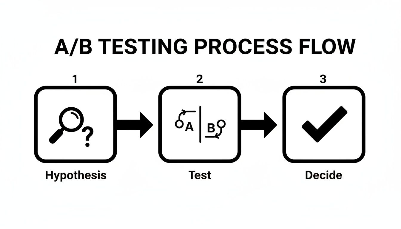
Start With A Clear Hypothesis
Every good test starts with an educated guess, not a random "let's try this" idea. Your performance audit from earlier should have given you a solid list of potential weak spots. Your hypothesis is simply your proposed solution to one of those problems.
A strong hypothesis isn't complicated. It just needs a clear structure: "If I change [X], then [Y] will happen, because [Z]."
For example, a weak idea is just, "Let's test the button color." A much stronger hypothesis would be: "If we change the CTA button color from blue to bright orange, then the click-through rate will increase because the orange creates a higher contrast against our page background, making it pop."
See the difference? This approach forces you to justify why you're running the test and ties it directly to a metric you want to improve. No more testing for the sake of testing.
Prioritize Your Tests For Maximum Impact
You could test hundreds of tiny elements on your page, but you don’t have unlimited time or traffic. This is why you have to be strategic and prioritize. The key is to focus on the changes that have the biggest potential to move the needle on your landing page conversions.
Start with the heavy hitters—the stuff every single visitor sees and interacts with:
- The Headline: This is your first, and maybe only, impression. Try pitting a benefit-driven headline against a problem-focused one.
- The Hero Image/Video: Does a clean product shot outperform a picture of a smiling customer? There's only one way to find out.
- The Call-to-Action (CTA): This is huge. Experiment with the button text ("Get Started" vs. "Claim My Free Trial"), color, and even its placement on the page.
- The Form: How many fields are too many? Test whether removing the "phone number" field boosts form submissions.
The goal here is to chase the biggest wins first. A headline test is almost always going to give you more valuable insights than changing the color of the footer text. Zero in on the elements that are make-or-break for a user's decision.
Test Just One Thing At A Time
This is the golden rule of A/B testing, and you can't break it. If you change both the headline and the button color in the same test, your results will be useless. Sure, conversions might go up, but you'll have no idea which change caused it. You can't learn from what you can't measure.
By isolating one element at a time, you get clean, reliable data. It might feel slower, but you're building a library of proven insights about your audience. This is how you create a repeatable system for optimization, not just a series of one-off wins.
Wait For Statistical Significance
One of the biggest mistakes people make is ending a test too early. You might see one version jump out to a big lead after just a day or two and get excited. Hold that thought. Early results are often just noise and can be completely misleading.
You need to let your test run long enough to reach statistical significance—usually at a 95% confidence level. This means you can be 95% certain that your results are because of the change you made, not just random chance. Most A/B testing tools, like Google Optimize or VWO, calculate this for you and will tell you when you have a clear winner.
Skipping this step is like building your whole optimization strategy on quicksand. Be patient. Let the data do its job until you have a clear, statistically-backed winner. This discipline is what separates the pros from the amateurs and leads to real, sustainable growth.
Automating Lead Nurturing And Follow-Up
Getting a user to click your call-to-action is a huge win, but let's be real—that’s just the start. A conversion isn't the finish line. It's the starting gun. The speed and quality of your follow-up are what actually turn a promising click into a paying customer.
This is exactly where so many businesses drop the ball. They pour a ton of money into ads to get eyeballs and clicks, only to let those red-hot leads sit idle for hours… or even days. In this game, a delay is a momentum killer. A lead that’s ready to buy right now can turn ice-cold in less than an hour.
The Problem With Manual Lead Management
Think about it. You're running a killer Facebook Lead Ad campaign. A potential customer sees it, loves your offer, and fills out the form. Awesome! But now what? If you're handling things manually, that person's info is now sitting in a CSV file buried inside Facebook's platform, just waiting for you to log in and find it.
This old-school process is just full of holes:
- Time Delays: You have to remember to stop what you're doing, log in, navigate to the right page, find the right form, and download a spreadsheet. If you only do this once a day, you’re an eternity too late for an interested prospect.
- Human Error: Manually copying and pasting names, emails, and phone numbers from a spreadsheet into your CRM or email list? It's a recipe for typos, missed details, and lost information.
- Wasted Momentum: The second someone converts is the absolute peak of their interest. If you don't engage them right then, you’re missing the single best opportunity you'll ever have to connect.
The process below shows the steps for A/B testing—a crucial part of optimizing the landing page that generated the lead in the first place.
Just like testing refines your page for more conversions, automating your follow-up refines your process for better, faster sales.
Closing The Gap With Automation
This is where automation completely changes the game. Instead of letting leads gather dust in a spreadsheet, you can build a system that acts on them the instant they come in. This closes that critical, money-losing gap between a user showing interest and your team actually talking to them.
Tools like LeadSavvy Pro were built specifically to solve this problem for platforms like Facebook. The concept is simple but incredibly powerful: as soon as a lead hits "submit," the automation tool instantly grabs their info and routes it exactly where it needs to go.
The single most impactful change you can make to your post-conversion process is to reduce your lead response time. Automation isn't a luxury; it's the most effective way to ensure no lead is ever wasted.
This means a new lead from a Facebook ad could pop up in your sales team's CRM or a shared Google Sheet in real-time. Even better, it can fire off an email or SMS notification so a team member can follow up while that person is still thinking about your offer.
A Practical Automation Workflow Example
So what does this look like in the real world? With an automation platform, you can connect your Facebook page and set up a simple but effective rule.
Here’s the breakdown:
- The Trigger: Someone submits their info through your Facebook Lead Form.
- The Action: Their data (name, email, phone) is instantly pushed to wherever you want it—a Google Sheet for tracking, your CRM, or an email marketing platform.
- The Notification: At the same time, an email alert shoots over to your sales manager, letting them know a new lead is ready for a conversation.
This instant handoff is how you maximize your return on ad spend. You stop losing potential customers because of simple delays.
Scaling your ad campaigns becomes so much more manageable when you know the back-end process is running on autopilot. Research has shown that companies with 31 to 40 landing pages get seven times more leads, and the top performers hit conversion rates over 5.31% because they optimize and automate their entire funnel.
By pairing a high-converting landing page with a robust, automated follow-up system, you create a seamless journey from initial interest to genuine engagement. This doesn't just improve your landing page conversions; it ensures those conversions have the best possible shot at becoming real revenue.
For a deeper look into building these workflows, check out our guide on automated lead nurturing.
Common Landing Page Questions Answered
Even the most buttoned-up strategy runs into questions. Getting your landing page conversions dialed in is a constant process, and it's totally normal to hit a few snags along the way. Here are some straightforward answers to the questions we hear all the time from marketers just like you.
Think of this as your quick-reference guide for those practical "what if" and "how long" moments that can stall an otherwise great optimization plan.
How Long Should I Run An A/B Test Before Choosing A Winner?
This is the big one, isn't it? A solid rule of thumb is to let a test run for at least one or two full business cycles—that’s usually about two weeks. This helps smooth out any weird traffic spikes or dips you might see between a Tuesday and a Saturday.
But time is only half the story. The real goal is to hit statistical significance. You're shooting for a 95% confidence level, which is just a fancy way of saying you're sure the results aren't a fluke. Most A/B testing tools will tell you when you've hit this mark, so fight the urge to call a test early just because one version is pulling ahead.
Ending a test prematurely based on early results is one of the most common and costly mistakes in CRO. Be patient. Let the data mature before you make a decision that affects your bottom line.
What Is A Good Landing Page Conversion Rate?
The honest answer? It depends. You'll see reports quoting a median rate around 6.6%, but that number is pretty much meaningless without context. A "good" conversion rate is completely tied to your industry, where your traffic is coming from, and what you're offering.
For example, a SaaS company would be popping champagne over a 5% conversion rate for a high-ticket demo request. On the other hand, a simple webinar registration page might be aiming for 12% or more.
The best thing you can do is forget about universal benchmarks. Instead, figure out your own baseline and just focus on beating it month after month. For you, a "good" rate is simply one that's better than last month's.
Should I Use A Long-Form Or Short-Form Landing Page?
The perfect page length comes down to two things: how complicated your offer is and how much your audience already knows about you. There's no single right answer, just what’s right for your specific scenario.
A short, punchy page is your best friend for low-commitment actions. Think about newsletter signups or downloading a free checklist—the value is crystal clear, and the user has nothing to lose.
On the flip side, a long-form page is often a must for high-consideration offers, like expensive software or a detailed consulting service. In those cases, you need more real estate to build trust, tackle objections, and lay out all the details to justify the ask. When in doubt, test both and let your audience tell you what they prefer.
Stop losing leads to manual downloads. LeadSavvy Pro instantly syncs your Facebook leads to a Google Sheet or CRM, so you can follow up in seconds, not hours. Start for free and automate your lead capture today!