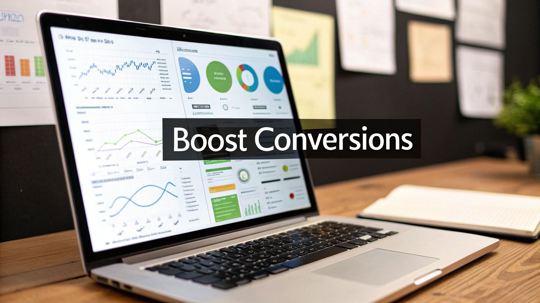
How to Improve Website Conversion Rates for Growth
Getting more conversions from your website isn't about some secret, complicated formula. It's actually pretty simple: figure out what your users are trying to do, and then get rid of whatever is stopping them.
That’s it. That’s conversion rate optimization (CRO) in a nutshell. It’s the process of turning guesswork into a real, repeatable strategy for growth by making your site easier and more intuitive for people to use.
Laying the Groundwork for Higher Conversions
Before you start changing button colors or rewriting headlines, you need to build a solid foundation. You can't fix what you don't measure, right? So, the first step is always understanding where you are right now.
Think of it less like a big technical project and more like an exercise in empathy. You're putting yourself in your visitors' shoes to see what's working, what's confusing, and what’s making them give up and leave.
To really nail this, you need to focus on four core areas.
The Four Pillars of Conversion Rate Optimization
At its core, a high-converting website stands on four pillars. Each one is critical for building a seamless user journey that guides visitors from curiosity to action. Get these right, and you're well on your way.
| Pillar | Primary Goal | Example Tactic |
|---|---|---|
| User Experience (UX) | Make the site intuitive and effortless to use. | Simplify your navigation menu. |
| Compelling Copy | Clearly communicate value and guide the user. | Rewrite a headline to focus on a benefit, not a feature. |
| Trust Signals | Build credibility and make visitors feel safe. | Add customer testimonials or security badges to checkout. |
| Technical Performance | Ensure the site is fast and works perfectly. | Optimize image sizes to reduce page load time. |
By systematically improving each of these areas, you create an experience that not only meets user expectations but actively encourages them to convert.
Understanding Your Starting Point
To know if your changes are actually making a difference, you need a baseline. Start by digging into your analytics to find those hidden opportunities.
Look closely at user flow reports, check the bounce rates on your most important landing pages, and identify the exact pages where people are dropping off. This data tells a story about where the friction is.
A common mistake is to get hung up on just the final conversion number. Real insight comes from breaking down the entire user journey. You need to spot the small wins and the drop-off points that all add up. Optimizing your sales funnel means looking at every single micro-conversion along the way. You can learn more by exploring our detailed guide on https://leadsavvy.pro/post/sales-funnel-optimization-strategies/.
This hierarchy diagram shows exactly how visitors move from just landing on your site to becoming engaged users and, finally, converting.
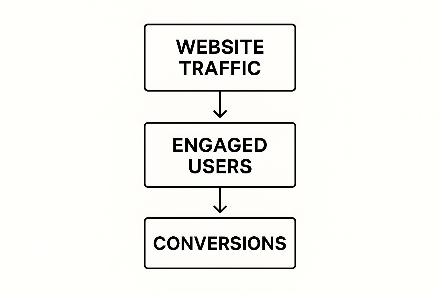
It’s a great reminder that while traffic is the starting point, success really depends on how well you guide those users through each stage.
It also helps to set realistic goals based on what’s happening in your industry. Looking ahead to 2025, the global average e-commerce conversion rate sits between 2% and 4%. But that number changes wildly depending on the market—personal care can hit 6.8%, while home decor is closer to 1.4%.
Here’s an interesting one: desktop users still convert at around 4.8%, which is nearly double the mobile rate of 2.9%, even though most traffic comes from phones. This tells you a lot about user intent on different devices.
For a deeper dive into improving your site, check out these conversion rate optimization best practices.
Finding and Fixing Conversion Blockers
Look, the quickest way to lift your website's conversion rates isn't always about adding flashy new features. More often than not, it’s about removing what’s broken. I’m talking about conversion blockers—those invisible points of friction that kill a user's journey. It could be a confusing button, a page that takes forever to load, or a form field that just won't cooperate.
Your job is to put on your detective hat and move past assumptions. You need to find out precisely where and why people are giving up and leaving. This isn't about guesswork; it's about following the digital breadcrumbs left in your analytics. The goal is to build a hit list of issues to fix, starting with the ones doing the most damage to your bottom line.
Pinpoint Where Users Abandon Your Funnel
Before you can figure out why people are leaving, you have to know where. Your first stop should always be your website analytics platform, like Google Analytics. Don't just glance at the overall bounce rate—that's a vanity metric. You need to dig into the user flow and find high-traffic pages with shockingly high exit rates.
For instance, you might discover that 70% of users who add an item to their cart bail on the very first page of your checkout. That’s a massive red flag. It tells you the problem probably isn't your product or your price. It’s something specific on that page that’s actively shoving potential customers out the door.
Common leakage points I always investigate include:
- Product pages with high exit rates but hardly any "add to cart" clicks.
- Landing pages from your ad campaigns with bounce rates climbing over 80%.
- Multi-step forms where a huge chunk of users drop off at the exact same step.
Once you have a shortlist of these problem pages, you know exactly where to focus your investigation.
See Your Website Through Your Users' Eyes
Analytics tell you what is happening, but they almost never explain why. To get that critical context, you need tools that let you see what your users are actually doing. This is where tools like Hotjar or Crazy Egg become absolute game-changers, turning abstract data into visual, "aha!" moments.
Heatmaps give you a bird's-eye view of where users click, move their mouse, and how far they scroll. You might see dozens of people furiously clicking on a beautiful image that isn't actually a link. That’s a classic design flaw creating frustration and stopping a conversion dead in its tracks.
Session recordings take this a huge step further. You can literally watch anonymized playbacks of individual user sessions. Imagine seeing a user trying to fill out your contact form on their phone. You might watch them struggle to tap a tiny button, get stuck in a loop because of a confusing error message, and finally give up.
These tools build empathy. When you see a real person struggling with an element you designed, your mindset shifts from "optimizing a metric" to "solving a human's problem." That perspective is the key to making improvements that actually matter.
By combining heatmaps and session recordings, you can validate the problems your analytics hinted at. That high exit rate on your checkout page? It might be caused by a confusing shipping cost calculator that users can't figure out. Now you have a clear problem to solve.
Gather Direct Feedback with On-Page Surveys
While watching user behavior is powerful, sometimes the easiest way to find out what's wrong is just to ask. On-page surveys and feedback widgets are a simple, low-effort way to get direct feedback right when it matters most. You don't need a 20-question survey.
A single, well-timed question can give you incredible insights.
- On an exit-intent popup: "Quick question—what was the one thing stopping you from signing up today?"
- On a product page with high exits: "Is there any information missing on this page?"
- On the checkout confirmation page: "What almost stopped you from completing your purchase?"
The answers you get are pure gold. They give you the exact words your customers use to describe their problems, which can inform everything from your sales copy to your UX. If five people say, "I couldn't find your return policy," you know exactly what to fix. This feedback loop closes the gap between data and reality, giving you a clear, user-validated action plan.
Optimizing Your On-Page User Experience

Alright, you've pinpointed the conversion blockers. Now for the fun part: actively crafting an experience that gently nudges visitors right where you want them to go. A killer user experience isn't about trendy designs or wild animations; it’s about making things clear and intuitive. It should feel completely effortless for someone to understand what you do and how to get it.
This means looking at every single element on the page—from the main navigation down to the tiniest button—and asking one simple question: "Is this helping my user, or is it just getting in the way?" You'd be amazed how small tweaks can remove friction, build momentum, and send your conversion rates climbing. When you're digging in, focusing on the key elements of modern website design is a great way to ensure you're covering all your bases for engagement.
Craft a Value Proposition That Clicks Instantly
You’ve got about three seconds. That’s it. Your value proposition is the first thing people see, and it has to answer their unspoken question: "What's in it for me?"
So many businesses get this wrong by listing features instead of benefits. Don't say, "Our software has AI-powered scheduling." Instead, hit them with, "Automatically find the perfect meeting time without back-and-forth emails." See the difference? The second one solves a real, annoying problem. Make sure that powerful statement is the dominant headline on your homepage and any important landing pages.
Simplify Navigation to Guide the Journey
Confusing navigation is a certified conversion killer. If people can't find what they're looking for, they won't stick around to play detective—they'll just bounce. Your job is to create a dead-simple, logical path to your most important pages.
Here are a few ways to declutter your site’s navigation and make it work for you:
- Limit Main Menu Items: Stick to five to seven essential options. Any more than that and you risk analysis paralysis.
- Use Clear Language: Ditch the clever jargon. "Pricing" beats "Investment Options" every time. "Contact Us" is way clearer than "Get in Touch."
- Make the Search Bar Obvious: If you have a site with lots of content or products, a prominent search bar isn't a luxury; it's a necessity.
Think of your navigation as a helpful tour guide, not a complex puzzle. Every click should get the user closer to their goal with zero confusion.
Keep in mind that your traffic source hugely impacts user expectations. Knowing which channels bring the most motivated visitors is key. For instance, direct traffic (people typing your URL right into the browser) often has the highest conversion rate at around 3.3% because they already know and trust your brand.
Email marketing isn't far behind at 2.8%, since you're talking to a warm audience. Organic search converts at about 2.3%, with paid search trailing at 1.5%. Understanding these benchmarks helps you tailor the experience for visitors arriving from different channels, as they all have slightly different mindsets.
Design Calls-to-Action That Demand a Click
Your call-to-action (CTA) button is probably the single most important element on the page. It's the final gate to a conversion, so it needs to be compelling and practically impossible to miss. A weak, vague CTA like "Submit" or "Click Here" is a waste of space—it creates uncertainty and kills clicks.
Great CTAs use action-oriented, benefit-driven language. For example, just changing a button from "Download" to "Get My Free Ebook" immediately clarifies the value for the user.
A few CTA best practices I live by:
- Use a Contrasting Color: Your button needs to pop. It should stand out from the rest of the page design without looking obnoxious.
- Make It Look Clickable: Use shadows, gradients, or a clear button shape. Leave no doubt in the user's mind that it’s meant to be clicked.
- Place It Logically: Put your CTA right where the user's eye naturally lands after they’ve read your offer. Don't make them hunt for it.
Build Trust with Social Proof and Security Seals
People are way more likely to take action if they see that others trust you. Social proof and security signals are visual shortcuts that tell visitors, "Hey, this place is legit, and your info is safe with us."
Sprinkling these elements throughout your site, especially on checkout or sign-up pages, can work wonders for reducing user anxiety.
- Customer Testimonials: Feature real quotes or short video clips from happy customers.
- Security Badges: Display logos from well-known providers like Norton or McAfee.
- Trust Seals: Use seals from organizations like the Better Business Bureau if you have them.
- "As Seen On" Logos: If you've been featured in the media, show off those logos. It builds instant credibility.
From simplifying your forms to making sure your site works perfectly on a phone, every little detail adds up. If your forms are too long or confusing, you're literally pushing potential customers away. For some solid advice on this, check out our guide on https://leadsavvy.pro/post/lead-capture-form/ that converts.
Improving Site Speed and Technical Health
Nothing tanks a potential conversion faster than a slow, clunky website. You can have the most persuasive copy and jaw-dropping design, but it all counts for nothing if your page takes forever to load. A fast, technically sound website isn't a "nice-to-have"—it's the foundation of a great user experience that actually converts.
Think about it from your visitor's perspective. A slow site sends a clear message: you don't value their time. In a world of instant everything, even a one-second delay is enough to send someone scrambling for the back button and heading straight to your competitor.
The good news? You don't need to be a senior developer to find and fix the most common speed killers. With the right tools and a clear plan, you can make a huge technical impact that shows up directly on your bottom line.
Diagnosing Your Site Speed Issues
Before you start messing with code or plugins, you need to know exactly what’s broken. Guesswork is your enemy here. Your first stop should always be a tool like Google's PageSpeed Insights. It gives you a detailed performance report for both mobile and desktop, completely free.
Just pop in your URL, and it spits out a performance score with specific, actionable recommendations.

This report shows you exactly what's bogging your site down, from massive image files to clunky code, giving you a crystal-clear roadmap of what to fix first.
Don't underestimate the power of speed. It's one of the most direct levers you can pull to lift your conversion rates. The data doesn't lie: sites that load in one second can see conversion rates 2.5 to 5 times higher than those that take five seconds. We're talking a potential tripling of conversions just by getting load times down. On the flip side, a ten-second wait can slash your conversions by a staggering 80%.
High-Impact Fixes for a Faster Website
Got your PageSpeed report? Great. Now you can start making targeted improvements. Focus on the low-hanging fruit—the issues that Google flags as having the highest impact.
Here are a few of the most common culprits and how to fix them:
- Compress Your Images: This is almost always the number one offender. Large, unoptimized images will absolutely murder your load times. Use tools like TinyPNG or an image compression plugin to shrink file sizes without any noticeable drop in quality.
- Implement Browser Caching: Caching tells a visitor's browser to save parts of your website (like images and CSS files). When they come back, their browser loads the page from this local cache instead of re-downloading everything. It makes the experience so much faster for repeat visitors.
- Reduce Server Requests: Every single element on your page—every image, script, and stylesheet—requires a separate request to your server. You can drastically cut down on these by combining files (like multiple CSS files into one) and deactivating any plugins you aren't actually using.
Think of each server request as a separate trip for a delivery driver. The fewer trips they have to make, the faster the whole delivery gets done. Your goal is to bundle as much as possible into one efficient trip.
Going beyond basic load times, a deep dive into application performance optimization can uncover hidden bottlenecks that are hurting the user experience in less obvious ways.
Leveraging a Content Delivery Network
If you have customers or visitors from all over the world, a Content Delivery Network (CDN) is an absolute game-changer. A CDN is basically a network of servers spread across the globe that stores a cached copy of your website.
When someone from another country visits your site, the CDN serves up the content from a server physically close to them, not your main server halfway across the world. This move drastically cuts down on latency and creates a much faster, more reliable experience for your global audience. Most modern web hosts offer easy CDN integration, making it a simple yet incredibly powerful way to boost your site’s performance.
Using A/B Testing for Smarter Decisions
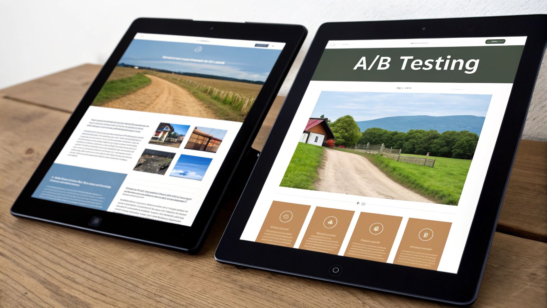
Sustainable growth is built on testing, not guessing. Once you've audited your site and have a few solid ideas about what might be holding back conversions, it's time to prove them right—or wrong. This is where A/B testing, or split testing, becomes your secret weapon for making data-driven decisions that actually move the needle.
The whole concept is pretty straightforward. You create two versions of a webpage: the original (your "control," Version A) and a new one with a single, specific change (the "variation," Version B). Then, you show each version to a different slice of your audience and see which one performs better.
This methodical approach takes ego and guesswork out of the picture. It doesn't matter if your design team is in love with that new green button; if the old orange one converts 15% better, the data has spoken. A/B testing is how you build an engine for continuous improvement.
Setting Up a Valid Experiment
A successful A/B test all comes down to a solid setup. If you rush this part, your results will be meaningless, and you'll end up making the wrong call based on bad data.
First, you need the right tool. Platforms like Google Optimize, Optimizely, or VWO make it simple to get tests running without bugging a developer. They handle splitting the traffic and tracking the results so you can stay focused on strategy.
Next, you have to define what a "win" actually looks like. Are you aiming for more clicks, more form submissions, or more sales? Pick one primary metric to decide the winner. Tracking too many goals at once just muddies the water.
Finally—and this is critical—you need your test to reach statistical significance. This is just a fancy way of saying you're confident the results aren't a random fluke. Most tools will tell you when you hit a confidence level of 95% or higher. Getting there requires enough traffic, so don't bother testing on a page that only gets a few visitors a week.
An A/B test without statistical significance is just a poll. It tells you what a small group of people did, but it doesn't give you the confidence to predict how a larger audience will behave. Wait for the data to mature before you declare a winner.
Practical A/B Testing Ideas
You don't need to kick things off with a massive, site-wide redesign. Often, the biggest conversion lifts come from small, focused changes. Your audit should have already given you a long list of things to try.
To help you prioritize, I've put together a simple matrix. It's a structured way to sort your ideas based on their potential payoff and how much work they'll take to implement.
A/B Testing Idea Matrix
| Test Idea | Potential Impact (High/Medium/Low) | Implementation Ease (Easy/Medium/Hard) | Primary Metric to Watch |
|---|---|---|---|
| Change CTA Button Copy | High | Easy | Button Click-Through Rate |
| Test a New Headline | High | Easy | Bounce Rate / Time on Page |
| Add a Testimonial Block | Medium | Easy | Form Submission Rate |
| Redesign a Landing Page Layout | High | Hard | Overall Conversion Rate |
| Simplify a Checkout Form | High | Medium | Checkout Completion Rate |
Start with the "High Impact, Easy" ideas first. For example, testing "Get Your Free Trial" against "Start Building Now" on a button is a quick experiment that can give you a clear win and build momentum for your whole testing program.
Common Mistakes to Avoid
A poorly run A/B test is worse than no test at all because it gives you the confidence to make bad decisions. Keep an eye out for these common pitfalls.
- Changing Too Many Variables: If you change the headline, the button color, and an image all at once, you'll have no idea which element actually made a difference. Test one thing at a time.
- Ending the Test Too Soon: Don't call a winner after just one day, even if one version is soaring ahead. You need to let the test run for at least a full week to account for natural dips and spikes in user behavior.
- Ignoring External Factors: Did you launch a big marketing campaign or get a major press mention in the middle of your test? Events like these can flood your site with unusual traffic and totally skew your results.
By avoiding these traps, you can trust that your results are reliable and your decisions are sound. Remember, understanding your lead generation performance metrics is a huge part of this process, as it helps you pinpoint which KPIs are most critical to test and improve in the first place.
Common Questions About CRO
Getting into conversion rate optimization can feel like a deep dive. It's a mix of hard data, tricky human psychology, and a whole lot of testing. Let's tackle some of the most common questions that come up.
What Is a Good Website Conversion Rate?
There’s no magic number here. A "good" conversion rate is all over the map depending on your industry, where your traffic is coming from, and what you’re actually measuring.
If you're looking for a general benchmark, anything from 2% to 5% is often considered solid.
But honestly, the most productive way to think about it is to focus on your own numbers. A truly "good" conversion rate is one that’s better than it was last month. If you manage to bump your rate from 1.2% to 1.8%, that’s a huge win and proof you're on the right track.
How Long Should I Run an A/B Test?
This really comes down to two things: how much traffic you get and reaching statistical significance. A page with a ton of visitors might get you a reliable answer in a week. A quieter page? You could be looking at several weeks, maybe even a month.
The biggest mistake people make is stopping a test the second one version nudges ahead. You absolutely have to let it run for at least one full business cycle (usually a week) to iron out the daily ups and downs in user behavior. Calling it early is a surefire way to make a bad decision based on incomplete data.
Your testing tool will let you know when you've hit a 95% confidence level or higher. That’s the industry standard for calling a winner.
What Is the Difference Between Macro and Micro Conversions?
Getting this distinction right is key to understanding the entire customer journey, not just the final sale.
- Macro-conversions are your big-ticket items—the primary goals. Think a completed sale, a submitted lead form, or someone signing up for a paid plan. These actions hit your bottom line directly.
- Micro-conversions are the smaller, supporting actions a user takes on their way to a macro-conversion. This could be anything from signing up for your newsletter, adding a product to their cart, or watching a demo video.
Tracking micro-conversions shows you where your funnel is working and where it's leaking. Someone might not be ready to buy today, but if you get them to download a guide (a micro-conversion), you've just moved them one step closer.
Can Small Changes Really Make a Big Difference?
Absolutely. It’s tempting to think a massive redesign is the only way to move the needle, but it's often the small, strategic tweaks that deliver the biggest, most reliable wins.
For example, just changing the text on a button from a generic "Submit" to a benefit-focused "Get My Free Quote" can have a massive impact on clicks. We've also seen clients add a single customer testimonial or a security badge near the checkout form, and that small dose of social proof was enough to calm user fears and slash cart abandonment.
The secret is to test these small changes one by one so you know exactly what worked.
Ready to stop letting valuable leads slip through the cracks? LeadSavvy Pro automates your Facebook lead capture, sending new contacts directly to your CRM or a Google Sheet the moment they come in. No more manual downloads, no more delays—just a simple, powerful way to respond faster and convert more. Start for free and see how easy it is.