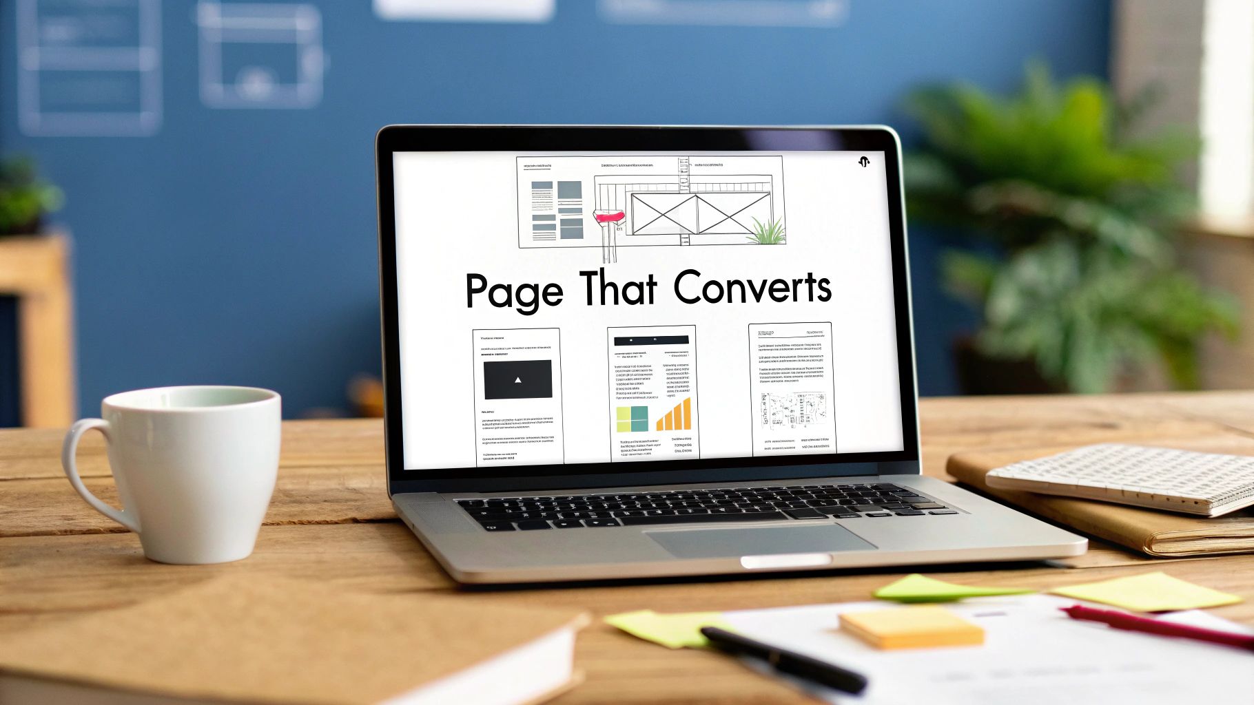
How to Create a Landing Page That Converts
Before you touch a single line of code or drag an element in a page builder, we need to talk strategy. A killer landing page isn't just about flashy design—it's about a rock-solid foundation.
A beautiful page with a weak strategy is doomed to fail. On the other hand, I've seen simple, almost "ugly" pages pull in incredible results because they nailed the fundamentals. This planning stage is where the real magic happens.
It’s so tempting to jump right into the fun stuff, like picking colors and fonts. But that's like trying to build a house without a blueprint. Every single word, image, and button on your page needs to serve one unified purpose. Without that clarity, you just create confusion, and confused visitors don't convert.
Laying the Groundwork for Conversion

Define Your Single Conversion Goal
Every landing page gets one job. Not two, not five—just one.
What is that one specific action you want someone to take? Are they signing up for a webinar? Grabbing a free ebook? Requesting a product demo? Trying to do too much is the fastest way to tank your conversion rate.
This single goal is your North Star. It guides every decision you make about the copy, the design, and especially the call-to-action (CTA).
Let’s look at a couple of real-world scenarios:
- Goal: Generate demo requests for your B2B SaaS tool. Here, your page needs benefit-driven copy, logos of companies you work with (social proof), and a big, bold "Request a Demo" button.
- Goal: Grow the email list for your e-commerce shop. Your page should scream value with an irresistible discount like "Get 20% Off Your First Order," showcase your best products, and have a dead-simple form asking only for an email.
A landing page with multiple offers can slash conversions by a staggering 266%. Stick to one goal to give your visitor a clear, frictionless path to becoming a lead.
Understand Your Audience Deeply
Once the goal is locked in, you have to get inside your audience's head. Who is this page for? What keeps them up at night? What are their biggest frustrations and secret desires?
When you truly get your audience, you can write copy that connects on an emotional level. You stop selling features and start solving their actual problems. You need to speak their language, not yours.
Craft an Irresistible Offer
Your offer is the heart of the landing page. It’s the answer to the visitor's crucial question: "What's in it for me?"
If the offer is weak, the page will fail. Period. It needs to be so valuable and compelling that handing over their contact info feels like a no-brainer.
This is the cornerstone of the what is lead generation in marketing process. A powerful offer doesn't just get you more leads; it gets you the right leads—the ones who are a perfect fit for your business.
Don't underestimate the impact of getting this right. While the average landing page converts at around 2.35%, businesses that nail their strategy can see that number jump to 5.31% or much, much higher. The top performers are converting north of 20% simply by focusing on these core elements.
To help you get started, here's a quick checklist to make sure you have your strategic ducks in a row before you start building.
Core Landing Page Strategy Checklist
| Strategic Element | Key Question to Answer | Example |
|---|---|---|
| The Goal | What is the single action I want a user to take? | "I want them to sign up for my live webinar." |
| The Audience | Who am I trying to reach? What are their pain points? | "Marketing managers at B2B tech companies who struggle with lead quality." |
| The Offer | What is the irresistible value I'm giving in exchange for their info? | "A free, 60-minute webinar that reveals 3 proven tactics to double lead quality in 30 days." |
| The "Why" | Why should they choose my offer over any other? | "Our webinar is taught by an industry expert and includes a free template pack no one else offers." |
Nail these four points, and you'll have a solid blueprint for a landing page that actually works.
Designing for Persuasion and Clarity
A high-converting landing page is more than just a pretty picture. It’s a carefully crafted machine designed to guide a visitor’s eyes—and their decision-making process—toward one single goal. Every layout choice, color, and empty space works together to build trust and make saying "yes" feel like the most natural next step.
This isn't about artistic flair. It's about building a visual story that instantly communicates value and removes any friction standing between your visitor and the conversion.
Mastering Visual Hierarchy and Flow
Visual hierarchy is simply the art of making the most important things look the most important. When you get it right, visitors don't have to think. Their eyes naturally follow a path from your headline, to your key benefits, and straight to your call-to-action (CTA).
One of the easiest ways to nail this is by using the classic Z-pattern. It mirrors how people in Western cultures naturally scan a page, making the entire experience feel intuitive.
Here's how it works:
- Top Left to Top Right: This is prime real estate for your logo and the main headline. It's the first thing they see.
- Diagonal Down to Bottom Left: Their eyes will cut across the page, scanning your juicy bullet points, testimonials, or an impactful image.
- Bottom Left to Bottom Right: This is the finish line. It’s the perfect place to drop your CTA button and close the deal.
By lining up your key elements along this path, you’re working with your user's brain, not against it.
You have less than three seconds to grab someone's attention. A solid visual hierarchy means your core message and CTA are impossible to miss, even with a quick glance.
If you’re targeting specific regions, you may also need to think about local design cues. This is especially true when it comes to building winning location landing pages, which benefit from a more tailored approach.
The Power of Whitespace and Simplicity
Ever landed on a page that felt instantly overwhelming? It was probably cluttered. Whitespace, or the empty space around your text and images, is your best weapon against that feeling. It lets your content breathe.
Clutter is the absolute enemy of conversions. It creates decision paralysis and sends visitors scrambling for the "back" button. On the other hand, generous whitespace makes your page feel calm, professional, and focused. More importantly, it makes your headline and CTA button pop.
This Instapage example gets it right. The design is clean, using tons of whitespace to draw your eye directly to what matters.

There’s no question what they want you to do. The headline and the orange button are the stars of the show, creating a super clear path for the user.
Choosing Persuasive Colors and Imagery
Color isn't just decoration; it's a psychological tool. While there’s no magic "best" color that converts, the single most important rule is contrast. Your CTA button needs to stand out from the background and scream "click me!"
Different colors can also help set the mood:
- Urgency: Reds and oranges are great for creating excitement or a sense of scarcity.
- Trust: Blues and greens tend to feel stable, calm, and trustworthy—perfect for financial or B2B services.
- Energy: Yellows can feel optimistic and attention-grabbing.
Your images are just as critical. They build an emotional bridge and help visitors picture themselves succeeding with your offer. Ditch the cheesy, generic stock photos—they kill trust instantly. Instead, use high-quality photos of real people, your product in action, or images that represent the transformation you’re selling.
Your design should make the visitor's journey feel both effortless and compelling. By mastering visual hierarchy, embracing simplicity, and being strategic with your colors and images, you'll build landing pages that don't just look good, but get results.
Writing Copy That Compels Action
If your landing page's design is the skeleton, its copy is the soul. The right words don't just explain your offer; they create a connection, build trust, and convince your visitor to act.
Even the most beautiful design will fall flat with bad copy.
Your real job here is to make the visitor feel completely understood. You need to prove you get their problem—maybe even better than they do—and that you hold the key to solving it. This isn't about showing off clever wordplay. It's about being incredibly clear and empathetic.
Hook Them With a Powerful Headline
Your headline is everything. It's the first—and sometimes only—thing people will read. If it doesn't immediately grab their attention, they're gone. A great headline makes a bold promise and speaks directly to your ideal customer's biggest frustration or deepest desire.
Forget about boring, self-centered headlines. Focus on the transformation you're offering.
- Weak Headline: "Our New CRM Software"
- Strong Headline: "Stop Juggling Spreadsheets and Close More Deals"
See the difference? The second one works because it names a specific pain point (endless spreadsheets) and promises a tangible outcome (more sales). It’s not about your software; it’s about what your software does for them.
Structure Your Message With a Proven Framework
To guide your reader from skeptical visitor to eager lead, you need a roadmap. One of the most effective copywriting frameworks ever created is PAS (Problem-Agitate-Solution). It's a simple, three-act structure that works because it taps directly into human psychology.
- Problem: Kick things off by describing the problem your audience is struggling with. Use the exact words they would use. This builds instant rapport.
- Agitate: Now, don't just leave the problem there—pour a little salt on the wound. Remind them of the frustrations, the wasted time, and the negative consequences that come with it. Make them feel the pain of inaction.
- Solution: With the problem fresh in their mind, swoop in with your offer as the perfect relief. Frame your product or service as the clear, obvious way to make all that pain disappear.
PAS in Action (Webinar Signup):
- (P) Problem: "Struggling to get quality leads from your Facebook ads?"
- (A) Agitate: "You're burning through your budget every day, but the leads are junk. Your sales team is frustrated, and you have nothing to show for it."
- (S) Solution: "Join our free webinar and discover the 3-step targeting method that attracts high-quality leads who are actually ready to buy."
This simple formula takes your visitor on an emotional journey, making your offer feel less like a sales pitch and more like a lifeline.
Crafting a Call-to-Action That Actually Converts
Your call-to-action (CTA) is the moment of truth. It's where you ask them to take the leap. Vague, lazy CTAs like "Submit" or "Click Here" are conversion killers. They’re boring, uninspiring, and offer zero value.
Think of your CTA button text as completing the sentence: "I want to…" It should clearly state what the user gets by clicking. Be specific, use an action verb, and make it feel like a win for them.
Don't underestimate the power of a few words. The average landing page conversion rate hovers around 6.6%, but this can swing dramatically. For example, the events industry sees a median of 12.3%, while SaaS often lags at 3.8%. A strong CTA is one of the key levers you can pull to push your numbers toward the higher end of your industry benchmark. You can dig into these industry-specific conversion rates to see where you stand.
CTA Copy Comparison for Different Goals
A weak CTA feels like a chore, while a strong one feels like an opportunity. This table shows you how to turn a generic button into a conversion magnet.
| Goal | Weak CTA Example | Strong CTA Example |
|---|---|---|
| Ebook Download | Submit | Get My Free Guide |
| Webinar Signup | Register | Save My Spot! |
| SaaS Demo | Contact Us | See It in Action |
| E-commerce Discount | Subscribe | Unlock 20% Off Now |
The strong examples put the user in the driver's seat. They create a sense of ownership ("My Guide") and urgency ("Now"), making the action far more appealing. Every word on your page matters, but the words on that final button often matter most.
Making Your Lead Capture Form Effortless
Think of your lead capture form as the final handshake. It’s that critical moment where a visitor decides if your offer is really worth handing over their personal info. A clunky, demanding, or confusing form can kill your conversion right at the finish line, no matter how amazing the rest of your page is.
Your goal is to make this step feel completely seamless and safe. Every single field you add creates friction and gives someone a reason to bail. Let's talk about how to strip away that friction while still getting the info you actually need.
How Many Form Fields Is Too Many?
There's a golden rule in form design, and it’s brutally simple: only ask for what you absolutely need.
If you’re offering a top-of-funnel goodie like an ebook or a newsletter sign-up, just an email address is usually enough. The second you start asking for a phone number, company size, and job title for a simple PDF, you're going to see a massive drop-off. The value of your offer has to feel bigger than the "cost" of the information you're asking for.
Here’s a quick way to think about it:
- Low-Value Offer (e.g., Newsletter): Go for the bare minimum. An email field is perfect.
- Mid-Value Offer (e.g., Webinar): You can probably get away with a name and email. Maybe a company name if you’re in the B2B space.
- High-Value Offer (e.g., Demo Request): This is where you have permission to ask for more. A phone number or job title makes sense because the user is showing serious buying intent.
A well-known study from HubSpot found that just cutting form fields from four to three can boost conversions by as much as 50%. Simplicity doesn't just look good—it gets you more leads.
Designing a Form That Doesn't Suck
Once you’ve trimmed the fat from your fields, the form's design takes center stage. You want a layout that's clean, logical, and incredibly easy for a user to scan and complete.
A few simple design tweaks can make a world of difference:
- Stick to a Single-Column Layout: This creates a clean, straight line for the user's eyes to follow down the page. It’s simple, intuitive, and reduces mental clutter.
- Label Fields Clearly: Always put labels above the input fields. Don't use that placeholder text that disappears the moment someone starts typing—it’s a usability nightmare.
- Make Your CTA Button POP: Your call-to-action button should be the loudest thing on the form. Use a color that contrasts with the rest of the page and write compelling, action-driven copy like "Get My Free Guide" instead of a boring "Submit."
The form builder in HubSpot is a great example of this in action. You can see how the drag-and-drop interface lets you build something that’s easy on the back-end and even easier for your visitors to use.
Notice how everything is aligned in a single column? That’s not an accident. It guides the user straight to the finish line.
Advanced Tricks for Getting More Conversions
What if you genuinely need to collect more information but don't want to tank your conversion rate? That's when a multi-step form becomes your best friend. These forms break down a long list of questions into smaller, bite-sized chunks.
The psychology here is incredibly effective. You start by asking for something easy, like a name and email. Once the user makes that tiny initial commitment, they're far more likely to see it through and complete the next steps. It just feels less intimidating than staring down a form with ten fields all at once.
Finally, you can’t forget what happens after someone clicks submit. You need to make sure every new lead is captured and sent to the right place instantly. Integrating your form with your CRM or a tool like LeadSavvy Pro means your sales team gets notified immediately, letting them follow up while the lead is still red-hot. For a deeper dive, check out our guide on how to optimize lead capture forms for better results.
At the end of the day, building a great form comes down to empathy. Put yourself in your visitor's shoes, respect their time, and make the whole process as painless as you possibly can.
Launching and Optimizing for Better Results
Alright, you’ve built your landing page and you’re ready to go. Hitting that "publish" button feels like the finish line, but it’s really just the starting gun.
A great landing page is never truly finished. It's a living, breathing part of your marketing that you can—and absolutely should—keep improving. The launch is just the beginning of a cycle: test, learn, and optimize. This is how you stop guessing and start making data-driven decisions that consistently bump up your conversion rates.
First Things First: Set Up Your Measurement Tools
Before you even think about sending a single visitor to your new page, you need tracking in place. Flying blind is the fastest way to burn through your ad budget. Without data, you have no idea what's working.
You'll need two essential types of tools in your kit:
-
Web Analytics: Something like Google Analytics is completely non-negotiable. It gives you the hard numbers: how many people are visiting, where they came from, and what percentage are actually converting. Think of it as your high-level scorecard.
-
Heatmaps and Session Recordings: Tools like Hotjar or Crazy Egg show you the why behind those numbers. Heatmaps give you a visual on where users are clicking, moving their mouse, and how far down the page they scroll. You’ll see exactly what grabs their attention and what gets completely ignored.
Time to Run Your First A/B Test
Once you’ve collected some baseline data, you can start making real improvements with A/B testing. The idea is simple: create a variation of your page (Version B) and test it against the original (Version A) to see which one gets more conversions.
The secret to a good A/B test is being scientific about it. Don't just throw random changes at the wall to see what sticks.
Start with a Clear Hypothesis
Every good test begins with an educated guess. A solid hypothesis looks like this: "By changing [X], I believe [Y] will happen, because [Z]. This framework forces you to think through the logic behind your test.
For example:
"By changing the CTA button text from a generic 'Submit' to 'Get My Free Guide,' I believe conversions will increase because the new copy focuses on the value the user gets, not the action they have to take."
That’s a world away from just saying, "Let's try a new button." You have a clear reason and a measurable outcome in mind. If you're new to this, a great first step is understanding what is conversion tracking to make sure you’re measuring the right actions.
Prioritize Your Tests for Maximum Impact
You can test nearly anything on a landing page, but some changes will move the needle way more than others. To get the most bang for your buck, start with these high-impact elements:
- The Headline: It’s the first thing people read. A stronger, more benefit-focused headline can create a massive lift.
- The Call-to-Action (CTA): Test everything—the button copy, color, size, and even its placement on the page.
- The Offer Itself: Sometimes, the offer is the weak link. Try testing a free trial versus a demo, or an ebook versus a short checklist.
- The Hero Image or Video: A more compelling visual that truly represents your offer's value can have a huge impact on conversions.
This whole process boils down to a simple philosophy: balance the user's experience, simplify their journey, and connect your tools to make it all work seamlessly.
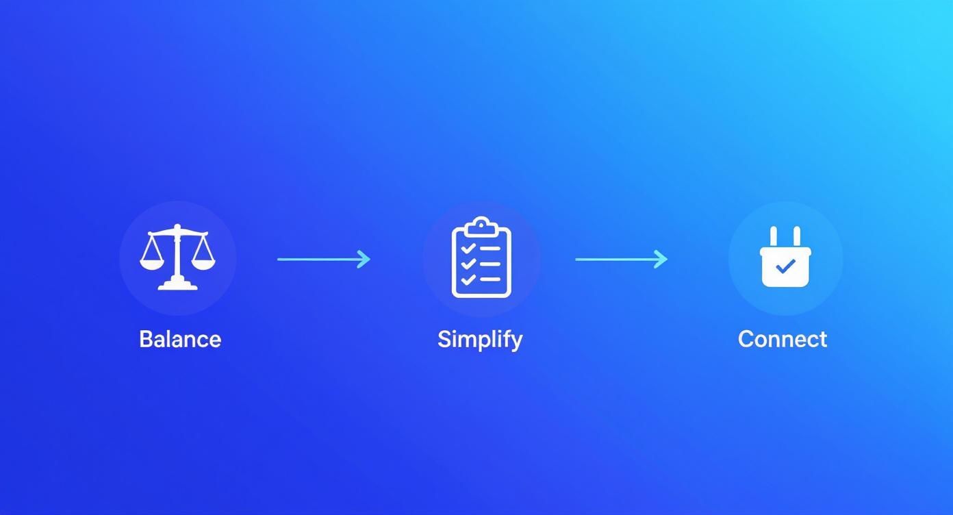
Each of these pillars—balancing, simplifying, and connecting—is a fantastic area to brainstorm A/B tests.
Analyzing Results and Doing It All Over Again
Once your test has run long enough to get a statistically significant result (most tools will tell you when you're there), it's time to check the data.
If your variation won, awesome! Make that change permanent and move on to your next hypothesis.
But what if it lost, or there was no difference? That’s still a win. You just learned something that doesn't work for your audience, which is just as valuable. Use that insight to shape your next test. Optimization isn't a one-and-done task; it's a continuous loop.
To really get into the weeds, check out these advanced landing page optimization strategies. By constantly testing and learning, you'll turn that good landing page into a high-performing conversion machine.
Got Questions About Landing Pages? We've Got Answers.
Even with the best game plan, a few questions always seem to pop up right when you're in the thick of building a landing page. Let's tackle some of the most common ones we hear so you can keep moving forward and build something that actually converts.
Think of this as your quick-reference guide to sidestepping the usual mistakes that can quietly kill your conversion rates.
How Long Should a Landing Page Be?
Honestly? It all comes down to the "ask."
There's no magic word count. The real rule is that your page length should match the size of the commitment you're asking for. A bigger ask needs more runway—more proof, more persuasion, more reasons for them to say "yes."
Here’s a simple way to break it down:
- For a small ask, like a newsletter signup or a free checklist download, keep it short and punchy. A killer headline, a few benefit-focused bullet points, and the form itself are usually all you need. The commitment is low, so the copy can be light.
- For a big ask, like signing up for a high-ticket course, booking a sales demo, or buying a product, you'll need a much longer page. You have a lot more objections to handle and a much stronger case to build.
The bottom line is simple: the more you're asking for (in time, money, or information), the more you need to write to justify it. Never be afraid of a long-form page if your offer demands it.
Can I Just Use My Homepage as a Landing Page?
In almost every scenario, the answer is a hard no. Your homepage and your landing page have completely different jobs, and mixing them up is a recipe for confusion.
Your homepage is your digital storefront lobby. It’s built for browsing, showing off all the different parts of your business, and directing all sorts of people (customers, job seekers, investors) to various places. It's packed with navigation links and multiple calls to action.
A landing page, on the other hand, is a specialist. It has one job, one message, and one goal. It's designed to strip away all distractions and funnel a specific audience towards a single action. Sending your targeted ad traffic to your homepage is like dropping someone in a massive mall and just hoping they find the specific store you want them to visit. It just doesn't work.
Is It Okay to Have More Than One Call to Action?
While the golden rule is "one page, one goal," you can—and absolutely should—have multiple CTA buttons on a single page. For longer pages, it’s not just okay; it's a best practice.
The trick is that every single one of those buttons must point to the exact same action. For example, you might have a "Get My Free Demo" button right at the top, another one midway through your features section, and a final one at the very bottom.
This makes sure that the moment a visitor is convinced, a CTA is right there, ready for them. The goal is singular; you’re just giving them more chances to act on it.
Stop wasting time manually downloading leads from Facebook. LeadSavvy Pro automatically syncs every new lead to your CRM or a Google Sheet the second they come in, so you can follow up instantly and close more deals. See how it works at https://leadsavvy.pro.

