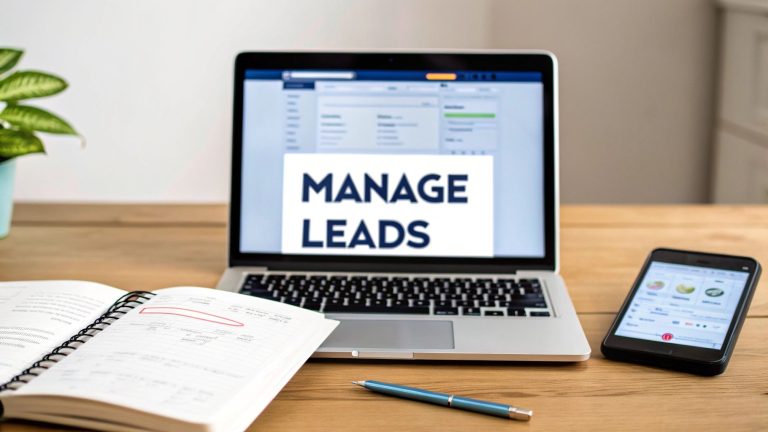
Master the Lead Capture Landing Page
So, what exactly is a lead capture landing page?
Think of it as a laser-focused, standalone web page built for one single purpose: collecting a visitor's contact details (a "lead") in exchange for something valuable. This isn't your homepage, which is usually cluttered with links and different messages. Instead, it’s a specialized digital handshake designed for a specific marketing campaign.
Why Your Business Needs a Digital Handshake
Imagine your website's homepage is a giant department store. There are dozens of entrances, countless departments, and signs everywhere trying to grab your attention. A visitor can easily get distracted, wander around, and leave without buying anything.
A lead capture landing page, on the other hand, is like a small boutique with one clear offer. It's designed to present one specific item—your lead magnet—and guide the visitor straight to the checkout counter, which is your contact form.
This focused environment is what makes it so incredibly effective. By stripping away all distractions like navigation menus, sidebars, and links to other pages, you create a clear, uncluttered path straight to your goal. Every single element, from the headline down to the call-to-action button, works together to convince the visitor to take that one specific action.
If you want to zoom out and see how this fits into the bigger picture, our guide on what lead generation is in marketing gives you the full context.
The Core Purpose and Function
At its heart, a lead capture page is a simple trade: value for information. You offer something your target audience genuinely wants, and in return, they give you their details to get it. This "something" is your lead magnet, and its quality is absolutely critical to your success.
Here's what these pages do so well:
- Targeted Messaging: They let you speak directly to a very specific audience from a particular campaign, like a Facebook ad or an email promotion. The message is perfectly tailored.
- Higher Conversion Rates: It's a simple fact: a page with one goal will almost always outperform a general-purpose page. The data backs this up—businesses with 30+ landing pages generate 7 times more leads than companies with just a handful.
- Data Collection: These pages are your primary tool for gathering valuable information about potential customers, allowing you to nurture them through your sales funnel.
A great lead capture page doesn't just ask for an email; it builds the foundation of a relationship by offering genuine value upfront. It's the first step in turning a stranger into a loyal customer.
Ultimately, this specialized page is the critical bridge connecting your marketing efforts to your sales pipeline. It’s what turns passive website traffic into real, actionable leads.
For a deep dive into building your own, check out this guide on how to create a high-converting lead generation landing page.
The Anatomy of a High-Converting Page
Every killer lead capture page is built from a handful of core parts working in perfect sync. Think of it like a finely tuned engine—each part has a specific job, but they only create real power when they operate in harmony. Getting a handle on this anatomy is the first step to building pages that consistently turn casual visitors into solid leads.
These elements aren't just boxes to check off a list. They're psychological triggers designed to guide a visitor from initial curiosity all the way to taking action. A truly great page knows what the user is thinking, answers their questions before they even ask, and builds trust with every scroll.
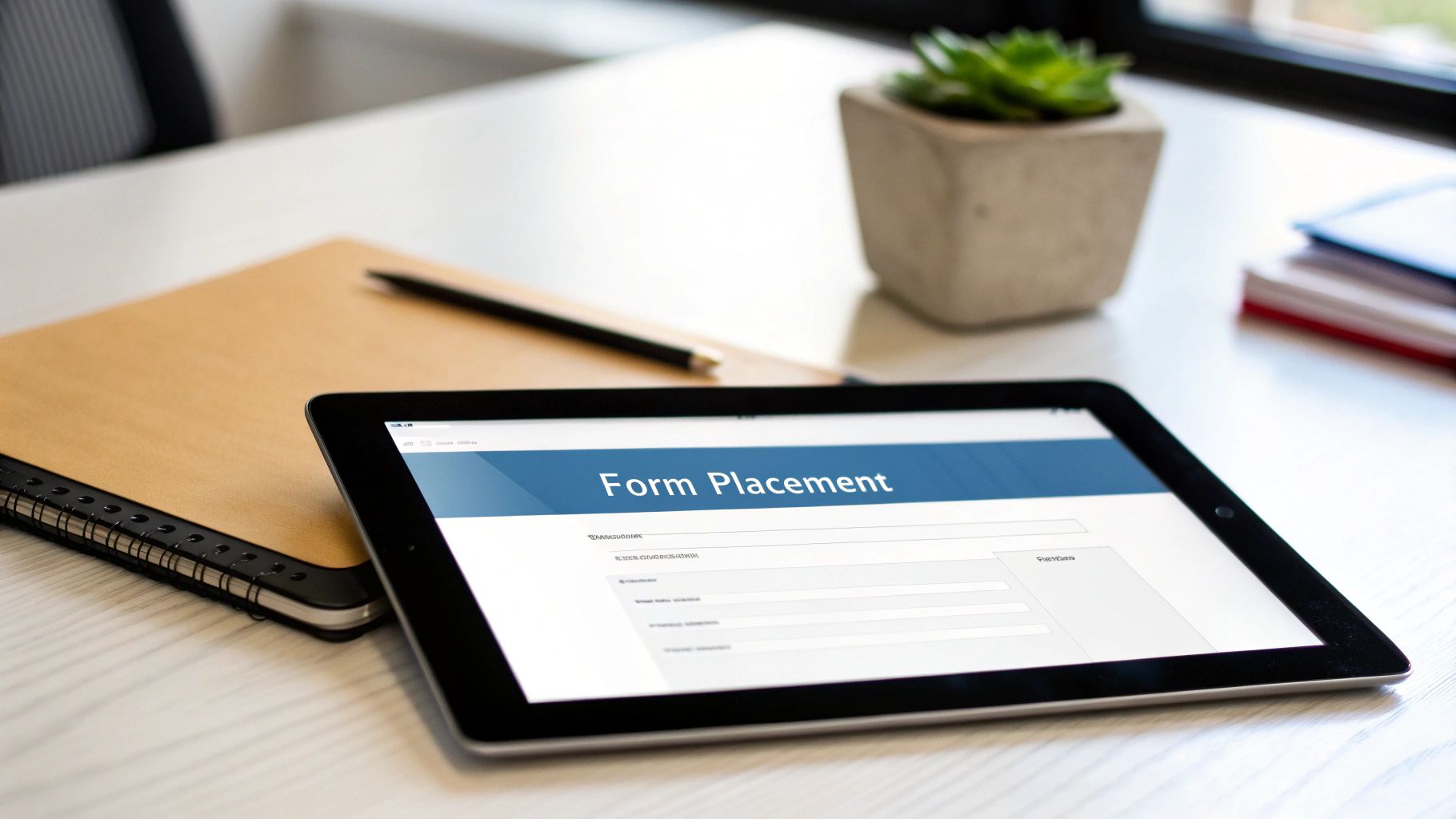
Here’s a quick visual breakdown showing how these foundational pieces fit together.
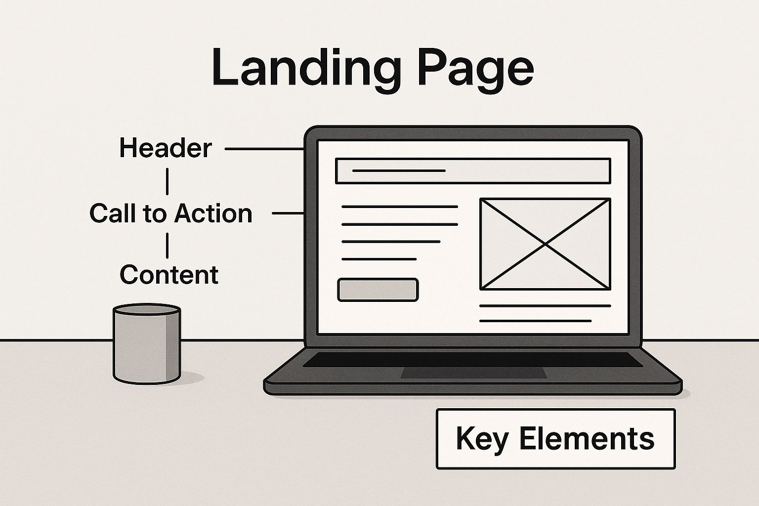
This wireframe gives you a sense of where each element goes, creating a logical flow that just makes sense to the visitor.
The Irresistible Headline
Your headline is your first—and sometimes only—shot to make an impression. It has one job: stop the scroll. You’ve got maybe three seconds to grab a visitor's attention and make them care.
A high-converting headline is crystal clear, screams benefits, and speaks directly to a visitor's biggest problem or desire. Forget trying to be clever; it needs to be understood in a heartbeat.
For instance, "Our New Guide" is forgettable. But "Double Your Website Leads in 30 Days With Our Free Checklist"? Now you’re talking. That second one promises a specific, juicy outcome.
Persuasive Copy and Visuals
Once the headline hooks them, your subheadings, body copy, and visuals team up to tell a compelling story. This is where you really make the case for your offer.
- Benefit-Oriented Copy: Don't just list what your product does. Focus on what the user gets. Translate every feature into a tangible benefit that makes their life easier.
- Trust-Building Visuals: High-quality images, videos, or graphics are non-negotiable. If you're offering an ebook, show the cover. For a service, a short video demo can boost conversions by a whopping 86%.
- Social Proof: Nothing sells like social proof. Sprinkle in testimonials, short case studies, or logos of clients they'll recognize. This shows that real people have already gotten value from what you're offering.
A visitor lands on your page with a healthy dose of skepticism. Your copy and visuals must work together to tear down that wall and replace it with trust and excitement.
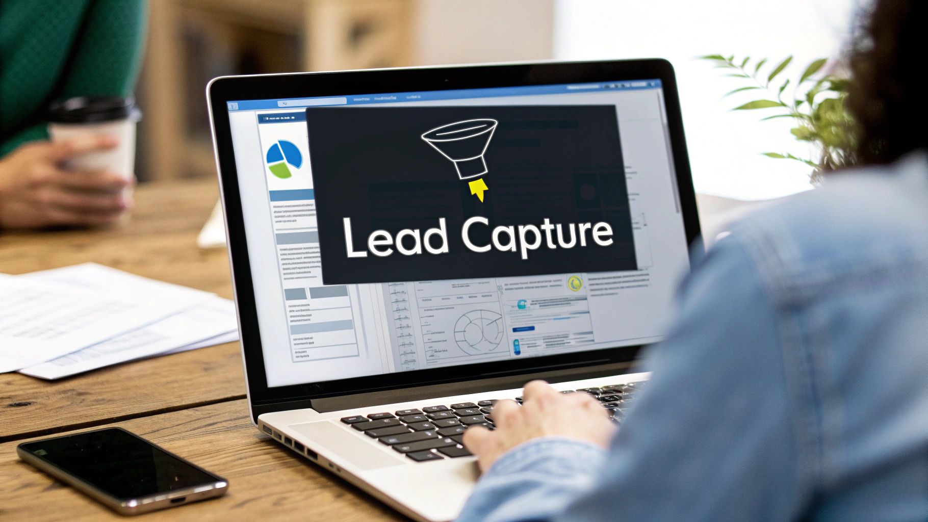
The Frictionless Form
The lead capture form is the moment of truth. This is where the visitor decides if what you’re offering is worth handing over their personal info. The name of the game here is simplicity.
Every single field you add creates friction and gives them another reason to bail.
So, only ask for what you absolutely need. For a simple newsletter signup, an email address is plenty. If you need more info to qualify leads down the line, make sure every field has a clear purpose. A clean, simple form removes that last barrier and makes hitting "submit" feel effortless.
Designing a Frictionless User Experience
Great design is invisible. It doesn't shout for attention. Instead, it quietly guides your visitors exactly where you want them to go, making the entire journey feel natural and almost effortless. This invisible hand is the secret to turning casual interest into real action on a lead capture page.
The whole point is to create an experience so smooth that visitors forget they're even on a landing page. They're just focused on the value you’re offering them. This isn't an accident—it's the result of a deliberate mix of visual hierarchy, smart use of space, and subtle psychological cues that build trust and make saying "yes" easy.
Creating a Clear Visual Path
Visual hierarchy is just a fancy way of saying you’re telling your visitor’s eyes where to look first, then second, then third. You control this path with things like size, color, and placement. Your headline should be the biggest, boldest thing on the page, followed by your supporting subheadings, and finally, your call-to-action (CTA) button.
Think of it like leaving a trail of breadcrumbs that leads straight to your form. Each element should flow logically into the next, creating a seamless journey that answers questions in the right order. To really nail this, it helps to understand the bigger picture of user experience, like the concepts covered in these web application UX design tips.
A well-designed page feels like a natural conversation. It anticipates what the user is thinking and gives them the answer right when they need it, making the final 'yes' feel like the only logical choice.
Leveraging Space and Trust Signals
White space is your best friend. Seriously. Also known as negative space, it's all the empty area around your text, images, and form fields. Using plenty of it makes your content easier to read and helps your most important elements—like that big CTA button—really pop.
Just as important are your trust signals. These are the little visual cues that calm a visitor's anxieties and build their confidence in you. Placing them strategically near your form can make a world of difference.
- Testimonials: Short, powerful quotes from happy customers are pure gold. They provide instant social proof.
- Partner Logos: Got well-known clients or partners? Show off their logos. It borrows their credibility.
- Security Badges: If you're asking for any kind of sensitive information, security badges (like SSL certificates) are non-negotiable.
These elements all work together to reassure visitors that they're making a smart, safe decision. The impact is huge—landing pages with solid UX design can perform up to four times better. And don't forget video; adding one can boost conversions by as much as 86%.
Finally, none of this matters if it all breaks on a smartphone. A flawless mobile-responsive design is absolutely essential to make sure this frictionless experience works perfectly on any device your leads are using.
Writing Copy That Persuades and Converts

If the design of your landing page is what guides the eye, your words are what guide the mind. The copy on your lead capture landing page is your single most important sales tool. It has one job: convince visitors that what you're offering is worth handing over their precious contact information.
Great copy is the difference between a visitor thinking, "Huh, that's interesting," and feeling, "I absolutely need this right now."
It doesn't happen by accident, either. It follows proven formulas, and one of the most effective frameworks ever created is AIDA. It’s a simple, structured path to persuasion that just works.
- Attention: Snag their interest instantly with a powerful, benefit-driven headline.
- Interest: Keep them hooked by diving into the problems they're actually facing. Show some empathy.
- Desire: Build an undeniable craving for your solution. Paint a vivid picture of the awesome outcome they'll get.
- Action: Give them a clear, compelling, and urgent command to get what you're offering.
Using a structure like this turns your copy from a simple description into a compelling story that makes people want to act.
Translate Features Into Benefits
Here's one of the biggest mistakes marketers make: they talk all about features instead of benefits.
A feature is what your product is or does. For example: "Our new ebook is 50 pages long."
A benefit is what the user gets out of it. For example: "You'll learn a new marketing strategy in just one afternoon."
Visitors don’t care about your product; they care about what your product can do for them. Always answer their unspoken question: "What's in it for me?"
So, instead of saying your software has "real-time analytics," say it gives you "instant insights to make smarter decisions faster." See the difference? That subtle shift in perspective connects your offer directly to their pain points, making the value exchange feel like a complete no-brainer.
Write for Scanners
Let's be real: almost nobody reads every single word on a webpage. They scan. They skim.
Your job is to make your key messages jump off the page so they're impossible to miss, even for the quickest scrollers. This means structuring your content for maximum readability.
To get this right, you have to break up your text with clear visual cues. For a deeper dive into structuring the most crucial part of your page, check out our complete guide to lead capture form best practices.
Here’s how to make sure your message hits home:
- Use Short Paragraphs: Keep paragraphs to three sentences or less. This creates much-needed white space and makes the text feel way less intimidating.
- Leverage Bullet Points: When you have a list of benefits or complex info, break it down into easy-to-digest bullet points. Just like this.
- Bold Key Phrases: Don't be shy. Use bold text strategically to make your most important takeaways and value props stand out.
When you write for scanners, you ensure that even someone who spends just a few seconds on your page walks away knowing exactly why they should sign up.
Real-World Examples of Winning Landing Pages
Theory is great, but seeing these principles in action is where the lightbulb really goes on. Let's move past the 'how-to' and dissect a few killer lead capture landing pages that absolutely nail it.
By breaking down what works for them, you can swipe proven strategies for your own campaigns. Pay attention to how each page, despite being in a totally different industry, sticks to the core ideas: be clear, offer value, and have one single goal.
SaaS Example: Shopify
Shopify’s free trial landing page is a masterclass in clean, trust-building design. The headline, "Start your business with Shopify," gets straight to the point. No fluff, just pure action that speaks directly to their audience's dream.
The page uses very little text, keeping the focus on the main benefit: getting your business online. They feature a dead-simple form asking for just an email address, which crushes any friction to sign up. This is all backed up by huge trust signals, like a counter showing millions of businesses already use their platform. It makes the decision to sign up feel both safe and smart.
Ecommerce Example: Frank & Dick
Digital ad agency Frank & Dick cooked up a brilliant campaign for Blafre, a kids' accessories brand. They dangled the perfect carrot: a chance to win a back-to-school package, targeting parents with something they desperately wanted, right when they needed it.
This approach was so effective for a few simple reasons:
- High Perceived Value: The giveaway prize felt substantial, making an email signup a total no-brainer.
- Low Barrier to Entry: The form was quick and easy, asking only for the basics.
- Perfect Timing: They hit "go" right as parents were stressing about kindergarten prep.
The result? Over 8,000 new email leads. This shows how a well-timed, high-value offer can generate massive results for an ecommerce store.
And this is just a glimpse of what's possible. Across the industry, the numbers are huge. Leadpages users, for example, hit an average 11.22% conversion rate in 2023, while companies using Instapage have racked up over 500 million conversions. You can dig into more of these powerful landing page stats to see how big brands like Airbnb and Verizon lean on this exact strategy.
Professional Services Example: UENI
UENI, a service that builds websites for small businesses, used a pre-launch landing page to build hype for a new ecommerce feature. They played it cool, using a mysterious, polished design with minimal copy to create a ton of intrigue.
The headline promised "the best way to sell online, for free," and the CTA was a simple "Get early access." This clever approach worked like a charm, converting at an insane 56%.
This proves that you don't always need to give away a freebie. Sometimes, the promise of exclusive, early access to a game-changing solution is an even stronger pull—especially for a B2B crowd hungry for a competitive edge.
Analysis of High-Converting Landing Page Elements
Let's pull back the curtain and break down what made these examples so successful. The table below highlights the specific tactics each company used, connecting their strategy back to the best practices we've discussed.
| Company Example | Key Strength | Copy Tactic Used | Design Highlight |
|---|---|---|---|
| Shopify | Building Trust | Direct, benefit-driven headline. Minimal text focuses on the user's goal. | Ultra-simple, single-field form. Prominent social proof (millions of users). |
| Frank & Dick | High-Value Offer | Creating urgency and desire with a timely giveaway. | Bright, engaging visuals of the prize that grabs attention. |
| UENI | Exclusivity | Building curiosity with a mysterious "early access" promise. | Sleek, minimalist design that implies a premium, high-tech solution. |
As you can see, there's no single "right" way to build a landing page. Shopify leans on trust, Frank & Dick on value, and UENI on exclusivity. The common thread is a deep understanding of their audience and a laser-focus on a single, compelling call to action.
Optimizing Your Page for Maximum Results
Hitting "publish" on your lead capture page isn't the end of the road. It's actually the starting line. Real growth happens when you commit to making your page better and better over time.
Think of your page less like a static brochure and more like a dynamic tool that can always be sharpened. The secret to doing this effectively? A/B testing.
A/B testing (or split testing) is simple: you create two versions of your page (an "A" version and a "B" version) and show them to different groups of visitors. By changing just one thing at a time—like the headline or the button color—you can see exactly what works and what doesn't. This isn't guesswork; it's data-driven improvement.
What to Test for the Biggest Impact
Not all tests will give you groundbreaking results. If you want to see the needle move, you need to focus on the elements that have the biggest psychological punch.
Here are the high-impact elements you should start testing right away:
- The Headline: This is the first thing people read, and it's often the single biggest lever you can pull. Try testing a headline that clearly states a benefit against one that sparks curiosity.
- CTA Button Copy: Don't just settle for "Submit." Experiment with different action words. Does "Get Your Free Guide" pull in more leads than "Download Now"? You'd be surprised how much small word changes matter.
- Form Length: Every field you ask someone to fill out creates friction. Try removing just one non-essential field from your form. A shorter form almost always leads to a nice bump in conversions.
- Imagery and Video: A picture is worth a thousand words, but a video might be worth a thousand leads. Test a static image of your offer against a short, punchy video that explains its value.
Optimization is a game of inches. Small, consistent improvements over time compound into massive gains in lead generation, turning good results into great ones.
Scaling Your Efforts with Targeted Pages
Once you get the hang of A/B testing, you can take your strategy to the next level by creating multiple, targeted landing pages for different traffic sources.
Think about it: someone clicking from a targeted Facebook ad has a completely different mindset than someone coming from your email newsletter. When you tailor the message on the landing page to match the ad or email they just saw, you dramatically increase relevance and conversions. This is especially true when you want to generate leads with Facebook, where matching the ad creative to the landing page is non-negotiable.
This strategy of creating more pages has a massive payoff. In fact, businesses that maintain 31 to 40 landing pages generate a whopping seven times more leads than businesses with just one to five pages. The more you tailor, the more you grow.
While this guide is all about digital lead capture, it's always smart to have a well-rounded strategy. For example, learning effective trade show lead capture techniques can perfectly complement your online efforts.
By continuously testing, tweaking, and tailoring your approach, you'll transform your landing page from a simple webpage into a powerful, results-driven engine for your business.
Common Questions About Lead Capture Pages
Even with a killer strategy in hand, you'll probably run into a few practical questions when you sit down to build your first lead capture landing page. That's totally normal. Getting straight answers to these common sticking points can make all the difference, helping you launch with confidence.
Let’s dig into some of the questions we hear most often.
How Many Form Fields Should I Use?
The golden rule here? Ask for the absolute bare minimum.
Every single field you add is another little hurdle for your visitor. Each one gives them another reason to second-guess and bounce. Your goal is to make saying "yes" feel quick, easy, and painless.
For a simple offer at the top of the funnel, like a free checklist or guide, a name and email are usually all you need. But if you're offering something more high-commitment, like a product demo or a sales call, you’ll naturally need more info to qualify them—think company name or size.
When in doubt, start with fewer fields. You can always test adding more later, but only if the jump in lead quality is worth the almost certain drop in your conversion rate.
What Makes a Lead Magnet Genuinely Great?
A truly great lead magnet isn't just some random freebie. It's a targeted solution to a specific, urgent problem your ideal customer is facing right now. It delivers immediate value and is super easy to digest.
Think practical tools that simplify a tough task:
- Checklists
- Templates
- Exclusive video walkthroughs
- A free tool or calculator
The offer has to be so relevant and compelling that your ideal customer feels like they're getting an absolute steal in exchange for their contact info. And just as important, it needs to be a natural first step toward the main product or service you're selling.
Where Are the Best Places to Promote My Landing Page?
Simple: go where your audience already hangs out online. There’s no single "best" channel that works for everyone. The right answer depends entirely on who you’re trying to reach.
Here are a few of the most reliable channels to get you started:
- Paid Search (Google Ads): Perfect for catching people who are actively searching for the exact solution you provide.
- Social Media Ads: Use a platform like LinkedIn for B2B offers or Facebook and Instagram for B2C to target users based on their demographics and interests.
- Email Marketing: If you've already got a subscriber list, share your new offer with them when it makes sense.
- Internal Links: Drop links to your landing page from your popular blog posts and other relevant pages on your main website.
No matter which channels you choose, the key to success is message match. The ad, email, or link that brought someone to your page needs to perfectly mirror the headline and promise they see when they land. That consistency builds instant trust and keeps conversion rates high.
Ready to stop juggling CSV files and start converting leads faster? LeadSavvy Pro automates your entire Facebook lead capture process, sending new leads directly to your Google Sheet or CRM in real-time. Sign up for a free plan and see how easy it is.